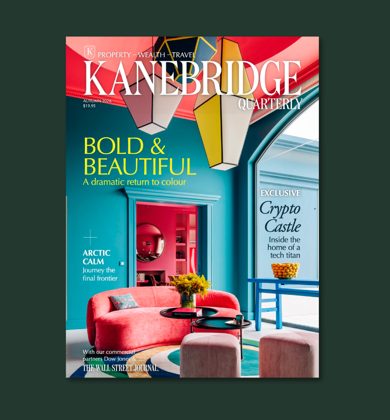


Luxury in every shade: How colour creates a high-end interior
From timeless neutrals to rich jewel tones and earthy hues, the right colour palette can elevate any space, creating mood, elegance and effortless sophistication.
 3 min
3 min
When people think of luxury in interior design, their minds often jump to expensive furniture or opulent finishes, but in truth, one of the most powerful tools in creating a refined, elegant home lies in the palette you choose.
Colour has an extraordinary ability to shift a space’s mood, scale and energy. The right hue, applied with thought and care, can make a modest room feel expansive, elevate everyday pieces and instantly signal sophistication. As a designer, I believe that luxury is not about excess; it’s about intention. And colour, when chosen well, can speak volumes.
Timeless neutrals: The essence of understated elegance
There’s something inherently luxurious about a well-balanced neutral palette. Soft whites, warm beiges, and the perfect blend of greige, which is a gentle meeting point between grey and beige, offer a timeless foundation for any space. I often gravitate toward warm whites like ivory, bone, or champagne, tones that feel luminous yet grounded.
In more modern interiors, cooler greys bring a crisp sophistication, especially when layered with clean architectural lines. The beauty of neutrals is their versatility, they allow your materials, textures and lighting to take centre stage, creating a quiet kind of opulence that never goes out of style.
Rich jewel tones: For depth, drama and decadence
If you’re drawn to interiors with a sense of grandeur, jewel tones are your secret weapon. Emerald green, in particular, has an enduring allure especially when paired with brushed gold or antique brass. It evokes nature but with a regal twist. Deep sapphire blues bring a sense of calm authority to a space, while ruby red delivers unapologetic confidence.
These colours work best when expressed in rich textures: velvet armchairs, high-gloss cabinetry or dramatic accent walls. In the right application, jewel tones don’t shout they whisper luxury.
Dark and moody: The modern masterstroke
I’ve always admired the elegance of moody interiors. Charcoal greys and deep navies create a sense of intimacy, wrapping a room in warmth and quiet confidence. A matte charcoal wall in a living or dining room feels architectural and considered, while a navy velvet headboard or cabinetry in a study can anchor the room with presence and depth.
To keep these spaces from feeling too heavy, I like to introduce metallic highlights, a polished chrome lamp, a brushed gold sconce, or even a soft glint of silk in a throw or curtain. It’s these small contrasts that give dark interiors their designer edge.
The soft side of luxury: Muted pastels
Pastels can be incredibly luxurious when done right. Think blush pink offset by crisp linen, soft gold and creamy stone. It’s not saccharine; it’s sensual. I find muted lavender and powder blue especially beautiful in bedrooms and dressing spaces, where they exude serenity and quiet indulgence.
These colours pair well with tactile textures, cashmere throws, velvet cushions, and silk sheers for a softness that’s both comforting and couture.
Earthy tones: Effortless sophistication from nature
Earth-inspired shades like terracotta, olive green and warm taupe have surged in popularity for good reason. These tones bring a worldly richness to interiors, referencing Mediterranean villas, lush vineyards and sun-drenched landscapes.
Terracotta, whether in a statement wall or an artisan vase, offers warmth and groundedness. Olive green is wonderfully versatile both calming and bold and works beautifully with natural timbers and leathers. Taupe, the quiet achiever of the colour world, blends seamlessly into almost any palette while adding depth and warmth.
Elevating colour through detail
Colour is only part of the story. The way you apply it and what you pair it with makes all the difference.
How to enhance the luxury effect in your home
Beyond colour, the way you use and complement these colours and shades can enhance the luxurious look and feel of your home:
- Pair with metallics: Gold, brass, or chrome accents instantly elevate a colour scheme.
- Choose high-quality finishes: Matte, satin, or high-gloss paint finishes can impact how colours reflect light and create a sense of depth.
- Layer with textures: Velvet, silk and high-thread-count linens add richness to any colour palette.
- Use statement lighting: Elegant chandeliers or modern sconces enhance the mood and sophistication of a space.
Final thoughts
Creating a luxurious home doesn’t require extravagance. It requires consideration. The right colour palette whether classic neutrals, dramatic jewel tones or earthy naturals can transform your home into a sanctuary of style and substance.
As I often tell my clients: luxury is not a price point it’s a feeling. And colour is one of the most powerful ways to create that feeling, every day, in every room.
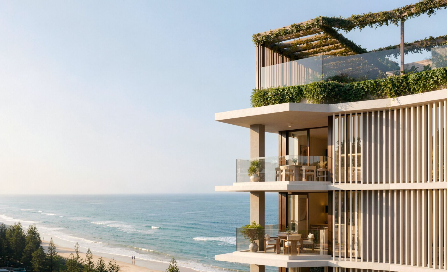
Studio apartments have almost disappeared from new Australian developments. Lura is bringing them back to Burleigh Heads from $495,000.

Porsche’s Cayenne Turbo Electric produces up to 1,156PS and reaches 100km/h in a claimed 2.5 seconds.
Bjorn Farrugia was named for Björn Borg, the ice-cool Swede who once ruled Wimbledon’s Centre Court, and for a long stretch of his young life the name felt like a mandate
3 min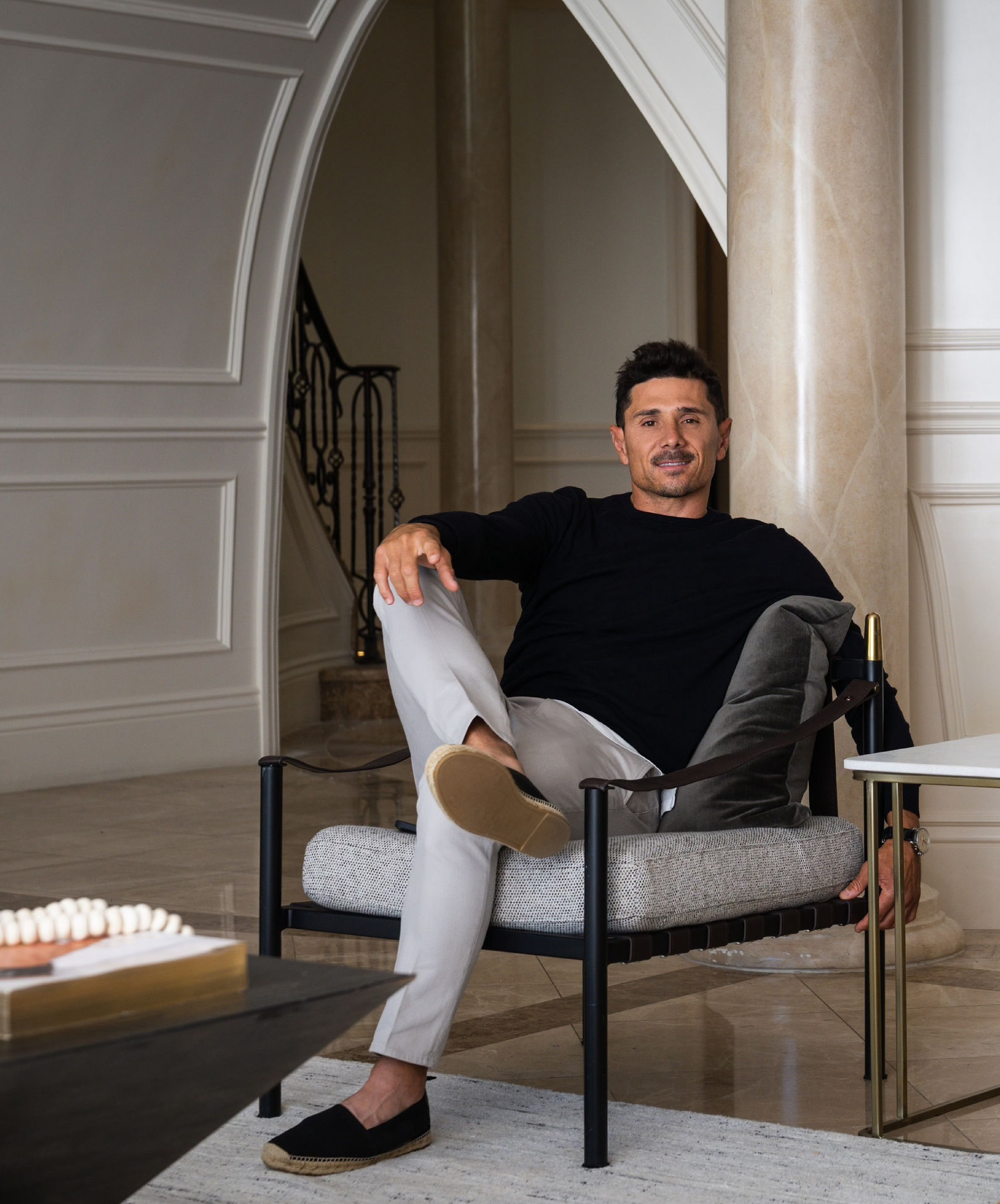
A tennis scholarship took him to America two decades ago with no return ticket in mind. Today the Melbourne-born, Beverly Hills-based agent is one of the most decorated names in Los Angeles luxury real estate — and still calls himself an Australian first.

Hand-built in Melbourne and limited to just 10 cars a year, the Zeigler/Bailey Z/B 4.4 is reshaping what a modern collector car can be.

International AI strategist Justin Kabbani will headline the Kanebridge Property Summit in Sydney on June 18, with tickets selling fast.