




The Australian Palette: How Landscape Is Rewriting the Colour Rulebook
From bushland greens to valley reds, the country’s most awarded designers are proving that the best colour palette was never on a swatch card; it was outside the window all along.
 4 min
4 min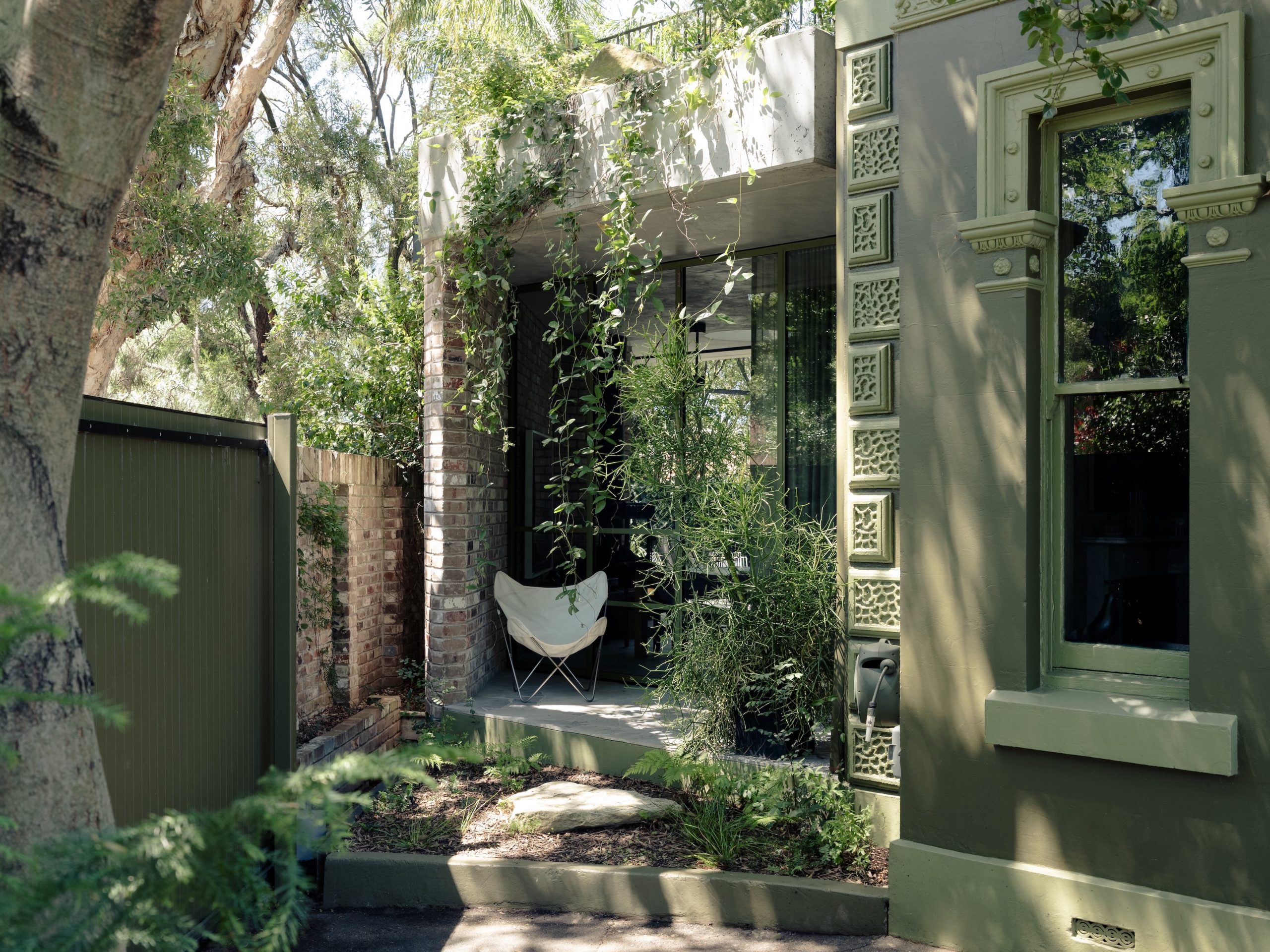
Walk through the Australian bush, and you’ll find a green that no paint chart quite captures. Eucalyptus canopy filtered through dust, heat and distance, grey at the edges, sometimes almost silver, never one fixed shade.
For decades, Australian interiors avoided it for exactly that reason. It was much easier to paint the walls white and look at the landscape.
That is no longer the case. Across this year’s Dulux Colour Awards, the celebrated projects shared an unmistakable thread: colour drawn not from trend forecasts or mood boards, but from the ground the buildings stand on.
Bushland greens, harbour blues, valley reds, coastal aquas are a palette with terroir, if such a thing can be said of paint.
“There’s a strong sense that designers are moving beyond safe, uniform schemes and embracing colours that reflect the local Australian landscape,” says Dulux Colour and Design Manager Lauren Treloar.
She points to greyish greens echoing coastal bushland, cool blues that nod to Sydney’s harbourside light, and rust-toned reds pulled from inland, rural country. “These shades feel rich, earthy and versatile.”
White walls, grey stone, maybe navy if a client was game, that was the old formula. Now colour is being used to describe where a house actually is, not just how it looks.
The house that disappears into its garden
Few projects made that argument more persuasively than Nithsdale, an 1890s villa in Stanmore, restored and extended by Studio Prineas as an intergenerational family home.
Once compromised by decades of unsympathetic renovation, the house has been restored to something like coherence, and colour has done much of the heavy lifting.
Architect Rachel Prineas didn’t stop at a front door or a strip of trim.
She drenched the entire exterior in two deep tones, Dulux Bronze Icon and Tambo Tank, pulling render, timber and ironwork into one chromatic field, lifted straight from the native planting around the house, species indigenous to Wangal Country. The building and its garden start to blur into each other.
Judge Ben Peake, Principal at Carter Williamson Architects, called the result mature and sophisticated, praising the discipline behind it: deliberate selections lifted from the immediate native landscape rather than abstracted from it.
The effect is a house that no longer sits in its garden so much as it recedes into it, camouflage as design strategy, and a quietly radical rebuttal to the idea that heritage colour has to mean caution.
A valley, painted from the inside out
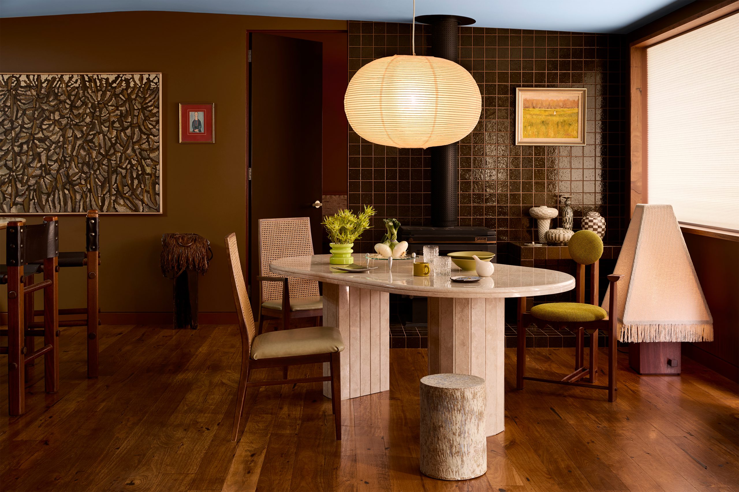
If Nithsdale shows landscape dictating a single, disciplined hue, The View, this year’s Residential Interior winner, designed by Studio Shields in the treetops of the Yarra Valley, shows what happens when an entire palette is built from the shifting conditions of a single place over time.
Seven years, start to finish. The colour scheme evolved right alongside the build, tones tested on site, adjusted through the seasons, checked against the light as it moved across the valley.
“The palette draws from oxidised earth, eucalyptus canopy, dry grasses and shifting skies, allowing the interior to feel inseparable from the landscape,” says designer Ruby Shields.
Chartreuse and olive pick up the bushland outside the windows. Burgundy and earthy reds anchor the more intimate rooms, echoing soil and aged timber. Powdered electric blues cut through the warmth for clarity.
It is, in Shields’ words, less a single decision than a tonal narrative, unfolding room by room as a considered journey.
Judge Sarah Jane-Pyke, of Arent&Pyke, singled out the precision of that placement, and the cohesion it created, proof, she said, of how thoughtfully deployed colour can enhance the texture of everyday life.
It’s a long way from colour as decoration. Here, it functions closer to memory: a way of encoding a specific valley, its light and its seasons, into the walls of a house.
When the landscape is the coastline
Not every project translating “place” into paint sits in the Australian bush.
Te Pākau Maru, a 63-home development on former brownfield sites in New Brighton, Christchurch, took its name, meaning “the sheltering wing,” or “the place of joy”, from a gift by Ven Dr Lyndon Drake, and built its exterior palette around the beach, sea and sky.
What ties Nithsdale, The View and Te Pākau Maru together isn’t a shared shade; it’s a method.
Each project treats its palette as more of a site survey than a style choice, asking what a place already looks like before deciding how a building should be painted.
Treloar sees this as central to where Australian and New Zealand design is heading.
Warm neutrals are doing particularly well in the Australian climate right now, she says, softening rooms without losing their contemporary edge, and sitting easily next to the timber, linen and stone that anchor so many of these projects. The bigger shift, though, is about provenance. Designers can increasingly tell you why a colour belongs in a house, not just that it looks good in it.
There’s a practical lesson in all this for anyone renovating or building right now: skip the trend report. Step outside instead. Look at the ground, the trees, the light at a particular time of day. Ask what the house is already surrounded by.
As these award-winning projects prove, the answer was often there all along; you just have to be willing to bring it inside.

Victorian auction buyers will soon receive a piece of information that has traditionally been withheld until bidding reaches it: the vendor’s reserve price. Under new property-sale and underquoting laws, agents must publish the agreed reserve at least seven days before an auction or fixed-date sale. Most changes begin on 1 October 2026 and apply to …
Continue reading “Victoria’s New Auction Rules Will Force Reserve Prices Into the Open”
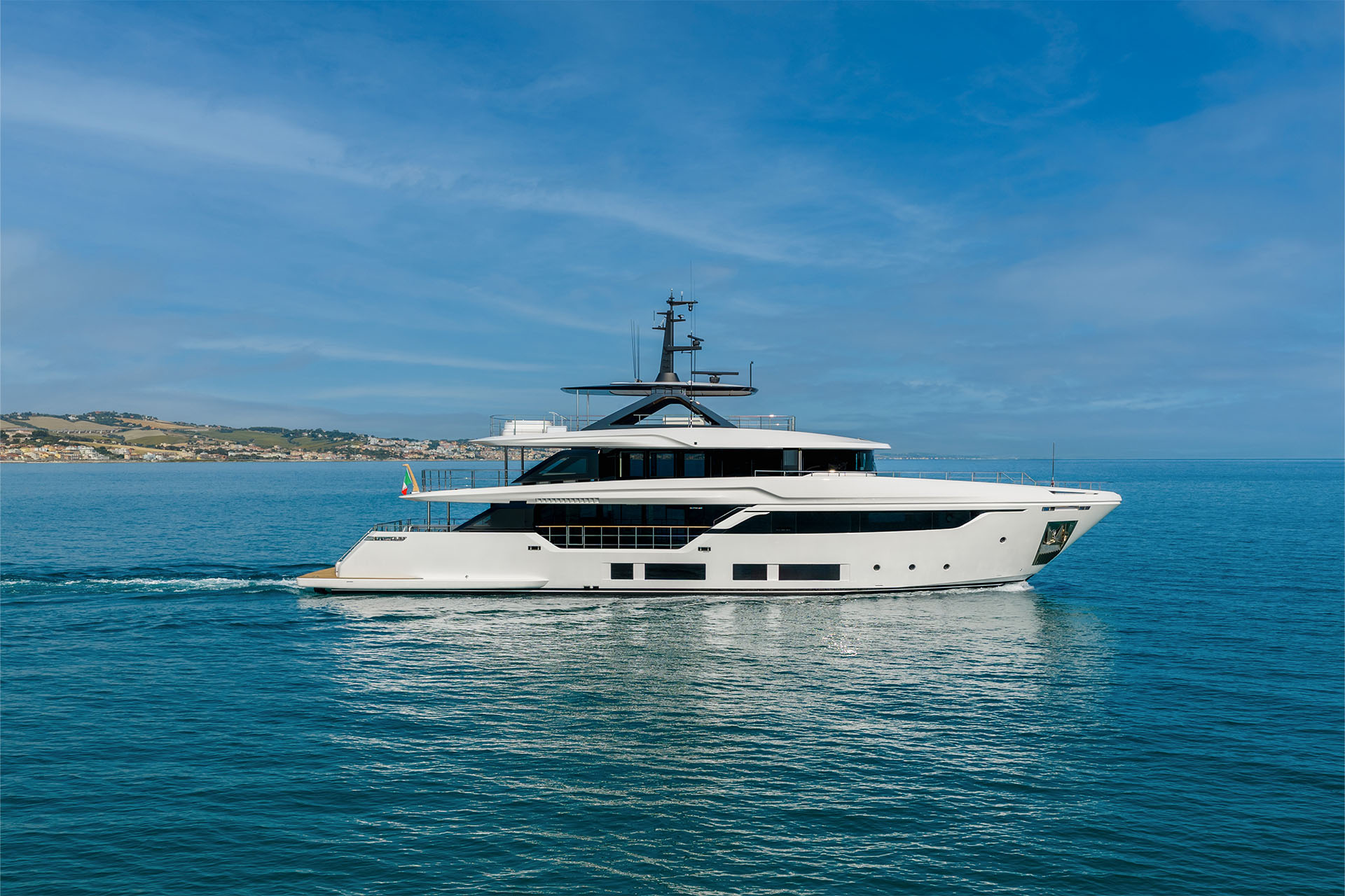
Four decks, 34.5 metres and a made-to-measure interior: step aboard the new Custom Line Navetta 35, unveiled at Cannes.
Four decks, 34.5 metres and a made-to-measure interior: step aboard the new Custom Line Navetta 35, unveiled at Cannes.
2 minThe most compelling modern yachts increasingly borrow from residential architecture: clearer circulation, larger windows and outdoor rooms that feel genuinely connected to the interior. Custom Line’s new Navetta 35, given its world premiere at the Cannes Yachting Festival, pushes that idea across four decks.
At 34.5 metres long with a beam of 7.7 metres, the yacht is the new entry point to Custom Line’s displacement range. Its scale is substantial enough to create distinct private, social and service zones, yet remains below the dimensions of the yard’s larger custom superyachts.
The exterior was developed through Ferretti Group’s Strategic Product Committee and Engineering Department, while Custom Line Atelier supervised the interior definition and owner personalisation. That made-to-measure process is central to the brand: layouts, materials, furniture and artwork can be shaped around how an owner intends to use the yacht rather than applied as a fixed decorative package.
Outdoor living is distributed across the vessel rather than concentrated at the stern. The beach club brings guests close to the water; the main and upper decks provide protected entertaining areas; and the sun deck creates a more private elevated retreat. The design seeks to preserve open sightlines, allowing sea views to run through social spaces and reducing the sense of division between saloon and terrace.
The Navetta designation signals a displacement yacht intended for composed, efficient cruising rather than outright speed. For owners, the appeal lies in range, comfort and the ability to spend longer periods aboard. Technical specifications, engine options, range and top speed should be confirmed against the final shipyard data for the displayed hull.
What can be seen is a continuation of Custom Line’s preference for quiet sophistication. Instead of decorating every surface, the interior architecture uses proportion, natural light and carefully selected materials to carry the experience. Built-in pieces establish structure, while freestanding furniture and art allow an owner’s personality to emerge.
The debut also arrives during Custom Line’s 30th anniversary year. Since its foundation, the marque says it has delivered more than 300 made-to-measure yachts. The Navetta 35 is therefore both a new model and a statement about what the next chapter should look like: more openness, closer contact with the water and customisation that goes beyond choosing finishes.
At Cannes, where new models compete for attention metre by metre, the Navetta 35’s proposition is relatively restrained. It is not trying to look like the fastest boat in the marina. It is designed to feel like a highly private waterfront home — one capable of moving when the owner wants a different view.
Yacht snapshot
– Model: Custom Line Navetta 35
– Type: Displacement superyacht
– Length: 34.5 metres
– Beam: 7.7 metres
– Decks: Four
– Debut: Cannes Yachting Festival, 8–13 September 2026
– Builder: Custom Line, Ferretti Group
– Price: On application

Three-Michelin-starred chef Massimiliano Alajmo will host an intimate Mediterranean sailing aboard Crystal Serenity, redefining fine dining at sea.

Porsche has revealed a one-off 911 GT2 RS that brings the extraordinary silhouette of its 935/78 “Moby Dick” racing car onto the road. Created by Porsche Sonderwunsch with Manthey, the commission began with a near-new GT2 RS. The owner requested greater performance, a Slantnose profile and a rear wing influenced by the limited 911 GT3 …
Continue reading “Porsche Builds a Road-Going “Moby Dick” From a 911 GT2 RS”


