


Baby Blue Tubs and Lemony Loos. Are Coloured Bathroom Fixtures Chic Again?
The divisive trend has design pros in a lather. Here, they argue both sides.

 4 min
4 min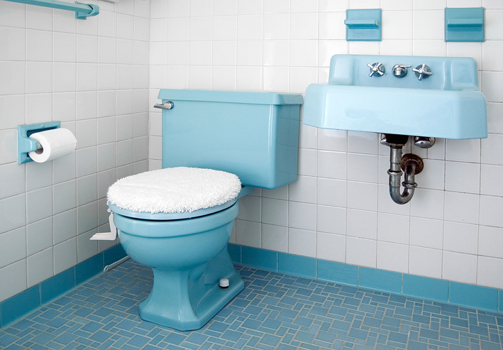
COLOURED TUBS and sinks are getting another shot. Design experts are revisiting the look, which originated in the 1920s. American waterworks brand Kohler recently revived two heritage colors they originally released in the ’20s and ’30s, and British manufacturers such as the Water Monopoly and the Bold Bathroom Company have found fans on both sides of the Atlantic.
Some designers, however, wincingly recall the avocado-hued tubs and sinks of the 1970s and hold that coloured fixtures are a trend that will date very quickly. For these naysayers, only white bath fixtures will do. Here, they debate the issue.
Yes, coloured fixtures give a bathroom a much-needed shot of style.
Many design pros applauded the news that come summer, Kohler’s bathroom fixtures—including toilets—will be available in two shades from its archive: Spring Green, an icy teal, and Peachblow, a mauvy pink. Fans of the chromatically diverse Rockwell collection from the Water Monopoly, meanwhile, appreciate the fixtures’ vaguely vintage eccentricity.
London interior designer Lizzie Green nestled a Powder blue Rockwell tub, one with a puffy upper rim and spheres for feet, against a wall of variegated green-blue tiles (above). “The playful design creates a center piece in a large bathroom,” she said. (In a similarly bold move, Ms. Green installed a blue art deco pedestal sink from British manufacturer the Bold Bathroom Company in a shower room clad in rose-pink tile.)
Elizabeth Metcalfe, of EM Design in Toronto, made a chalky green Rockwell tub the hero of a primary bath and a foil to some serious luxury. It sits amid walls of Breccia marble—a creamy stone veined in deep purple—and windows hung with pink cashmere drapery. The tub gives an otherwise conservative, grown-up room a “uniquely stylish” edge, she said.
The designers we surveyed agree that the trend’s biggest fans are older millennials who grew up in what Lauren Lothrop Caron terms the “beige 2000s.” The founder of Seattle’s Studio Laloc—a senior millennial herself—urges her contemporaries to be bold. For her own bathroom remodel, she’s eyeing Kohler’s Peachblow fixtures.
Noncommittal types might do best to choose one small colored fixture, says Jake Rodehuth-Harrison, founder of Los Angeles design firm Hubbahubba. Mr. Rodehuth-Harrison loves the “heavy dose of nostalgia” the pieces provide at a time when “the design world and algorithms are always looking forward and saying new, newer, newest.” He popped lilac ball feet onto another Water Monopoly Rockwell tub, this one white, in a Napa Valley, Calif., project. The result perches, most surprisingly, on muted green flooring he chose. If that’s too bold, “we can neutralize these fixtures by surrounding them with tiles in the same color,” he noted.
Another trick: Tiffany Duggan of London’s Studio Duggan suggests working with vintage fixtures that were born white. The designer recently updated an original iron tub with a wash of Farrow & Ball’s Red Earth. “If you change your mind, you can just paint over it.”
No, colored basins and bathtubs are too fatally trendy and impractical besides.
Doubters say hued baths will be a blip on the trend continuum. Unless you’re trying to preserve the aesthetic of a historic home, warned Liana Hawes Young, creative director of Wimberly Interiors in New York City, “colored fixtures will feel dated quickly, if not immediately.” And unlike trendily tinted shower curtains or wall paint that can be changed with little expense, this craze requires a spendy swap out, argued naysayers. Said Kristina Phillips, an interior designer in Ridgewood, N.J., “Clients looking for more long-term, classic design, along with keeping eventual resale in mind, might hesitate.”
Traditionalists say that if you really must, relegate such vivid choices to powder rooms and kids’ baths, spaces you don’t linger in. And well-intentioned salvage-scourers should be wary of mixing eras, said other concerned parties. “Vintage plumbing fixtures can date a space due to their scale,” explained Hattie Collins, founder of Hattie Sparks Interiors, in New Orleans. “Most times, coloured tubs and toilets are much smaller than present-day fixtures.” A safer bet, she suggests, is to focus on rescuing original floor and surround tile.
Powder blue is one thing, many say, but bright or hot-hued renditions of this trend read garish. “Neons and oranges could be a thorn in the room,” said Los Angeles designer Gilda Hariri. Even Ms. Metcalfe, who otherwise champions the trend, warned, “Avoid vibrant, aggressive tones, such as reds and oranges, that evoke a strong emotional response.”
Designers who actually can see a place for coloured fixtures couldn’t help but trivialise the trend as “retro” and “eclectic.” The rest of the room has to quietly suggest luxury, they suggest, to balance kookiness with class. Ms. Collins thinks wallpaper that has layered, expressive colours—the sort often offered by House of Hackney, Gracie or Cole and Son—could help coloured fixtures read higher end, as would lighting of reeded glass and high-quality metal finishes. “Lovely but expensive,” she added. Is the cost of a cheerful toilet really worth it?
The power of association doesn’t work well in the trend’s favor, either. A black bathroom, for instance, installed for a sense of refined moodiness, might evoke one from a 1980s basement nightclub, giving words like sterility and sanitary a new appeal. Austere white bathrooms, a holdover from the “hospital white’” tiled bathrooms of the early 1920s, are far more practical. Dark colours reveal water marks and chalky toothpaste smears. To Kristine Renee, co-founder of Sacramento, Calif., interiors firm Design Alchemy, “Nothing ever seems as clean as white.”
The Wall Street Journal is not compensated by retailers listed in its articles as outlets for products. Listed retailers frequently are not the sole retail outlets.
 Copyright 2020, Dow Jones & Company, Inc. All Rights Reserved Worldwide. LEARN MORE


International AI strategist Justin Kabbani will headline the Kanebridge Property Summit in Sydney on June 18, with tickets selling fast.
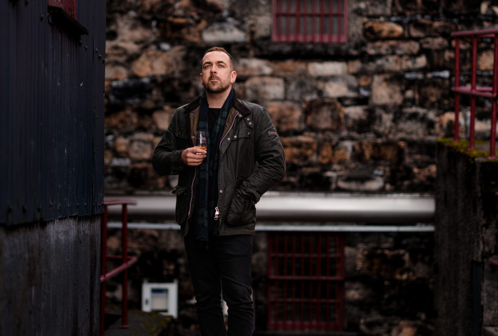
Scotch whisky expert, luxury hospitality strategist and Keeper of the Quaich inductee Ross Blainey is bringing a new philosophy of luxury experiences to Citizen Kanebridge.

Scotch whisky expert, luxury hospitality strategist and Keeper of the Quaich inductee Ross Blainey is bringing a new philosophy of luxury experiences to Citizen Kanebridge.
4 minFrom Scotch whisky and luxury retreats to fashion collaborations and world-class hospitality, Ross Blainey has spent years shaping high-end experiences around one idea: modern luxury is no longer just about what you own.
It is about access, connection and moments money alone cannot buy.
As Citizen Kanebridge continues to grow as one of Australia’s most sought-after private members’ clubs, Blainey, the club’s new Head of Membership, says the future lies in creating experiences members cannot find anywhere else.
“The ultimate memorable experiences are the money can’t buy moments,” Blainey said.
“The things that you can’t just put together anytime or any place. They make up something that is greater than the sum of its parts.”
On June 4, Blainey will bring that philosophy to life when he hosts an exclusive whisky evening for Citizen Kanebridge members at Sydney’s Royal Automobile Club of Australia.
Titled A Journey Through Whisky, the intimate event will see Blainey guide members through a curated selection of rare and unreleased whiskies drawn from his personal archive, alongside stories gathered across years working at the highest levels of the Scotch whisky world.
The evening will also include reflections on Blainey’s induction as a Keeper of the Quaich at Blair Castle in Scotland last year, one of the whisky industry’s rarest global honours.
A career built around experience
Before joining Citizen Kanebridge, Blainey built a career spanning luxury hospitality, Scotch whisky, premium lifestyle brands and experiential events.
But he says one industry above all others shaped the way he thinks about people and community: Scotch whisky.
“At its core, at its heart and throughout its whole history, Scotch has been about sharing, enjoyment, telling stories, meeting people and generally having a good time,” he said.
“Whisky can be that shared moment of laughter, and it can also be a shared moment of just slowing down, taking stock and contemplating. These are so key to building community.”
Blainey’s deep involvement in the whisky world culminated in 2025 when he was inducted as a Keeper of the Quaich at Blair Castle, a recognition is reserved for a select group of individuals who have made an outstanding contribution to Scotch whisky internationally.
“I was inducted last year, 2025, an incredible honour,” he said.
“There were a couple of teary-eyed moments as I stood in Blair Castle, on historic ground, realising that this was a moment I would remember forever.”
The next chapter for Citizen Kanebridge
Looking ahead, Blainey says Citizen Kanebridge will continue to focus on highly curated experiences, exclusive access, and bringing together like-minded members from Australia’s property, finance, and investment sectors.
“Our baseline of Car of the Year is already one of the most impressive events on the social calendar of Australia,” he said.
“My job is to find a way of raising the bar, taking things to the absolute top level for access, experiences and events.”
Blainey said the long-term goal was not simply to create another networking group or luxury club, but to build a community centred around meaningful relationships and unforgettable experiences.
“We provide the access, the money can’t buy memories, and we will be making those happen regularly,” he said.
“If we start with how amazing Car of the Year is and the only way is up, we are going to have some mind-blowing moments for our members.”
Hospitality at its absolute best
Another major influence on Blainey’s thinking came through his connection with world-famous New York restaurant Eleven Madison Park, once named the best restaurant in the world.
He says two concepts from the restaurant’s owners still shape the way he approaches luxury experiences today: “enlightened hospitality” and “unreasonable hospitality”.
“Enlightened hospitality is a way of doing business that looks at not just the product of what you serve, but how it makes people feel,” Blainey said.
“Unreasonable hospitality is more about striving for the absolute best all the time. If you’re going to do something, do it to an unreasonable level that blows everything else out of the water.”
It is a philosophy, he says, which aligns closely with where Citizen Kanebridge is heading next.
“That’s what we’re doing here with CK, taking members’ experiences to another level,” he said.
Fashion, whisky and creative collaborations
Blainey’s career has also included working with Glenfiddich as a Creative Collaborations Lead, where his role centred on bringing luxury experiences and partnerships to life through designers, chefs, artists and bartenders.
Among the projects were runway collaborations with leading Australian fashion designers, with pieces from the partnerships now housed inside Sydney’s Powerhouse Museum.
“My job was to find a creative way of bringing the brand to life,” he said.
“How do we make something that none of us could make on our own? Searching for the things that will resonate with people.”
What luxury consumers want now
Beyond whisky and events, Blainey also played a key role in building Blackbird Byron, the boutique Byron Bay hinterland retreat later recognised in Tatler’s Top 101 Hotels list.
The property, known for its dramatic views, minimalist architecture, and secluded atmosphere, helped shape his understanding of how luxury consumers are changing.
“I think I learned that people looking for luxury in hotels want memorable moments, considered design and the ability to get away from the hustle and bustle of modern life,” he said.
“To feel at home without being at home is important.”
More broadly, he believes today’s luxury consumers are increasingly driven by authenticity and emotional connection.
“For luxury consumers overall, I think it comes down to craft, story and connection,” he said.
“The product itself has to be impeccable, the story behind it builds your reason for looking at it, and then you need to make a genuine connection with people.”
Interested in becoming a member of Citizen Kanebridge? You can contact Ross here.

Paine Schwartz joins BERO as a new investor as the year-old company seeks to triple sales.

A divide has opened in the tech job market between those with artificial-intelligence skills and everyone else.