


Can Colourful Interior Design Actually Lift Your Spirits?
Brighten up your home for a vibrant mood.
 4 min
4 min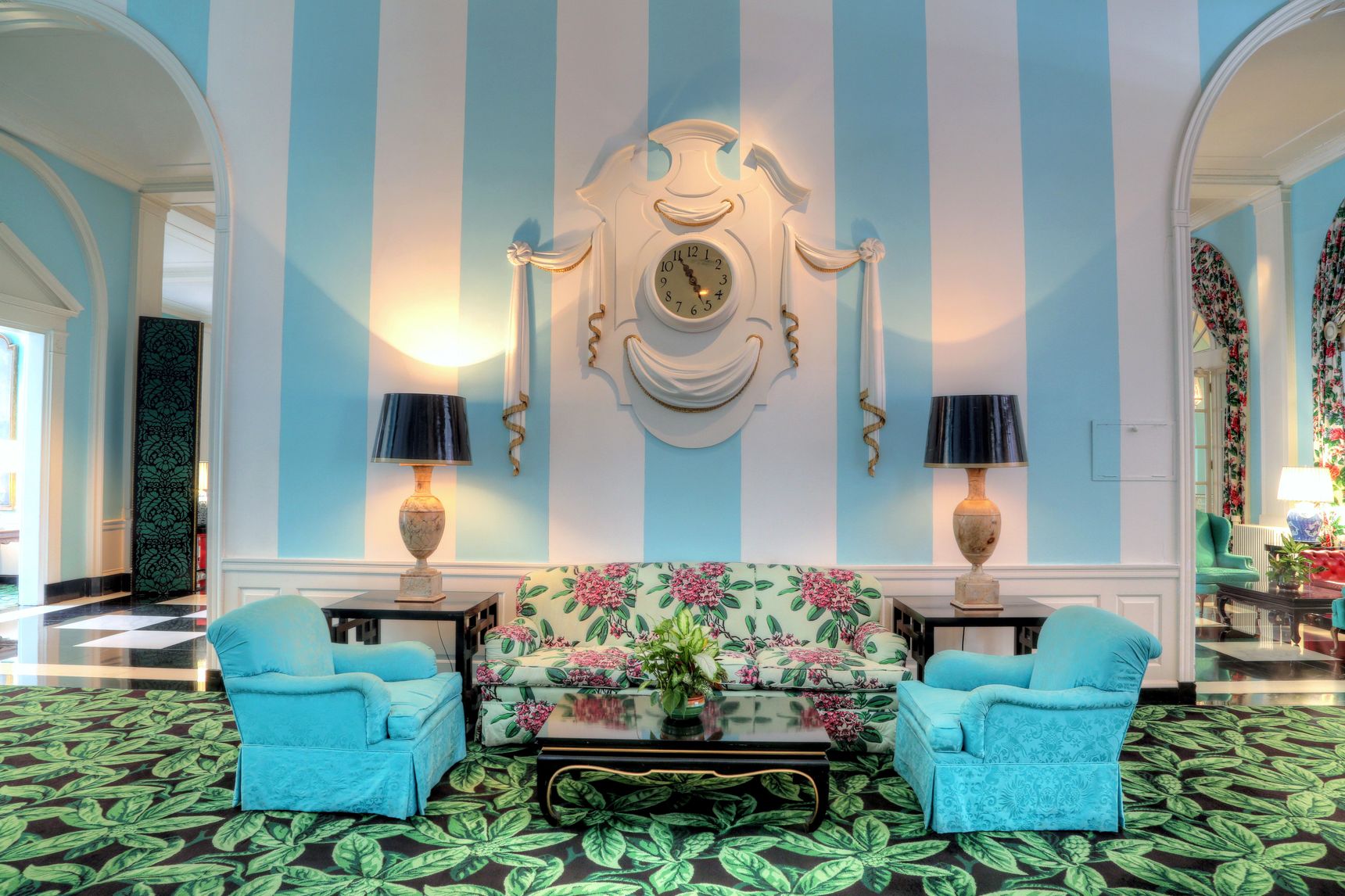
WHEN DOROTHY DRAPER, Gilded Age heiress turned famed decorator, was enlisted in 1946 to revitalize the storied Greenbrier Resort in White Sulphur Springs, West Virginia., she was met with its skeletal remains. Abandoned after its stint as an army hospital during World War II, it had been ravaged. There was no finery, no inkling its grounds had once been the playground of American aristocracy.
In a way, the state of the resort represented America. Many in Draper’s generation had lived through two world wars and the Great Depression. Everyone, regardless of status, had lost loved ones and watched stability evaporate. Draper had also been subject to a high-profile divorce from Dr. George Draper, President Franklin Roosevelt’s polio doctor, who left her on the eve of the stock market crash and ultimately married a woman 10 years her junior.
Everyone had stories. Everyone was battle-worn—not unlike the great fatigue we feel today, born of uncertainty that makes us either fold in fear or grasp for hope. Draper’s response was the latter. She believed deeply in the power of positive thought made manifest in the colourful decorating aesthetic she was known for.
By the time Draper’s train reached the White Sulphur Springs station, she had reanimated countless spaces. To New York City’s Hampshire House, she brought turquoise walls and cabbage-rose chintz. She transformed Brazil’s Quitandinha Resort with neo-baroque plasterwork and a brash palm-leaf print she called Brazilliance.
Colour ran counter to the prevailing interior decorating aesthetic c. 1890-1910, what might be called funeral-parlour chic. Draper, the daughter of iron heir Paul Tuckerman and shipping heiress Susan Minturn, had grown up in exclusive Tuxedo Park, N.Y., surrounded by antique furniture that was often stuffy, impractical and uncomfortable; and gravy colours such as wheat, slate and cream. The dreary neutrals Draper loathed were so beloved by the Gilded Age upper crust that Edith Wharton, in her 1897 decorating book, “The Decoration of Houses,” wrote “…the fewer the colours used in a room, the more pleasing and restful the result will be. A multiplicity of colours produces the same effect as a number of voices talking at the same time.”
Even before Draper’s first formal foray into decorating, her peers recognized the eye-catching beauty she cultivated in her own homes. Her opinion was so frequently sought that in the early ’20s, she did the unthinkable for a proper heiress and went into business, opening the Architectural Clearing House, a sort of matchmaking service between architects and clients. The firm evolved into Dorothy Draper & Company when it became clear that her real passion lay in decorating commercial spaces.
Draper chose what spoke to her, what she thought would make others joyful. Her husband, Dr. Draper, was a firm believer in the beneficial physical effect of positive thinking, and Draper carried the philosophy into her work. Bright shades and prints could influence not only the ambience of a space but also the mood of those occupying it. Her conviction resonated, and her clientele grew internationally. She deinstitutionalized patient rooms at the Delnor Hospital in St. Charles, Ill., with arm chairs, ottomans and window valences in floral chintz. In the cafeteria-style restaurant in New York’s Metropolitan Museum of Art, 8-foot birdcage chandeliers and fluted columns surrounded a sculpture pool, and shocks of coral banquettes lined blackberry walls. All over the world, Draper replaced beige and sadness with wide stripes in splashy colours, lacquered furniture in striking black and white, and elaborate plaster mouldings. Eager to spread her message and style, she also wrote how-to books and a long-running column in Good Housekeeping.
The Greenbrier finally reopened in April of 1948, and it was Draper’s masterpiece. The first weekend boasted celebrities like the Duke and Duchess of Windsor, Bing Crosby and the Kennedys, but the true highlight was Draper’s design. The lobby was dressed in her signature black and white checkerboard marble floors, bright presidential-blue walls and rhododendron-print curtains. The ballroom, the social centre of the weekend, sported a hand-plastered cameo ceiling and an 1,800 pound, Czechoslovakian drop-crystal chandelier inspired by the one found in the winter palace of Catherine the Great. Even the matchbooks were lovely, a bright neon red ornamented with a rhododendron blossom. The ragged old hospital was a memory.
Draper once said, “You don’t sell a commodity. You sell joy, gaiety, excitement. You aim at people’s hearts, not their minds.” It’s clear that today, reeling from the pandemic, we are leaning toward interior design that aims at our hearts. Carlton Varney, president of Dorothy Draper & Company and author of a deluxe edition of “The Draper Touch” (Shannongrove Press, June 29), has been enlivening homes and resorts for 62 years. “Across the board we have seen an increase in people seeking more colour and pattern in their homes, fully embracing our interiors,” said Mr. Varney, who believes as Draper did, that colour doesn’t just transform our walls, it is a form of magic.
Dorothy’s Edicts
Three tips from Draper’s 1939 book, ‘Decorating is Fun!’
1. Before You Begin. Gather the samples of every colour you intend using in your room…first and ask yourself whether you would wear them all in one costume. If you wouldn’t, don’t ask your room to do it either.
2. Choose What You Like. [Don’t] be afraid of a colour combination because you think it is too extreme or hifalutin. It probably isn’t at all. And it won’t cost a
cent more than a dull one.
3. Be Open-Minded. Muddy-coloured walls are nothing but a blight. So are undecided colours that compromise between…two blues until they become neither sea, sky nor good old cornflower. There should never be any doubt about what your colour has to say.

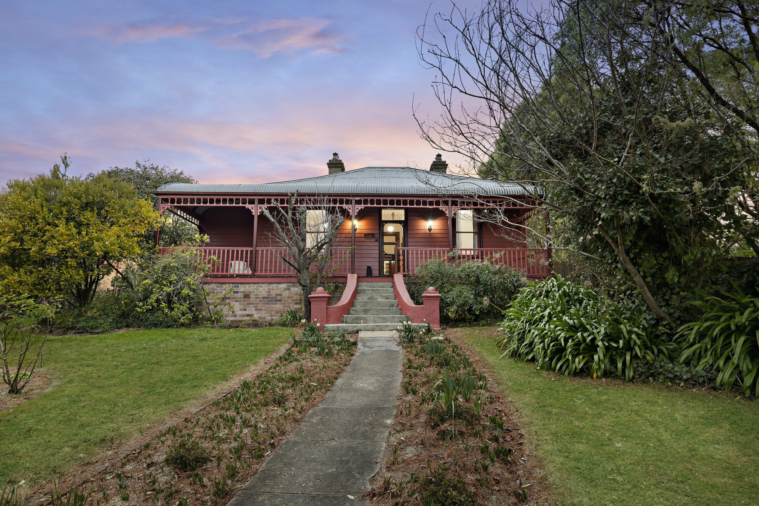
This stylish family home combines a classic palette and finishes with a flexible floorplan
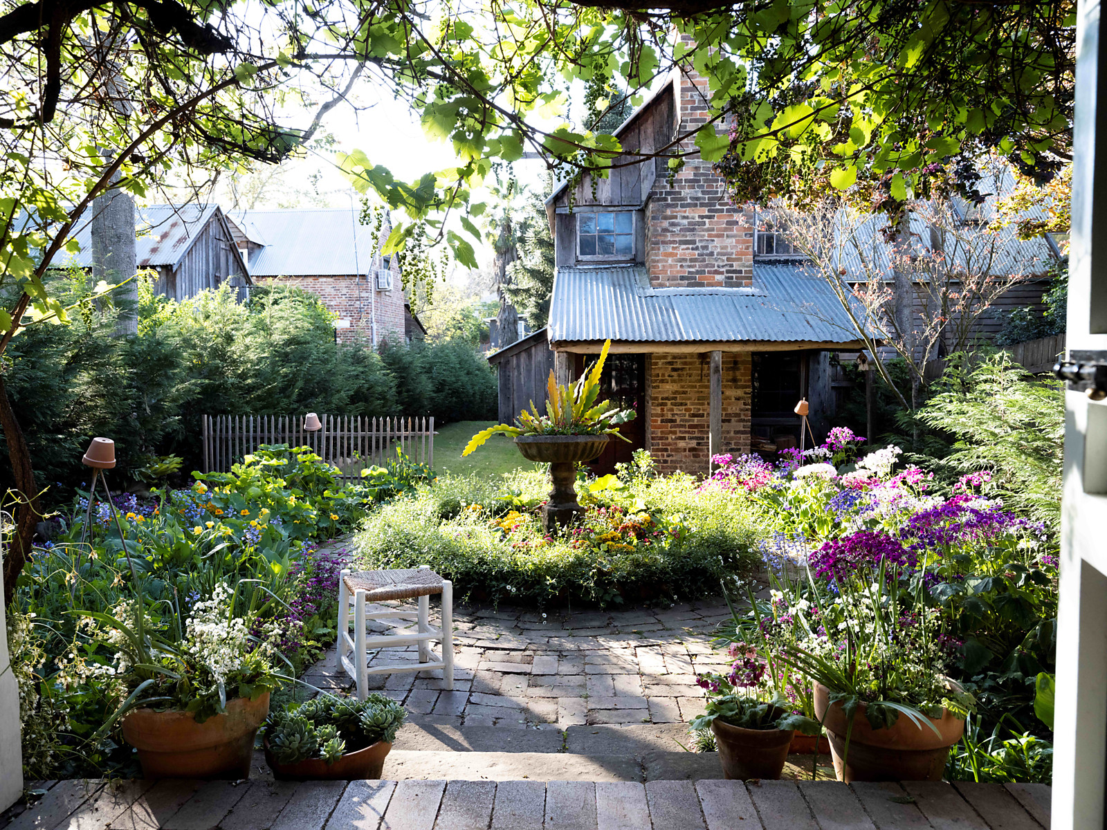
Just 55 minutes from Sydney, make this your creative getaway located in the majestic Hawkesbury region.

 4 min
4 min
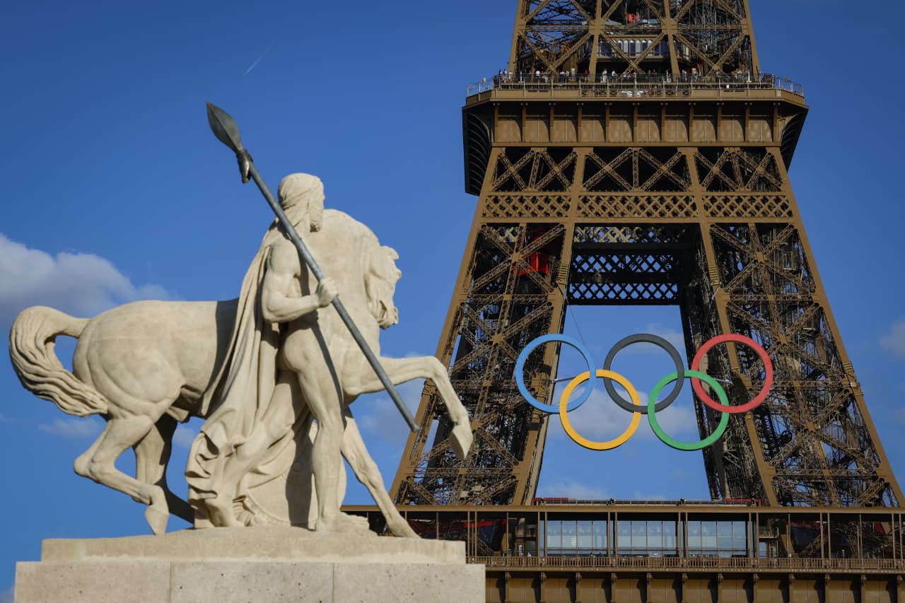
As Paris makes its final preparations for the Olympic games, its residents are busy with their own—packing their suitcases, confirming their reservations, and getting out of town.
Worried about the hordes of crowds and overall chaos the Olympics could bring, Parisians are fleeing the city in droves and inundating resort cities around the country. Hotels and holiday rentals in some of France’s most popular vacation destinations—from the French Riviera in the south to the beaches of Normandy in the north—say they are expecting massive crowds this year in advance of the Olympics. The games will run from July 26-Aug. 1.
“It’s already a major holiday season for us, and beyond that, we have the Olympics,” says Stéphane Personeni, general manager of the Lily of the Valley hotel in Saint Tropez. “People began booking early this year.”
Personeni’s hotel typically has no issues filling its rooms each summer—by May of each year, the luxury hotel typically finds itself completely booked out for the months of July and August. But this year, the 53-room hotel began filling up for summer reservations in February.
“We told our regular guests that everything—hotels, apartments, villas—are going to be hard to find this summer,” Personeni says. His neighbours around Saint Tropez say they’re similarly booked up.
As of March, the online marketplace Gens de Confiance (“Trusted People”), saw a 50% increase in reservations from Parisians seeking vacation rentals outside the capital during the Olympics.
Already, August is a popular vacation time for the French. With a minimum of five weeks of vacation mandated by law, many decide to take the entire month off, renting out villas in beachside destinations for longer periods.
But beyond the typical August travel, the Olympics are having a real impact, says Bertille Marchal, a spokesperson for Gens de Confiance.
“We’ve seen nearly three times more reservations for the dates of the Olympics than the following two weeks,” Marchal says. “The increase is definitely linked to the Olympic Games.”

Getty Images
According to the site, the most sought-out vacation destinations are Morbihan and Loire-Atlantique, a seaside region in the northwest; le Var, a coastal area within the southeast of France along the Côte d’Azur; and the island of Corsica in the Mediterranean.
Meanwhile, the Olympics haven’t necessarily been a boon to foreign tourism in the country. Many tourists who might have otherwise come to France are avoiding it this year in favour of other European capitals. In Paris, demand for stays at high-end hotels has collapsed, with bookings down 50% in July compared to last year, according to UMIH Prestige, which represents hotels charging at least €800 ($865) a night for rooms.
Earlier this year, high-end restaurants and concierges said the Olympics might even be an opportunity to score a hard-get-seat at the city’s fine dining.
In the Occitanie region in southwest France, the overall number of reservations this summer hasn’t changed much from last year, says Vincent Gare, president of the regional tourism committee there.
“But looking further at the numbers, we do see an increase in the clientele coming from the Paris region,” Gare told Le Figaro, noting that the increase in reservations has fallen directly on the dates of the Olympic games.
Michel Barré, a retiree living in Paris’s Le Marais neighbourhood, is one of those opting for the beach rather than the opening ceremony. In January, he booked a stay in Normandy for two weeks.
“Even though it’s a major European capital, Paris is still a small city—it’s a massive effort to host all of these events,” Barré says. “The Olympics are going to be a mess.”
More than anything, he just wants some calm after an event-filled summer in Paris, which just before the Olympics experienced the drama of a snap election called by Macron.
“It’s been a hectic summer here,” he says.
AFP via Getty Images
Parisians—Barré included—feel that the city, by over-catering to its tourists, is driving out many residents.
Parts of the Seine—usually one of the most popular summertime hangout spots —have been closed off for weeks as the city installs bleachers and Olympics signage. In certain neighbourhoods, residents will need to scan a QR code with police to access their own apartments. And from the Olympics to Sept. 8, Paris is nearly doubling the price of transit tickets from €2.15 to €4 per ride.
The city’s clear willingness to capitalise on its tourists has motivated some residents to do the same. In March, the number of active Airbnb listings in Paris reached an all-time high as hosts rushed to list their apartments. Listings grew 40% from the same time last year, according to the company.
With their regular clients taking off, Parisian restaurants and merchants are complaining that business is down.
“Are there any Parisians left in Paris?” Alaine Fontaine, president of the restaurant industry association, told the radio station Franceinfo on Sunday. “For the last three weeks, there haven’t been any here.”
Still, for all the talk of those leaving, there are plenty who have decided to stick around.
Jay Swanson, an American expat and YouTuber, can’t imagine leaving during the Olympics—he secured his tickets to see ping pong and volleyball last year. He’s also less concerned about the crowds and road closures than others, having just put together a series of videos explaining how to navigate Paris during the games.
“It’s been 100 years since the Games came to Paris; when else will we get a chance to host the world like this?” Swanson says. “So many Parisians are leaving and tourism is down, so not only will it be quiet but the only people left will be here for a party.”
This stylish family home combines a classic palette and finishes with a flexible floorplan
Just 55 minutes from Sydney, make this your creative getaway located in the majestic Hawkesbury region.