


The Right Way to Lay Out Your Living Room: The 7 Formulas Interior Designers Rely On
What size should the rug be? How high the coffee table? Design pros don’t just wing it. They follow these guidelines.

 4 min
4 min refers to classic interior design guidelines when creating his ‘room boxes.’")
“DESIGNING A ROOM is like putting a puzzle together,” Paul Corrie, an interior designer in Washington, D.C., told me. Despite my having interviewed dozens of design wizards as a journalist, my own suburban Colorado living room remains “unsolved.”
So I reached out to my decorating contacts to see if they could prescribe formulas for living rooms: from optimal rug sizing to how high to hang lights. None of these rules are etched in parquet, but even experienced designers largely stick to them. And they’ll help you (and hopefully me) map out a handsome but homey living room.
1. Keep Your Friends Close
Conversation can sputter fast if your seat is too far from—or discomfitingly near to—your chatmate. The minimum distance between the fronts of seats, says Atlanta designer Vern Yip, is 42 inches. Anything within that “feels like you’re intruding on somebody’s personal space,” said Yip, author of “Design Wise” (Running Press, 2016). The max separation is 120 inches. Any farther and “you no longer feel like you’re in the conversation.”
When laying out seating in a living space, Ellen S. Fisher, vice president for academic affairs and dean of the New York School of Interior Design, often conjures an image of three sides of a square for inspiration. “Why this shape? Because everyone likes a corner seat and to sit at right angles to others when conversing,” she said. Passageways between pieces that will see traffic should be at least 24 to 36 inches wide, says Yip.
2. Serve Up Comfort
My own coffee table is all wrong: a 33-inch wide ellipse of marble that, at just 12 inches tall, means my 6-foot-5-inch husband stoops like a drooping tulip just to pick up his morning tar. Ideally, says Yip, the table surface and seat should be the same height (as should a side table and sofa arm). And place the coffee table no further than 15 inches from the sofa, says Fisher, author of “Home: The Foundations of Enduring Spaces” (Clarkson Potter, 2018). Or even 12 inches, said Fisher. “That might seem too close, but if the table is too far away, a person on the sofa can’t pick up an hors d’oeuvre.” And the table should be one half to two-thirds the length of your settee, “small enough that you can negotiate around it but large enough that people sitting on the ends can still easily access the table,” Yip said.
3. Lower the Lights
You probably know to layer your lighting. An optimal scheme, says Yip, includes recessed, atmospheric and task lighting. But are you aware of ideal placements? Table and floor lamps, for example, should be low enough “so when you’re sitting, the shade doesn’t go above eye-level,” he said. Chandeliers need a minimum of 76 inches from the floor to the lowest point of the light but a maximum of 84 inches. “You see a lot of houses that have double stories—you know, homes in suburbia trying to be mansions—where the poor fixture is hugging the ceiling and doesn’t feel like part of the room,” said Yip. The aim is to have walking space while lending “ambience, atmosphere and scale to the space,” said Yip. Got sconces? Place them on either side of whatever they’re bracketing, be it a painting or mirror, aligned with the centerline.
4. Roll Out a Big Rug
Though I loathe the bland, taupe wall-to-wall carpet we inherited from our home’s previous owners, I have to admit, it creates a boundless horizon and feels dang good underfoot. Conversely, a too-small rug is bound to shrink the room. At minimum, the front feet of the furniture should sit on the rug. Better: all four feet, said Fisher. Yip takes it a step further, often custom-ordering expansive rugs so they extend to within 12 to 18 inches of the “limiting factor” (such as a wall or fireplace hearth).
5. Careful With the Couch
“A 6- to 8-foot long sofa is going to give you the most flexibility in designing a room,” said Corrie. As to the depth of the seat, a person can sit back about 24 inches before he or she starts to recline. Anything deeper calls for throw pillows. As for the overall depth of a sofa, “less than 33 inches starts to feel like a bench seat, and more than 38 inches creates a footprint that will impact everything else,” Corrie said.
6. Aim Higher
I dream of flinging open silk velvet draperies each morning, like a “Downton Abbey” maid. But if I make the splurge, how high should they be hung? “It doesn’t matter if you have thousand-foot-tall ceilings,” Yip said. “Take your drapery as high as you can go,” and don’t stop short of the floor. If you have crown molding, roost your curtain rods just below it. Yes, this costs, but it also makes rooms feel voluminous.
7. Max Out the Viewing
Whether placing a TV, mirror or painting, consider where the observing peepers will be. Hang art so that its center is 60 inches from the floor—“the average human eye level,” said Yip. Televisions, since they’re watched while sitting, can be hung as low as 48 inches floor-to-center. Ideal viewing distance? “Roughly 1½ to 2½ times the diagonal measurement of the screen,” Yip said. For example, a 60-inch screen is best placed 90 to 150 inches from your seats. Any closer and you’ll notice a breakdown in picture quality, says Yip. “Any farther and you won’t feel engaged.”
 Copyright 2020, Dow Jones & Company, Inc. All Rights Reserved Worldwide. LEARN MORE


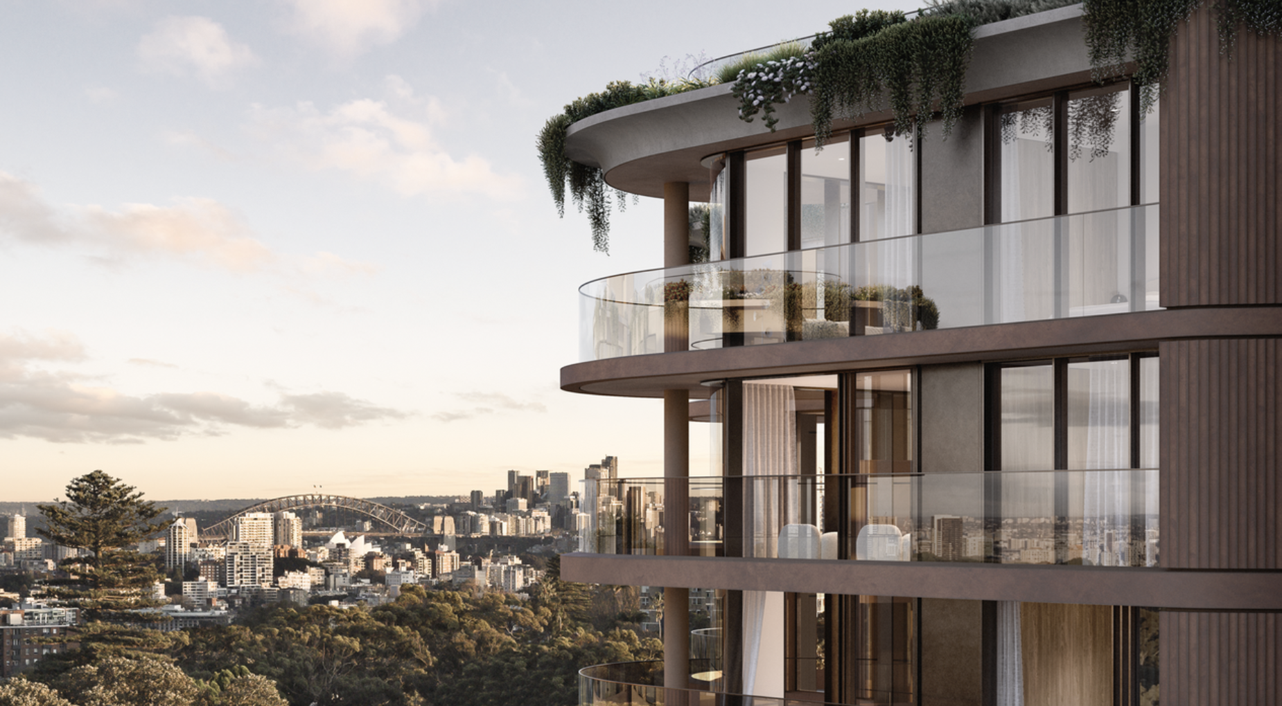
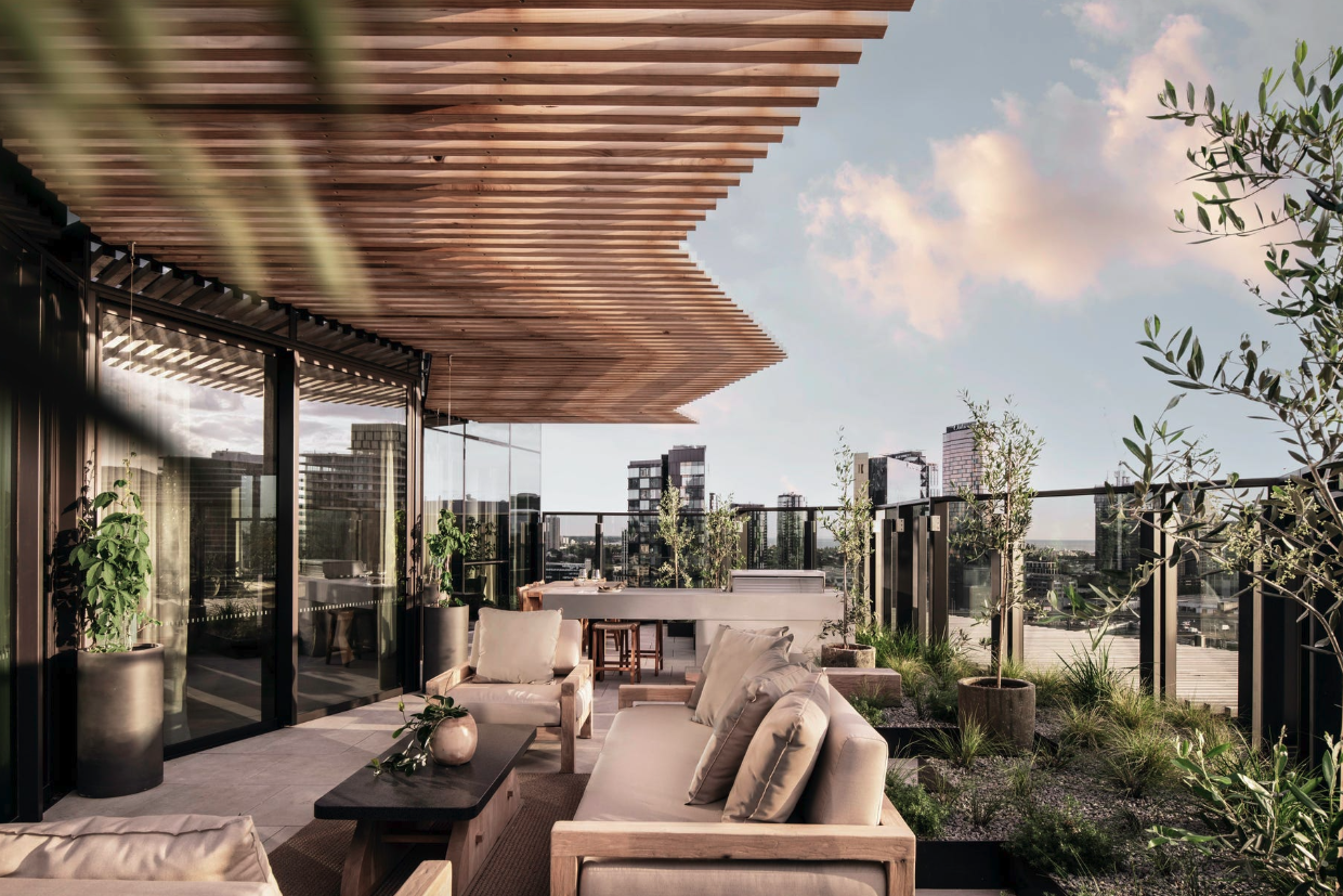
A record-breaking $11 million sale at The Centennial Collection has set a new benchmark for luxury apartment living in Bondi Junction.
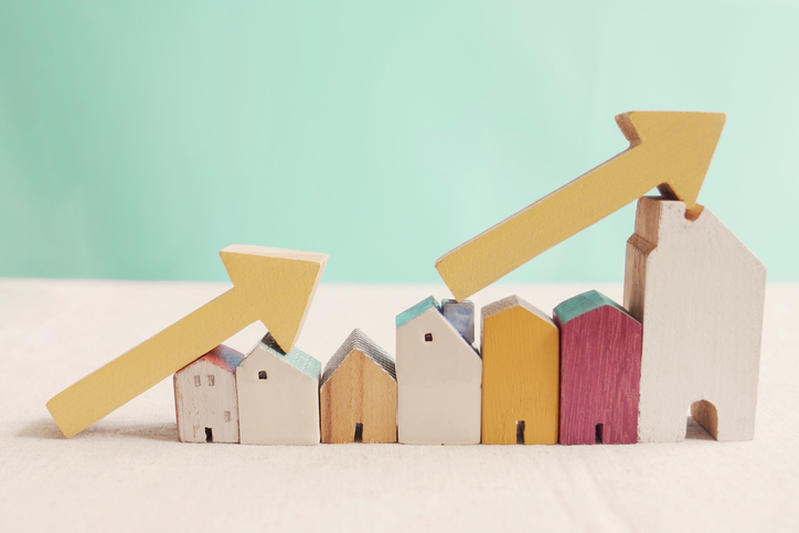
As interest rates, inflation and market sentiment fluctuate, investors are being urged to focus on data, not panic.

Australia’s housing affordability crisis is being fuelled by chronic undersupply, planning delays and rising development costs, as politicians continue to focus on the wrong solutions.
3 min
Australia’s housing crisis will not be solved by first-home buyer incentives or tax changes alone, with leading property figures warning governments must tackle supply constraints if affordability is to improve.
Speaking at the Kanebridge Quarterly Property Leadership Summit in Sydney last week, expert project marketing specialist Sam Elbanna, property investor and fund manager Paul Miron and property consultant Karla McNeice said that a lack of housing supply remained the central issue facing the market.
Elbanna, Director of CPM Realty with more than 30 years’ experience in project sales, argued that successive governments had focused too heavily on stimulating demand rather than addressing the barriers preventing new housing from being delivered.
“The misconception is that politicians think the way to solve the housing crisis is to drive demand,” he said.
“The reality is that’s not the way. This is a supply-side problem, and it needs to be solved on the supply side.”
Drawing on his experience in project sales, Elbanna said policies designed to help first-home buyers often had unintended consequences, pointing to previous grants that ultimately flowed through to higher property prices.
Instead, he said developers were facing increasing red tape, approval delays and rising costs, which were discouraging new housing supply.
“In the absence of stock, demand exceeds supply,” he said.
Miron, a Co-Founder and Fund Manager of Msquared Capital, said the housing debate had become overly focused on tax policy while overlooking broader structural issues.
He argued that affordability challenges stemmed from a combination of factors, including planning constraints, supply shortages, migration levels and interest rates.
“No-one can be 100 per cent certain on the real reason for property prices is going up,” he said.
“The reason why property prices are higher is a combination of interest rates, lack of supply, migration, vacancy rates and maybe taxes play a role.”
Miron was critical of recent federal housing policy changes, warning they could reduce the number of new homes being built and further constrain supply that was even highlighted in the budget.
He also highlighted the importance of the property sector to the broader economy, noting that residential real estate and related industries employed more than one million Australians.
McNeice, who advises developers on sales strategy and market intelligence, said understanding buyers had become increasingly important as affordability pressures intensified.
While affordability remained a major consideration, she said today’s buyers were focused on value rather than simply price.
“People are looking for value for money,” she said.
She said buyers were increasingly evaluating factors such as transport connections, walkability, nearby amenities and flexible living spaces that could accommodate changing family needs.
“What infrastructure is going on? Can I walk to the shops? Can I meet people at the local cafe?” she said.
The panel also discussed the mounting pressures facing developers, with Elbanna arguing that many projects become financially unviable from the moment a site is purchased.
“The viability of a development happens at the moment the site is bought,” he said.
He said rising construction costs, higher interest rates and overly optimistic feasibility assumptions had left some developers exposed as market conditions changed.
While acknowledging the growing number of smaller and first-time developers entering the market, Elbanna said property development required expertise across finance, construction, marketing and legal disciplines.
“It is actually a business that requires a level of expertise,” he said.
Looking ahead, the panel agreed opportunities remained in the market despite current challenges.
Miron said property should continue to be viewed as a long-term investment and cautioned against trying to time short-term market movements.
McNeice said success would increasingly depend on identifying projects that genuinely met changing buyer expectations.
Elbanna said affordable housing remained achievable, but developers needed to deliver more than just homes.
“We can provide affordable housing in this country,” he said.
“But we’ve got to wrap that affordable housing with the things that people want.”
As Australia’s housing affordability debate intensifies, the panellists agreed on one point: without a meaningful increase in housing supply, demand-side measures alone are unlikely to solve the nation’s property challenges.

ABC Bullion has launched a pioneering investment product that allows Australians to draw regular cashflow from their precious metal holdings.

From elevated skincare to handcrafted home pieces, this year’s most thoughtful gifts go beyond the expected.