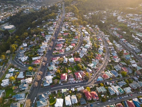


Why street appeal still matters to buyers in an online market
With the spring season in full swing and clearance rates stalling, street appeal is more relevant than ever
 4 min
4 min
W e’ve all done it. A quiet night in front of the TV spent scrolling property in dream locations has replaced peering into the shop windows of real estate agents while visiting your favourite holiday destination.
For dedicated property hunters, the next step is a drive by the ‘open for inspection’ to check out what the property had to offer. But in an increasingly virtual market where online purchases have become more common among interstate and overseas buyers, it’s worth questioning whether street appeal is becoming less important.
Not so, says John McGrath, managing director and CEO of McGrath Real Estate.
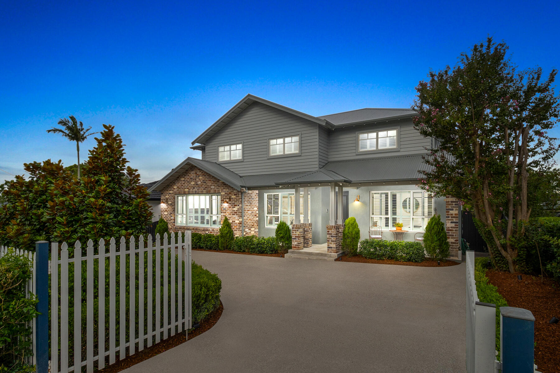
“Kerbside or street appeal is still alive and well,” McGrath says. “First impressions are most important, whether it be in the real or virtual world. People are time poor and often don’t have the time available to sort through multiple images so they will exclude properties based on the hero image – which is often the facade.”

Presenting the front of your property to its best advantage, even if you have to spend a few thousand dollars, will be money well spent to draw in more potential buyers, either in the virtual world or in real life. And more buyers means more competition on auction day. Putting out the welcome mat is essential.
“All timber work should be sparkling, and planting and greenery should give instant appeal,” McGrath says. “It goes without saying that any defects such as leaking downspouts or squeaky gates should also be fixed for the eventual inspections that should be generated from online buyers.
“I’ve found that a few thousand dollars invested in the front of the property can add 10 times that amount through attracting buyers to explore the home further.”
Even the smallest detail shouldn’t be overlooked.
“Things such as making it easy to find the street number can be a small but important detail,” he says.
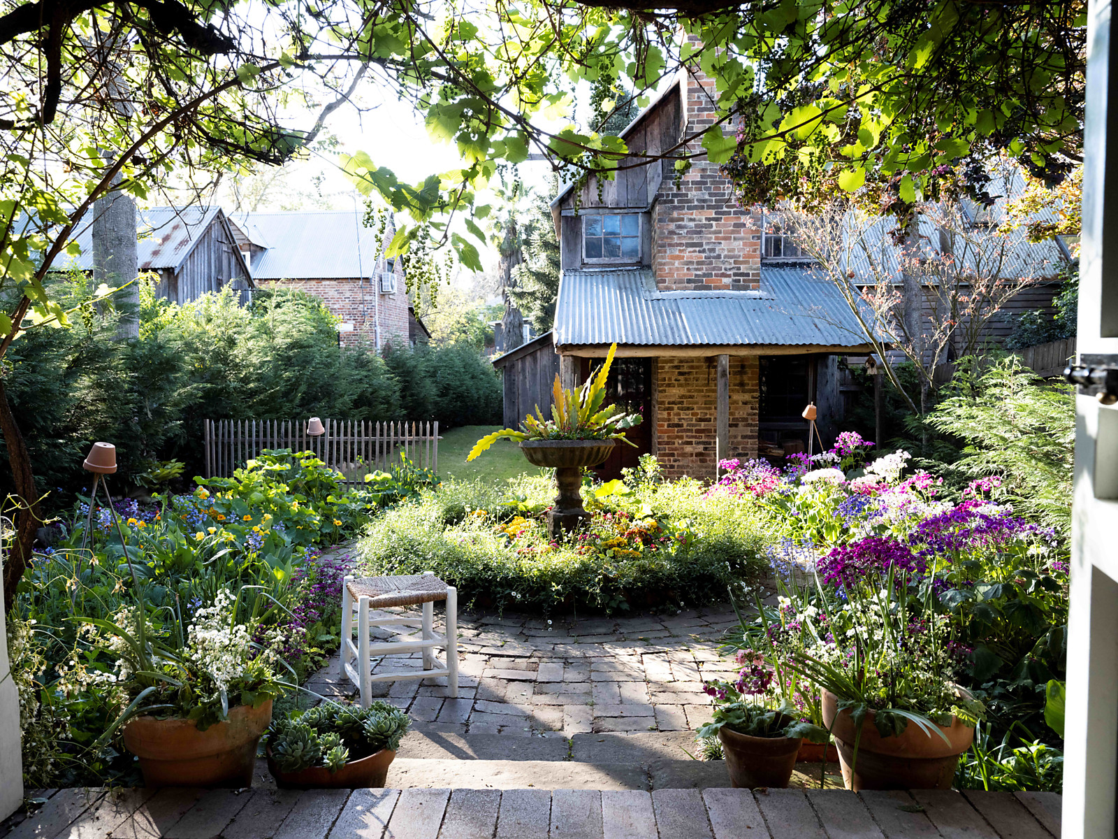
Matt Cantwell, creative director of landscape design and architecture firm Secret Gardens, says the front garden and facade is the first hint to buyers of what’s inside.
“Structural details like letterboxes and intercoms can offer clues to the style of the house internally,” he says. “You might have an old semi with a modern letterbox out the front and it will tell you a bit about what you will experience once you get inside.”

Landscaping, or updating exterior structures such as fencing can be a particularly useful tool for vendors looking to refresh their property without doing a major
renovation, as a way of inviting potential buyers to look closer.
“Definitely with that larger scale planting, the trees and hedges perform a few functions,” Cantwell says. “They are framing the view to the house and making sure your eye doesn’t wander to the house on either side.
“Providing that scale against the house is a vital part of presenting the architecture to its best. It can also be about obliterating unsightly angles or views.”
As a general rule, Cantwell says it’s often a case of providing balance between providing a sense of openness with carefully placed trees and shrubs, while still maintaining interest, or even creating ‘wow’ factor for buyers.
“Most people like the front of the house to feel a bit open,” he says. “With the front boundary line, it’s the detailing of structures like the fencing, walling and gates that people notice. They are important opportunities to pick up on details of the house.”
General manager international marketing at Brickworks, Brett Ward, says judging by the amount of time most first time homebuilders spend on choosing exterior bricks for their facade, street appeal still figures prominently for many, whether they’re selling or not.
“It’s as popular as it has ever been,” he says. “Building a new home is about creating your individual identity and giving you control over how it will look. Our clients are looking for guidance and advice on making their homes individual and how to mix and match materials on a project to make it look stylish.”
Just as interior finishes go in and out of fashion, it’s the same for facades, says Ward. He says lighter colours continue to prove popular, with harmonising colours added for more depth.
“Clients might use a white or light cream for the front of the house and then a slightly darker cream for the portico to make it pop without too much contrast,” he says. “There’s a lot more terracotta coming through with the architectural projects.”
If in doubt, he says commercial projects can provide inspiration for residential facades.
“The recently completed Quay Quarters site uses all three of the most popular colours we’re seeing and now that’s translating into residential design,” he says.
For those with older properties, property partner at The Agency, Tracy Tian Belcher, says vendors need to keep in mind who – or what – they are competing with.
“Clients might think because their property is close to the water that people will automatically be interested, but they are competing with much newer properties,” Belcher says. She says others can be reluctant to spend money on the front of a property they are just about to part with. However, she says it’s seldom money wasted.
“We always tell clients to put time and effort into the front garden,” Belcher says. “But it’s very difficult to convince people to spend money before they sell. In my experience though, you spend $1 and you get $2 back – at least.”
With an ongoing trade shortage expected, she says buyers are showing more interest in properties that are move-in ready.
“If you do the hard yards, people will pay for it,” she says. “ And they are going to budget more money than they should be when they make an offer.”
For more stories like this, order a copy of the launch edition of Kanebridge Quarterly here
This stylish family home combines a classic palette and finishes with a flexible floorplan
Just 55 minutes from Sydney, make this your creative getaway located in the majestic Hawkesbury region.

 4 min
4 min
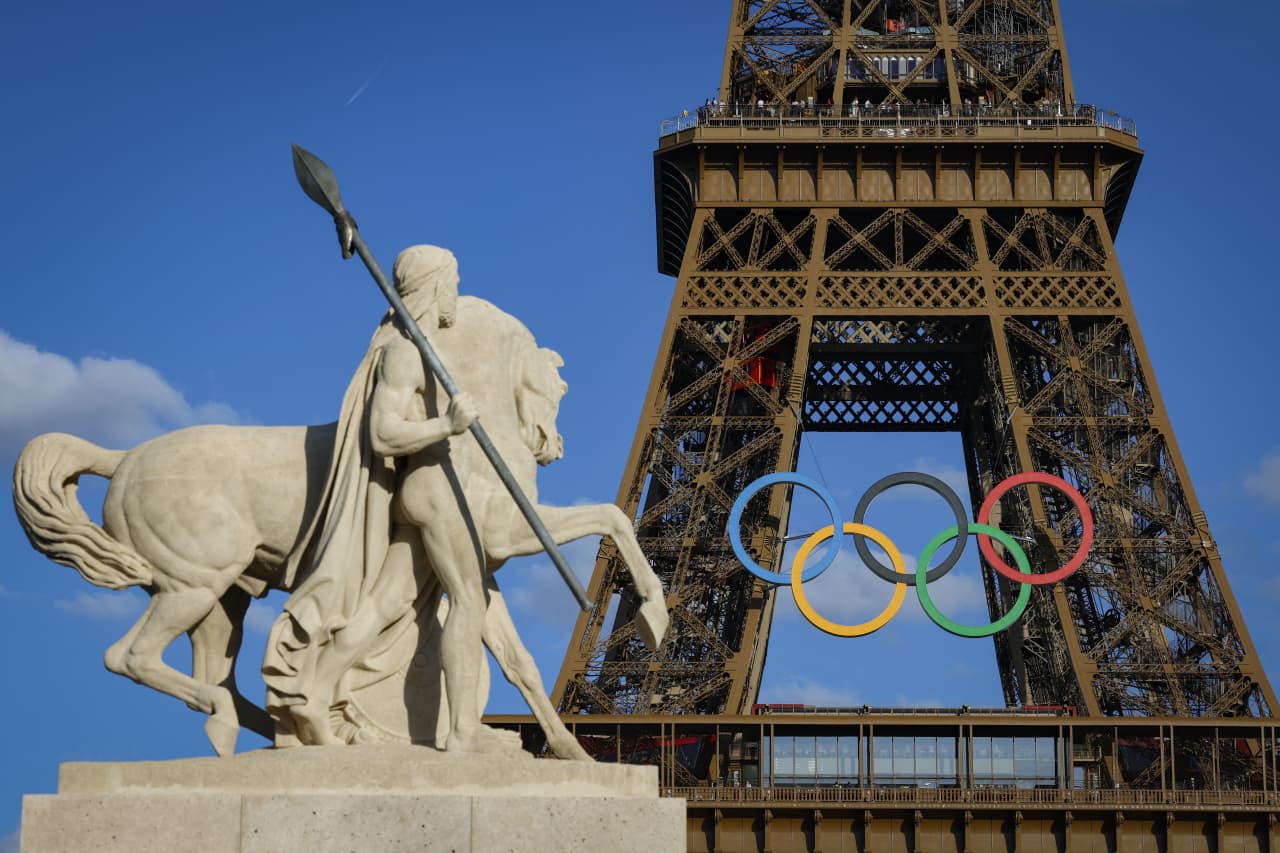
As Paris makes its final preparations for the Olympic games, its residents are busy with their own—packing their suitcases, confirming their reservations, and getting out of town.
Worried about the hordes of crowds and overall chaos the Olympics could bring, Parisians are fleeing the city in droves and inundating resort cities around the country. Hotels and holiday rentals in some of France’s most popular vacation destinations—from the French Riviera in the south to the beaches of Normandy in the north—say they are expecting massive crowds this year in advance of the Olympics. The games will run from July 26-Aug. 1.
“It’s already a major holiday season for us, and beyond that, we have the Olympics,” says Stéphane Personeni, general manager of the Lily of the Valley hotel in Saint Tropez. “People began booking early this year.”
Personeni’s hotel typically has no issues filling its rooms each summer—by May of each year, the luxury hotel typically finds itself completely booked out for the months of July and August. But this year, the 53-room hotel began filling up for summer reservations in February.
“We told our regular guests that everything—hotels, apartments, villas—are going to be hard to find this summer,” Personeni says. His neighbours around Saint Tropez say they’re similarly booked up.
As of March, the online marketplace Gens de Confiance (“Trusted People”), saw a 50% increase in reservations from Parisians seeking vacation rentals outside the capital during the Olympics.
Already, August is a popular vacation time for the French. With a minimum of five weeks of vacation mandated by law, many decide to take the entire month off, renting out villas in beachside destinations for longer periods.
But beyond the typical August travel, the Olympics are having a real impact, says Bertille Marchal, a spokesperson for Gens de Confiance.
“We’ve seen nearly three times more reservations for the dates of the Olympics than the following two weeks,” Marchal says. “The increase is definitely linked to the Olympic Games.”

Getty Images
According to the site, the most sought-out vacation destinations are Morbihan and Loire-Atlantique, a seaside region in the northwest; le Var, a coastal area within the southeast of France along the Côte d’Azur; and the island of Corsica in the Mediterranean.
Meanwhile, the Olympics haven’t necessarily been a boon to foreign tourism in the country. Many tourists who might have otherwise come to France are avoiding it this year in favour of other European capitals. In Paris, demand for stays at high-end hotels has collapsed, with bookings down 50% in July compared to last year, according to UMIH Prestige, which represents hotels charging at least €800 ($865) a night for rooms.
Earlier this year, high-end restaurants and concierges said the Olympics might even be an opportunity to score a hard-get-seat at the city’s fine dining.
In the Occitanie region in southwest France, the overall number of reservations this summer hasn’t changed much from last year, says Vincent Gare, president of the regional tourism committee there.
“But looking further at the numbers, we do see an increase in the clientele coming from the Paris region,” Gare told Le Figaro, noting that the increase in reservations has fallen directly on the dates of the Olympic games.
Michel Barré, a retiree living in Paris’s Le Marais neighbourhood, is one of those opting for the beach rather than the opening ceremony. In January, he booked a stay in Normandy for two weeks.
“Even though it’s a major European capital, Paris is still a small city—it’s a massive effort to host all of these events,” Barré says. “The Olympics are going to be a mess.”
More than anything, he just wants some calm after an event-filled summer in Paris, which just before the Olympics experienced the drama of a snap election called by Macron.
“It’s been a hectic summer here,” he says.
AFP via Getty Images
Parisians—Barré included—feel that the city, by over-catering to its tourists, is driving out many residents.
Parts of the Seine—usually one of the most popular summertime hangout spots —have been closed off for weeks as the city installs bleachers and Olympics signage. In certain neighbourhoods, residents will need to scan a QR code with police to access their own apartments. And from the Olympics to Sept. 8, Paris is nearly doubling the price of transit tickets from €2.15 to €4 per ride.
The city’s clear willingness to capitalise on its tourists has motivated some residents to do the same. In March, the number of active Airbnb listings in Paris reached an all-time high as hosts rushed to list their apartments. Listings grew 40% from the same time last year, according to the company.
With their regular clients taking off, Parisian restaurants and merchants are complaining that business is down.
“Are there any Parisians left in Paris?” Alaine Fontaine, president of the restaurant industry association, told the radio station Franceinfo on Sunday. “For the last three weeks, there haven’t been any here.”
Still, for all the talk of those leaving, there are plenty who have decided to stick around.
Jay Swanson, an American expat and YouTuber, can’t imagine leaving during the Olympics—he secured his tickets to see ping pong and volleyball last year. He’s also less concerned about the crowds and road closures than others, having just put together a series of videos explaining how to navigate Paris during the games.
“It’s been 100 years since the Games came to Paris; when else will we get a chance to host the world like this?” Swanson says. “So many Parisians are leaving and tourism is down, so not only will it be quiet but the only people left will be here for a party.”
This stylish family home combines a classic palette and finishes with a flexible floorplan
Just 55 minutes from Sydney, make this your creative getaway located in the majestic Hawkesbury region.