


BOLD COLOUR IS THE NEW CONFIDENCE
The beige era is fading. In its place, luxury homes are rediscovering the confidence to use deeper colour, layered emotion and bold palettes.
 8 min
8 min with designer Isabel Clune in Williamson’s East Liberty condo. Photo: Lindsey Drennan")
For almost a decade, interiors whispered. Minimalism took over, neutral palettes dominated, and many homes drifted into a safe sameness built from beige, cream and careful restraint.
But something has shifted. As the world becomes more chaotic, homeowners are leaning toward spaces that offer warmth, optimism and personality.
Colour has returned to luxury design because it delivers exactly that, but in a considered, modern way, far from the brash maximalism of the 2010s or the timid pastels of the early pandemic years.
The new wave is thoughtful, layered and emotionally led, a resurgence shaped by a desire to feel grounded in our own space.
From Sydney to Melbourne, Atlanta to Toronto and Portugal, colour is back with conviction.
Why Colour Matters
Major global paint houses see the shift clearly. Warm earth tones and gentle pastels are now sitting comfortably beside deeper colours like burnt orange, moss green, berry shades and vintage rose.
Forecasts suggest a swing back to expressive palettes shaped by nostalgia, slower living and a renewed pull toward nature.
This shift reflects what people are living through: rising costs, global tension, digital overload and plain old burnout. People want comfort, a sense of connection and something that lifts the mood. Designers are responding with palettes that feel warm, grounded and human.
Colour is no longer about trends, but about emotional resonance.
Lauren Treloar, Dulux Colour and Design Manager, says homes are increasingly becoming “canvases of personal storytelling.”
She notes a growing willingness to use colour to bring “energy, joy and personal character throughout the space,” driven by the desire for warmth, individuality and emotional connection.
The broader colour movement is also reflected in the 2026 Dulux Colour Forecast, distilled into three palettes: Ethereal, Elemental and Evoke.
Together they champion warm earth-based neutrals, rich burnt oranges, caramels, sage, moss and spearmint greens, alongside soft pinks, vintage rose tones and muted berries. One of the strongest shifts, Treloar says, is the rise of spearmint green, which pairs effortlessly with earthy pinks, browns and burgundies.
Sydney’s Coastal Blues
In one Sydney penthouse, the shift towards colour begins with quiet confidence. Soft aqua and Mediterranean blues wind through the kitchen, living and bathroom in a way that feels serene rather than showy.
The goal, says Nathalie Scipioni, principal architect and director of Nathalie Scipioni Architects, was to unify what had once been a disconnected, boxed-in layout.
“My aim was to open up what had been a closed, disconnected layout and create a home where the kitchen, living and dining areas feel connected and calm,” she says.
“I used one feature colour (blue) to tie the spaces together, applying it in different ways so it feels consistent but not repetitive.”
The palette works because it’s balanced with soft greys, pale timber, brushed brass and plenty of texture.
“I controlled saturation by choosing muted shades and finishes with texture. I used pale timber, brushed gold and soft greys so the blue stands out without overpowering the overall sense of calm,” she says.
Even so, Australia is still colour-cautious.
“I don’t see bold colour making a major return in Australia just yet,” she says. “The market still leans towards neutrals… clients are hesitant to embrace colour because they don’t see it used around them. It is not part of the visual landscape in the same way it is Europe.”
Yet she sees her work as a quiet education, showing that colour can be gentle, refined and deeply personal.
Earthy Depth
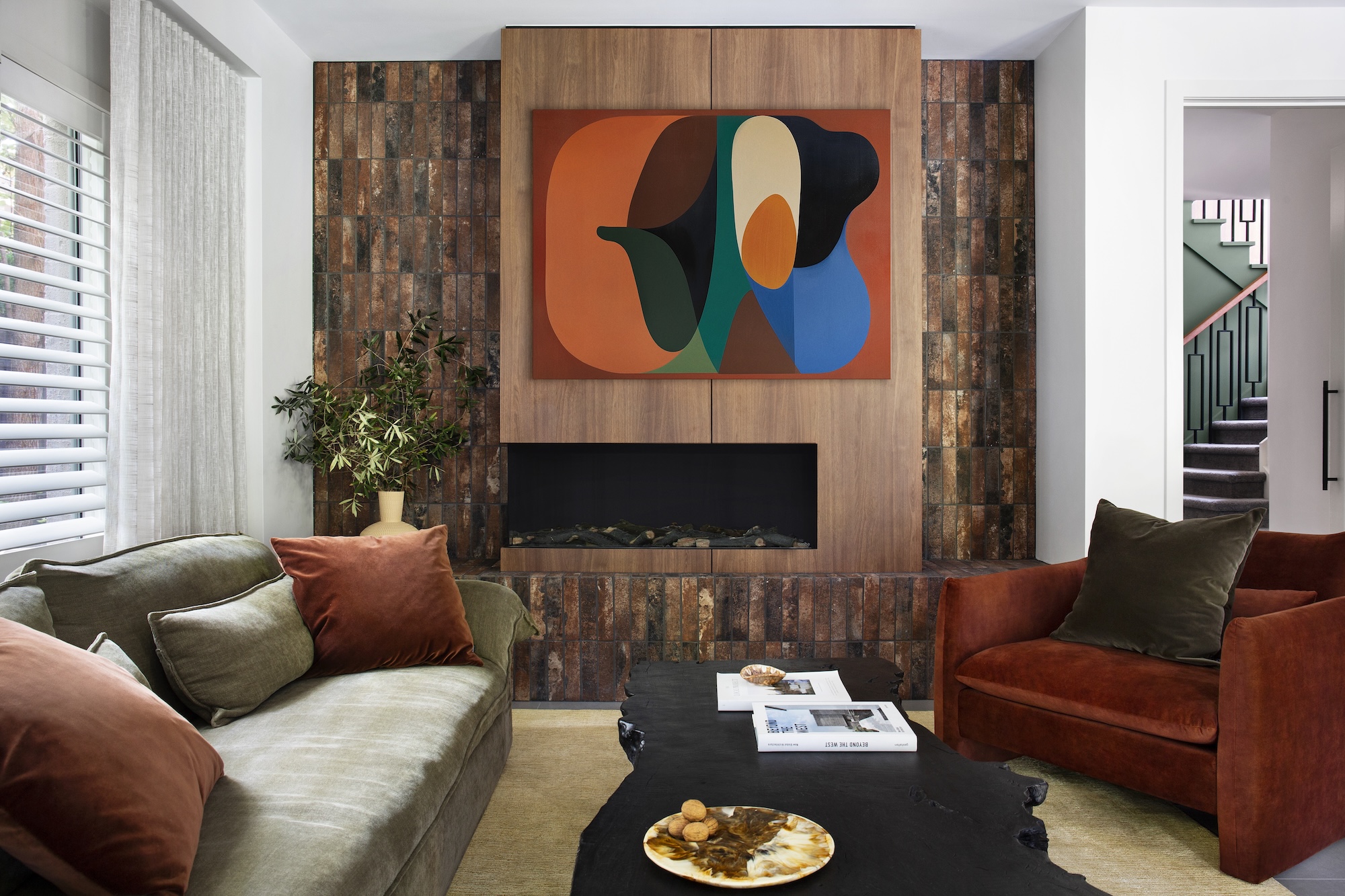
Further south, another family home takes colour in an entirely different direction. Here, deep greens, walnut timber, brushed brass, mustard, rust and black stone fill the rooms with a rich, tactile warmth.
The brief was clear: no more beige.
“The brief was to completely move away from the beige and neutral tones that once defined the home and to reintroduce personality through a palette that felt both sophisticated and nurturing,” says Richard Misso, creative director of The Stylesmiths.
“Deep greens and walnut were chosen for their connection to nature… Brushed brass details added warmth and subtle reflection.”
In the living area, an artwork becomes the anchor that unites rust armchairs, an olive sofa, terracotta tones and black stone.
“A multi-tone palette like this works when each hue earns its place and connects through tone rather than saturation,” he explains.
“Texture plays an equal role to colour… creating variation and visual rhythm without overwhelming the eye.”
What’s ahead?
“Bold colour is already making its return, but in a more refined, tonal way… It’s less about maximalism and more about authenticity through colour.”
The American Case
Across the Pacific, a roughly 930-square-metre manor near Atlanta champions a cinematic approach to colour, says Seth van den Bergh, principal designer at The Drawing Room.
Long architectural sightlines demanded strong punctuation points, bold red moments, black walls, saturated accents and warm neutrals.
“At Milton Manor, the palette was built around rhythm and a restrained use of colour,” van den Bergh says.
“Boldness only works when it is balanced with restraint… the ‘fearless palette’ gains its strength from warm neutrals, white painted wood floors and a thoughtful use of colours and objects.
These elements allow the saturated gestures to feel intentional rather than overwhelming. It is that balance that lets the home breathe.”
Even the black walls are handled with precision.
“We layered the surfaces and filled the negative space with related tones… the key is to treat black as a finish rather than a colour,” he says.
For those scared to commit, he recommends beginning with emotion, studying the light, understanding the room’s vistas, then editing to one clear direction.
“Think of it like a film. You would not have all your lead characters speaking at once, so let the room have one clear voice to follow,” van den Bergh says.
For homeowners nervous about bold shades, Treloar suggests starting with how a space should feel and introducing colour slowly through architectural details or textures. Moodboards and real paint samples remainessential.
“Colour can change substantially in different lighting or when colour from other furnishings reflects on the wall,” she says. “It’s all about experimentation and allowing your personal style to evolve.”
Playful Confidence in Toronto
In a Toronto condo belonging to actress Amalia Williamson, colour takes on a joyful, youthful energy.
The space started as a blank, characterless developer shell. With a careful mix of custom cabinetry and budget retail pieces, the palette evolved into a vibrant blend of navy, blush, gentle greens, bold orange and saturated green.
Crucially, the bold accents came last.
“We actually selected those accents at the very end,” designer Isabel Clune of Isabel Clune Design says. “The foundation of the room was already rich with colour but in a soft, muted way.
The saturated green pendants and bold orange stools became the perfect counterbalance… It’s a controlled pop, not a swing into ultra-maximalism.”
Even the surfaces balance practicality with beauty.
“I always design with equal consideration for function and beauty… Marble can be refinished, it’s naturally heat-resistant… its subtle imperfections and patina add character over time.”
The embossed tile was chosen purely for its visual impact, with marble behind the stove for everyday practicality.
It proves colour doesn’t require huge budgets – just intentionality.
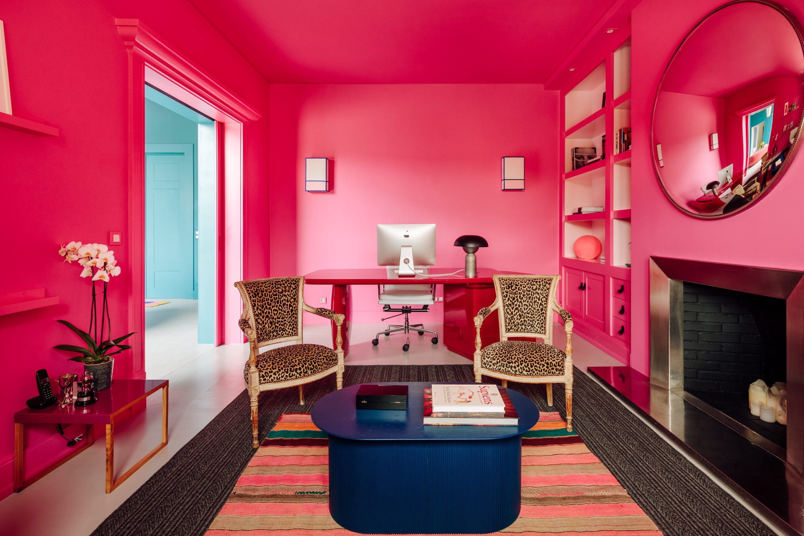
Colour Me Happy
Colour at Portugal’s Viterbo Interior Design begins with feeling, not pigment. As Gracinha Viterbo and Miguel Vieira da Rocha explain, “we never begin by selecting colours, we begin by talking about how people live.”
The team worked with the family to map the emotional temperature of each room, asking what mood each part of the home should hold: where they should feel energised, where they should slow down, where they should decompress and where they should gather with others.
The palette grew out of that emotional map, refined on site with large samples and fabrics at different hours of the day so that each hue produced the exact feeling the family wanted.
The home’s bold moments never spill into chaos because strict principles anchor the palette.
“Each room was given one strong chromatic gesture – never two,” the designers say, ensuring character without competition.
A restrained architectural backdrop and a tight family of colours allowed tones to reappear through the house in different intensities, creating continuity.
The result is a home that feels expressive and dynamic, yet the flow is seamless.
19th Century Revival
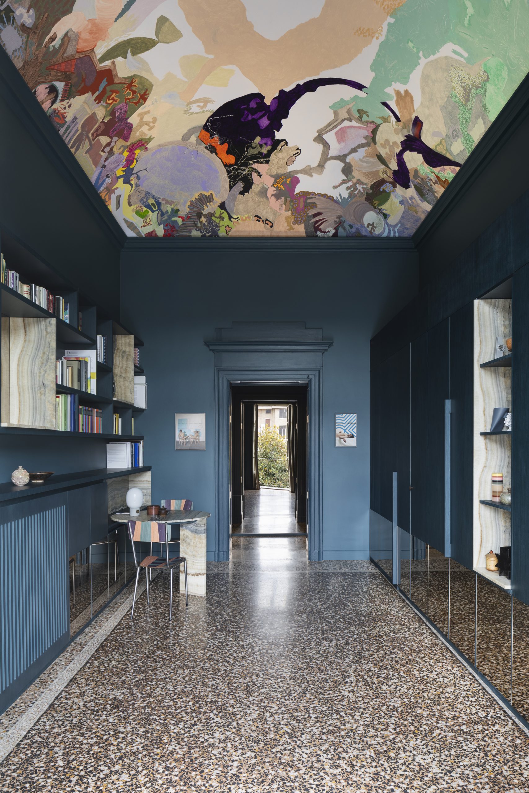
In Turin, colour becomes a bridge between eras. A 19th-century apartment restored by BRH+ Studio has been reimagined as a dialogue between heritage architecture and a vivid contemporary art collection.
Nowhere is that tension more captivating than in the entryway, where deep octanium walls and a site-specific fresco ignite a striking conversation between past and present.
Victoria Stoian’s fresco transforms the vaulted ceiling into an imagined sky, drawing the eye upward the moment visitors enter the apartment and signalling that this is a home shaped as much by art and narrative as by architecture.
BRH+ Studio treat colour not as decoration but as architecture, using it to connect the original terrazzo floors with new interventions and give the apartment a cohesive rhythm.
BRH+ on Colour and Heritage
For architects Barbara Brondi and Marco Rainò, founders of BRH+Q, the entrance to the Turin apartment was conceived as more than a hallway.
“The entrance to an apartment can be understood not only as the threshold to private living spaces, but also as a symbolically charged environment where the personality of the inhabitant can be expressed,” they explain.
In this case, the space was designed to reveal the owners’ passion for contemporary art while connecting that sensibility with the building’s nineteenth-century architecture.
The large tempera fresco by Moldovan artist Victoria Stoian transforms the vaulted ceiling into an imaginary landscape suspended between past and present. At the same time, the deep chromatic treatment of the walls connects visually with the apartment’s terrazzo flooring, creating a dialogue between decorative surfaces.
For Brondi and Rainò, the key to working within historic buildings is restraint. Every project begins with a close study of the context so that new interventions complement rather than overwhelm the architecture.
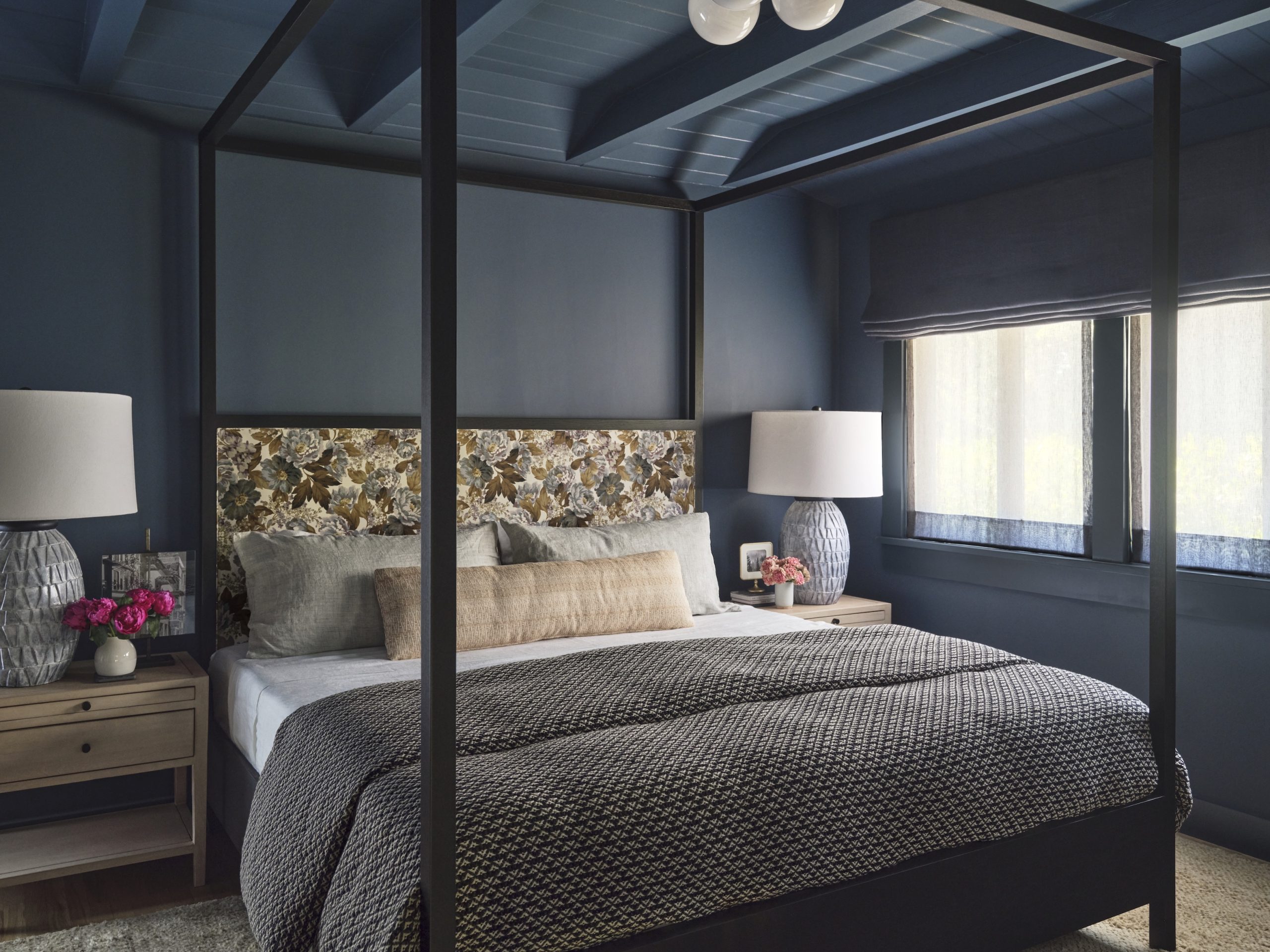
Pasadena: A Cocoon of Blue
In Pasadena, a second-floor bedroom suite became the perfect test case for how far colour can transform a small space when used with conviction.
The room sits apart from the home’s communal areas, giving interior designer Jennifer Vaquero of September Workshop the freedom to create a space centred entirely around her client’s favourite hue.
“While we loved the idea of creating a relaxing and serene space, it was equally important that the rooms also feel energetic and joyful,” she says.
Warm accents, reflective textures and subtle sheen in the window sheers ensure the deep blue palette never feels flat.
“When that light bounces off the golden and purple hues in the marble or the warm woods, the whole suite seems to come alive.”
Where Colour Is Heading
Across continents, a consistent story emerges. Colour is returning not as trend but as therapy, craftsmanship and identity.
Homes no longer want to whisper. They want to reflect the lives within them, joyful, complex, grounded and expressive.
Design is shifting from minimalism to meaning. From quiet to considered. From safe to soulful.
The new colour confidence isn’t loud or chaotic. It’s intentional, emotional and human, and one of the most powerful tools in luxury design.
This article appeared in the Autumn 26 issue of Kanebridge Quarterly, which you can buy here.
A record-breaking $11 million sale at The Centennial Collection has set a new benchmark for luxury apartment living in Bondi Junction.

As interest rates, inflation and market sentiment fluctuate, investors are being urged to focus on data, not panic.

Police, paramedics, firefighters and the public will walk from Newcastle to Penrith this September for World Suicide Prevention Day.
2 min
NSW schools, gyms, 000 services and the public are being called on to lace up for Steps for the Love of Living, a four-day, 200km walk from Newcastle to Penrith held in honour of World Suicide Prevention Day.
The walk will draw star power as well as solidarity: legendary MMA fighter and former WIBA and WBF world champion boxer Arlene Blencowe, known as “The Aussie Girl ‘Angerfist'” and a respected youth mentor, will join the walk’s final leg from Parramatta to Penrith.
She’ll be joined by five-time Olympian and diving icon Melissa Wu, Ambassador for the Step Into Action Foundation.
The walk runs from September 10 to 13, beginning on World Suicide Prevention Day itself, and starts at Newcastle’s McDonald Jones Stadium before finishing at Penrith Showground.
It’s a joint initiative between The Australian Man Cave Support Group Inc and the Step Into Action Foundation, two organisations working on the frontline of suicide prevention in NSW.
The Australian Man Cave provides a safe, non-judgmental space for men to speak openly, with a focus on reducing the rate of male suicide, while Step Into Action concentrates on youth suicide prevention through resilience-building and early-intervention programs.
This year’s event also features a friendly inter-service challenge between NSW Police, NSW Ambulance, Fire & Rescue NSW, SES, Surf Life Saving NSW and the Rural Fire Service, who’ll compete to walk the furthest and raise the most for suicide-prevention initiatives.
“This walk is about hope, connection, and standing together,” said Lou Greco, President and Co-Founder of The Australian Man Cave Support Group Inc. “Every step taken is a step toward saving a life.”
Leading the charge is Chris Barton, Founder of the Step Into Action Foundation and a long-distance walking adventurer, who is taking on the full 200km route.
He’ll be joined for part of the way by the “Bakery Brothers”, Tyson Pedro and Rama Pattison, who are trading in punches and pastries for kilometres, walking the full distance alongside Chris.
How to get involved
The event is open to everyone, not just those able to walk the full distance. Participants can:
- Walk the full 200km from Newcastle to Penrith
- Join for a single day or section of the route
- Take part virtually from anywhere in Australia — at school, the gym, work or in the local community, logging kilometres through walking, running, rowing, cycling or treadmill sessions
000 services can enter as teams for the inter-service challenge, and schools and gyms are encouraged to form their own teams to complete the distance collectively.
Funds raised will go towards mental health first aid training, crisis response support, community outreach programs, support services for at-risk men and families, and youth suicide awareness and prevention programs.
Suicide remains one of the leading causes of death among Australian men and young people. Both organisations say the walk is about ensuring no one feels alone in their struggle.
To register or find out more, visit stepsforloveofliving.com.au.
This is a sensitive topic. If this raises any issues for you, Lifeline is available on 13 11 14.

Parts for iPhones to cost more owing to surging demand from AI companies.

A luxury lifestyle might cost more than it used to, but how does it compare with cities around the world?