


How To Spiff Up Your Outdoor Area With Art
The next step in decorating your outdoor space with personality to entertain? Filling it with paintings, sculptures and more.

 3 min
3 min
You might be eyeing your outdoor area, wishing it were a bit more remarkable, a bit less overfamiliar. Festive, even.
One answer, say interior designers, is art, a therapeutic fix for spaces we’ve spent too much time in. Emily B. Collins, director of the New York Design Center’s Gallery at 200 Lex, has noticed intense interest in “items that contribute to a beautiful, functional setting outdoors.”
Homeowners and design pros are discovering that outdoor spaces are loaded with blank walls waiting to be decked out with paintings, mirrors, sculpture, decorative tiles—the same arsenal of art you’d use inside.
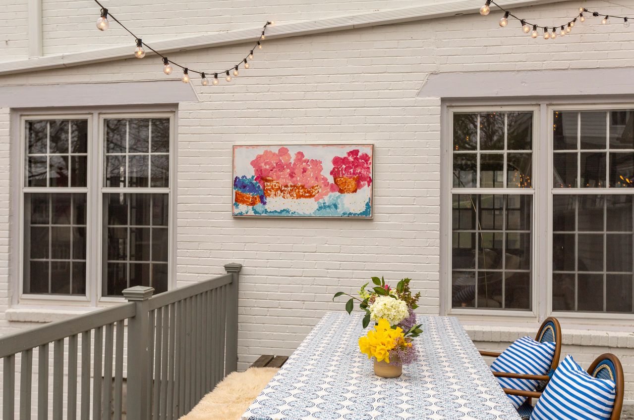
To liven up her outdoor’s seating area, Liz Lidgett, a gallery owner in Des Moines, Iowa, hung a painting on a nearby exterior white-brick wall with screws and wire. The glassless, wood-framed painting of pink and blue florals (above) was a $10 secondhand-store score, preserved with a coat of Rust-Oleum’s water-repelling NeverWet to withstand the weather. Guests, she said, seem to enjoy the unexpected element.
In Palm Springs, Tamara Hill, who rents her midcentury home on Airbnb, saw a blank canvas in the cement bottom of her kidney-shaped pool. She commissioned Brooklyn artist and designer Alexandra Proba to paint her trademark madcap—and suitably biomorphic—designs under the waterline. “It’s magical,” said Ms. Hill. “It brings the whole style of my home together far more than I imagined.”
Don’t have the coin to fly in an artist to paint a mural on a wall, fence or pool bottom? You can search for experienced artists near you on sites such as thumbtack.com. Plug in your postcode, view past projects, read client reviews and get in touch.
Wall sculptures of metal, wood or fired clay can dress up naked swaths of siding and fences. For a home in Los Angeles, New York designer Miles Redd invited ceramic sculpture artist Carlos Otero to reimagine a blank courtyard wall. “It called for something spectacular,” said Mr. Redd. The artist delivered a cream-coloured conglomeration of textures that evokes the surface of the moon, inspired by bas-relief panels of the 1960s architecture in Buenos Aires, Mr. Otero’s childhood home.
“Ceramics can live safely outdoors in most climates given some degree of protection,” said Juliet Burrows of New York’s Hostler Burrows Gallery, which represents Mr. Otero. History is full of examples of ceramics-ornamented architecture, she noted.
Dallas designer Jean Liu likes the midcentury modern metalwork of American duo Curtis Jere, which she installed in the lounge space of a client’s covered outdoor area. These cost thousands, but more than passably chic vintage wall sculptures can be found on sites like Etsy and eBay for less than $300.
Bryan McKenzie, a landscape designer in Jacksonville, Fla., is a fan of tiles and “exquisitely patterned walls.” He dolls up vertical surfaces with disks, squares and other polygons from G. Vega Cerámica, in Marbella, Spain. Against whitewashed surfaces, he hangs the Moroccan-style tiles glazed in shades of blue and green.
Another pro move is to hang a tapestry or fibre art in an alfresco space. Occasionally, on a side patch of her Fairfield, Conn., yard that’s visible from the street, Pam Poling exhibits one of her handmade quilts, which dangle from a stand she Macgyvered using photo equipment. The fair-weather exhibition started as a way to inspect her sewing in a natural light and snap a clean photo to share. Now, she says, neighbours look forward to the rotating show of coverlets, whose geometry and bold colours vibrate against her verdant landscaping.
In the front yard of her Phoenix, home, artist Kyllan Maney draped a tree with a necklace of solar lanterns she hand painted with whimsical stripes and dots. “Some of my neighbours have had visitors ask if we are having a party.”
Reprinted by permission of The Wall Street Journal, Copyright 2021 Dow Jones & Company. Inc. All Rights Reserved Worldwide. Original date of publication: April 7, 2021.
 Copyright 2020, Dow Jones & Company, Inc. All Rights Reserved Worldwide. LEARN MORE


This stylish family home combines a classic palette and finishes with a flexible floorplan
Just 55 minutes from Sydney, make this your creative getaway located in the majestic Hawkesbury region.

 4 min
4 min
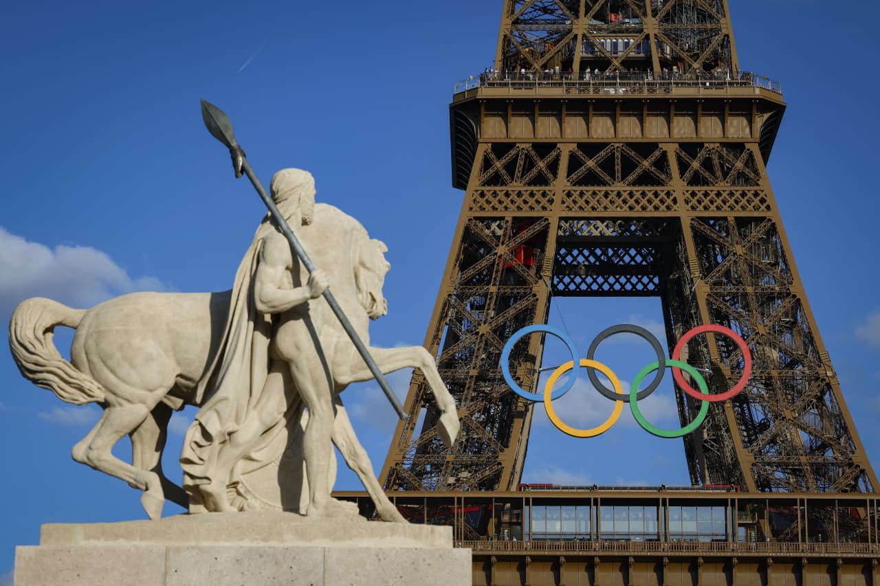
As Paris makes its final preparations for the Olympic games, its residents are busy with their own—packing their suitcases, confirming their reservations, and getting out of town.
Worried about the hordes of crowds and overall chaos the Olympics could bring, Parisians are fleeing the city in droves and inundating resort cities around the country. Hotels and holiday rentals in some of France’s most popular vacation destinations—from the French Riviera in the south to the beaches of Normandy in the north—say they are expecting massive crowds this year in advance of the Olympics. The games will run from July 26-Aug. 1.
“It’s already a major holiday season for us, and beyond that, we have the Olympics,” says Stéphane Personeni, general manager of the Lily of the Valley hotel in Saint Tropez. “People began booking early this year.”
Personeni’s hotel typically has no issues filling its rooms each summer—by May of each year, the luxury hotel typically finds itself completely booked out for the months of July and August. But this year, the 53-room hotel began filling up for summer reservations in February.
“We told our regular guests that everything—hotels, apartments, villas—are going to be hard to find this summer,” Personeni says. His neighbours around Saint Tropez say they’re similarly booked up.
As of March, the online marketplace Gens de Confiance (“Trusted People”), saw a 50% increase in reservations from Parisians seeking vacation rentals outside the capital during the Olympics.
Already, August is a popular vacation time for the French. With a minimum of five weeks of vacation mandated by law, many decide to take the entire month off, renting out villas in beachside destinations for longer periods.
But beyond the typical August travel, the Olympics are having a real impact, says Bertille Marchal, a spokesperson for Gens de Confiance.
“We’ve seen nearly three times more reservations for the dates of the Olympics than the following two weeks,” Marchal says. “The increase is definitely linked to the Olympic Games.”

Getty Images
According to the site, the most sought-out vacation destinations are Morbihan and Loire-Atlantique, a seaside region in the northwest; le Var, a coastal area within the southeast of France along the Côte d’Azur; and the island of Corsica in the Mediterranean.
Meanwhile, the Olympics haven’t necessarily been a boon to foreign tourism in the country. Many tourists who might have otherwise come to France are avoiding it this year in favour of other European capitals. In Paris, demand for stays at high-end hotels has collapsed, with bookings down 50% in July compared to last year, according to UMIH Prestige, which represents hotels charging at least €800 ($865) a night for rooms.
Earlier this year, high-end restaurants and concierges said the Olympics might even be an opportunity to score a hard-get-seat at the city’s fine dining.
In the Occitanie region in southwest France, the overall number of reservations this summer hasn’t changed much from last year, says Vincent Gare, president of the regional tourism committee there.
“But looking further at the numbers, we do see an increase in the clientele coming from the Paris region,” Gare told Le Figaro, noting that the increase in reservations has fallen directly on the dates of the Olympic games.
Michel Barré, a retiree living in Paris’s Le Marais neighbourhood, is one of those opting for the beach rather than the opening ceremony. In January, he booked a stay in Normandy for two weeks.
“Even though it’s a major European capital, Paris is still a small city—it’s a massive effort to host all of these events,” Barré says. “The Olympics are going to be a mess.”
More than anything, he just wants some calm after an event-filled summer in Paris, which just before the Olympics experienced the drama of a snap election called by Macron.
“It’s been a hectic summer here,” he says.
AFP via Getty Images
Parisians—Barré included—feel that the city, by over-catering to its tourists, is driving out many residents.
Parts of the Seine—usually one of the most popular summertime hangout spots —have been closed off for weeks as the city installs bleachers and Olympics signage. In certain neighbourhoods, residents will need to scan a QR code with police to access their own apartments. And from the Olympics to Sept. 8, Paris is nearly doubling the price of transit tickets from €2.15 to €4 per ride.
The city’s clear willingness to capitalise on its tourists has motivated some residents to do the same. In March, the number of active Airbnb listings in Paris reached an all-time high as hosts rushed to list their apartments. Listings grew 40% from the same time last year, according to the company.
With their regular clients taking off, Parisian restaurants and merchants are complaining that business is down.
“Are there any Parisians left in Paris?” Alaine Fontaine, president of the restaurant industry association, told the radio station Franceinfo on Sunday. “For the last three weeks, there haven’t been any here.”
Still, for all the talk of those leaving, there are plenty who have decided to stick around.
Jay Swanson, an American expat and YouTuber, can’t imagine leaving during the Olympics—he secured his tickets to see ping pong and volleyball last year. He’s also less concerned about the crowds and road closures than others, having just put together a series of videos explaining how to navigate Paris during the games.
“It’s been 100 years since the Games came to Paris; when else will we get a chance to host the world like this?” Swanson says. “So many Parisians are leaving and tourism is down, so not only will it be quiet but the only people left will be here for a party.”
This stylish family home combines a classic palette and finishes with a flexible floorplan
Just 55 minutes from Sydney, make this your creative getaway located in the majestic Hawkesbury region.