

Retro Kitchens Are Everywhere—and the Ultimate Rejection of the Sterile Luxury Trend
Playful 1950s style spotlights details like coloured cabinets, checkerboard and mosaic tile patterns, vintage lighting, and SMEG appliances

 6 min
6 min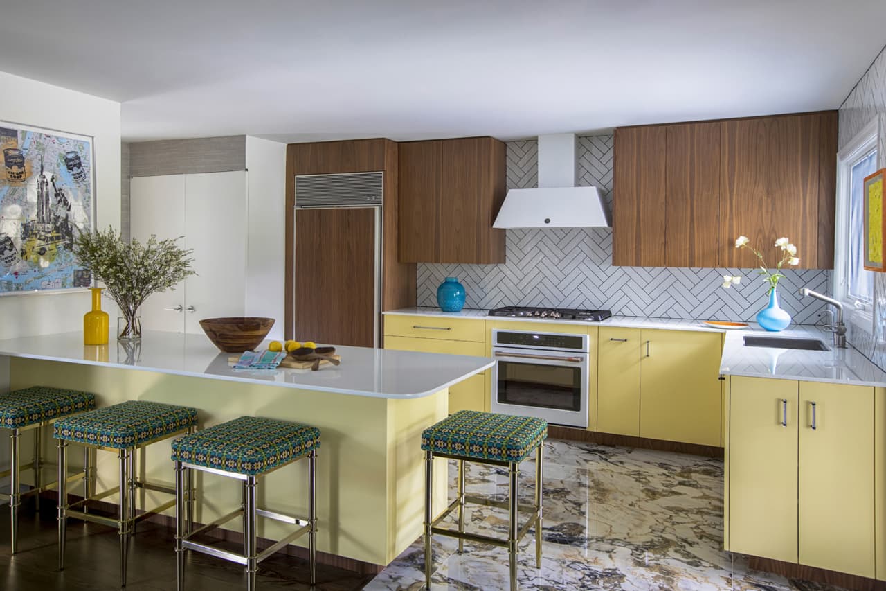
The 1950s spawned society’s view of kitchens as the heart of the home, a hub for gathering, cooking, eating and socializing. Thus, it makes perfect sense that the same decade could inspire today’s luxury kitchens.
“The deliberate playfulness and genius of the era’s designers have enabled the mid-century style to remain a classic design and one that still sparks joy,” said James Yarosh, an interior designer and gallerist in New Jersey.
That playful style spotlights details like coloured cabinets, checkerboard and mosaic tile patterns, vintage lighting, and SMEG appliances—all of which are a conspicuous rejection of the sterile, monochrome kitchens that have defined luxury home design for years. One of the hottest brands to incorporate into retro-style kitchens, SMEG is turning up more these days. But the question is: How do you infuse a colourful refrigerator and other elements from this nostalgic era without creating a kitschy room?
“The key to a modern, fresh look in your kitchen is to reference, not imitate, signature looks of the 1950s,” said New York-based designer Andrew Suvalsky, who often laces retro style throughout the rooms he designs. He said using the period as inspiration will steer you away from imagining a garish space.
“When it comes to incorporating that retro-esque look, it’s a fine dance between looking beautiful and looking kitschy,” added Lisa Gilmore, a designer in Tampa, Florida. Gilmore suggested balancing contemporary pieces with vintage touches. That balance forges a functional yet attractive design that’s easy to live with while evoking a homey atmosphere––and ultimately, a room everyone wants to be in.
Colour Reigns Supreme
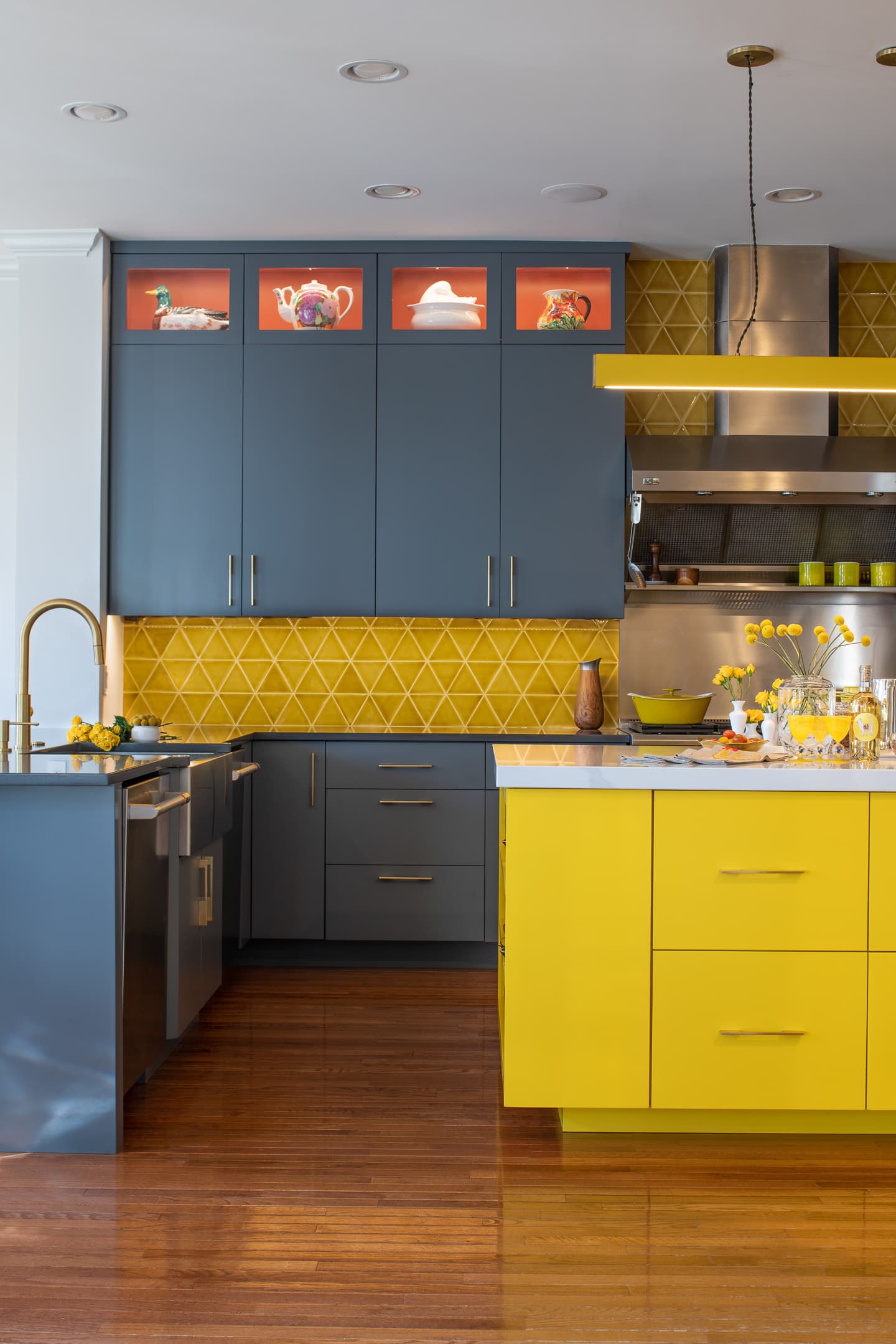
Suvalsky said one way to avoid a kitschy appearance is to mingle woods and colours, such as lacquered base cabinets and walnut wall cabinets, as he did in his Montclair, New Jersey, kitchen.
“Mixing colours into your kitchen is most effective when it’s done by colour-blocking––using a single colour across large areas of a space––in this case, zones of cabinetry,” he explained. He tends to lean toward “Easter egg colours,” such as baby chick yellow and pale tangerine. These soft pastels can suggest a starting point for the design while lending that retro vibe. But other hues can spark a vintage feel as well.
Natalia Robert
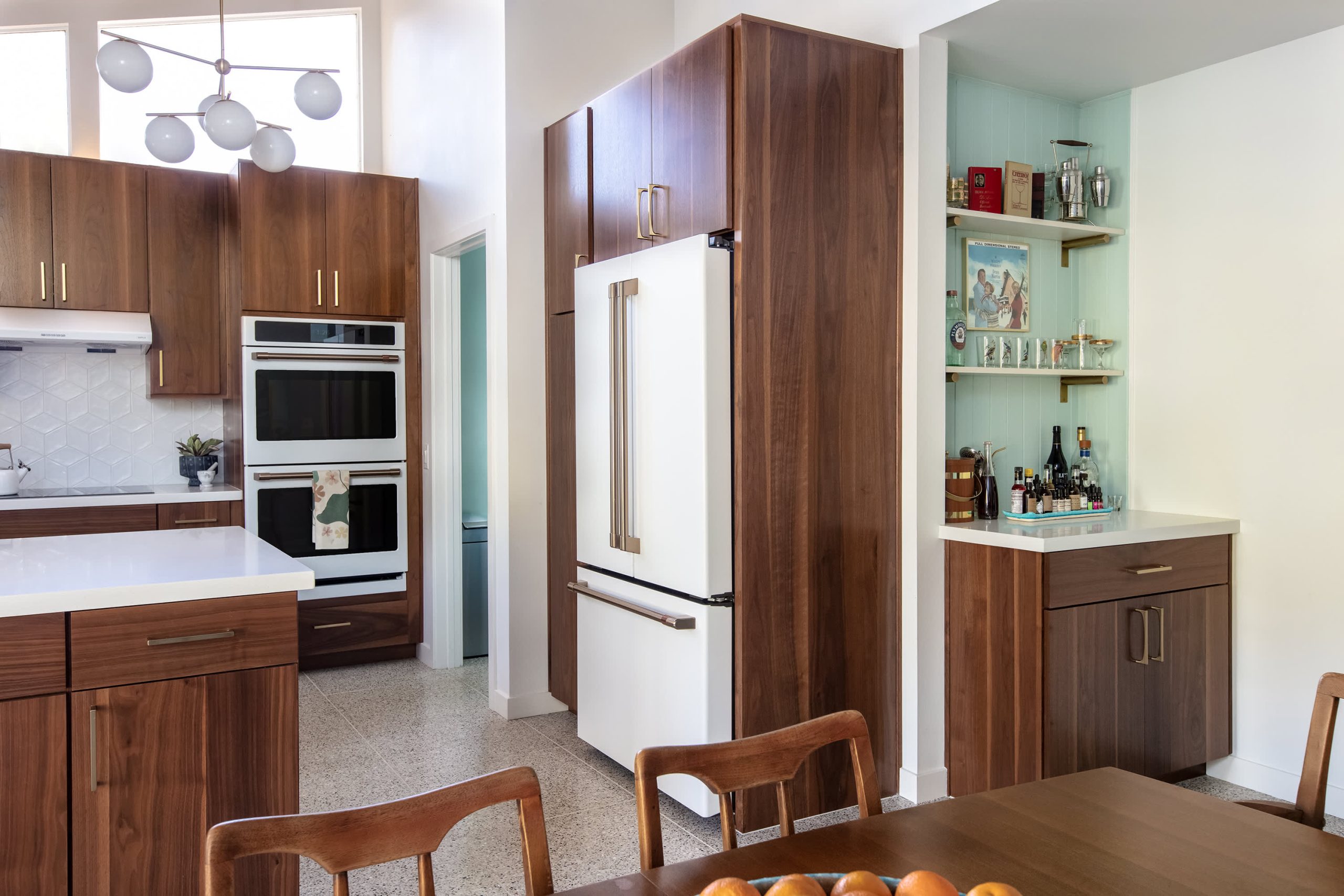
“Shades of green and blue are a timeless base foundation that work for a 1950s vintage look,” said designer Jennifer Verruto of Blythe Interiors in San Diego. But wood isn’t off the table for her, either. “To embrace the character of a mid-century home, we like a Kodiak stain to enhance the gorgeous walnut grain,” she said. “This mid-tone wood is perfect for contrasting other lighter finishes in the kitchen for a Mid-Century Modern feel.”
Since colour is subjective, a kitchen lined with white cabinetry can assume a retro aesthetic through accoutrements and other materials, emanating that ’50s vibe.
“The fun of retro designs is that you can embrace colour and create something that feels individual to the house and its homeowner, reflecting their tastes and personality,” Yaosh said. He recommended wallpaper as an option to transform a kitchen but suggested marrying the pattern with the bones of the house. “Wallpaper can create a mid-century or retro look with colours and hand-blocked craftsmanship,” he said. “Mauny wallpapers at Zuber are a particular favourite of mine.”
Suvalsky suggested Scalamandre wallpapers, for their 1950s patterns, and grass cloth, a textile that was often used during that decade. He also likes House of Hackney, a brand that “does a great job reinventing vintage prints in luscious colours,” he noted. “Many of their colourways invert the typical relationship between light and dark, with botanical prints in dark jewel tones set over light, more playful colours.”
Materials Matter
Beyond wall covering, flooring, countertops and backsplashes can all contribute to the 1950s theme. Manufactured laminate countertops, specifically Formica, were all the rage during the decade. But today’s high-end kitchens call for more luxurious materials and finishes.
“That’s a situation where going the quartz route is appropriate,” Gilmore said. “There are quartzes that are a through-body colour and simple if someone is doing colorued cabinetry. A simplified white without veining will go a long way.” She also recommended Pompei quartz Sunny Pearl, which has a speckled appearance.
Patricia Burke
But for those who welcome vibrant colour schemes, countertops can make a bold statement in a vintage kitchen. Gilmore said solid surface materials from the era were often a colour, and quartz can replicate the look.
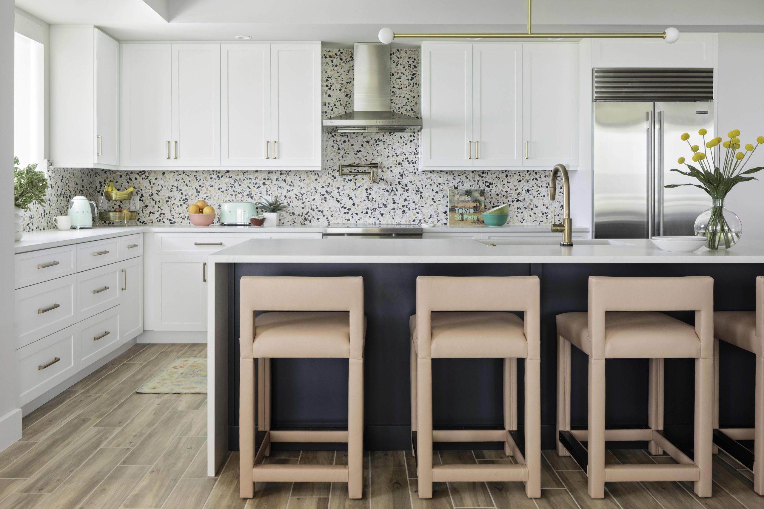
“Some brands have coloured quartz, like red,” she said. But keeping countertops neutral allows you to get creative with the backsplash. “I‘d pull in a terrazzo backsplash or a bold colour like a subway tile in a beautiful shade of green or blush,” Gilmore said. “Make the backsplash a piece of art.”
Suvalsky also leans toward bright and daring––such as checkerboards––for the backsplash. But depending on the kitchen’s design, he’ll go quieter with a double white herringbone [tile] pattern. “Either version works, but it must complement other choices, bold or simple, in the design,” he explained.
Native House Photography
Likewise, his flooring choice almost always draws attention. “My tendency is more toward very bold, such as a heavily veined marble or a pattern with highly contrasting tones,” he noted. Yarosh suggested slate and terrazzo as flooring, as these materials can make an excellent backdrop for layering.
Forge a Statement With Vintage Appliances
As consequential as a kitchen’s foundation is, so are the appliances and accoutrements. While stainless steel complements contemporary kitchens, homeowners can push the design envelope with companies like SMEG when making appliance selections for a retro-style kitchen. Although Suvalsky has yet to specify a SMEG fridge, he is looking forward to the project when he can.
“I think they work best when the selected colour is referenced in other parts of the kitchen, which helps to integrate these otherwise ‘look at me’ pieces into the broader design,” he noted. “They are like sculptures unto themselves.”
“For our mid-century-inspired projects, we’ve opted for Big Chill and the GE Cafe Series to bring a vintage look,” Verruto added. Similar to SMEG, Big Chill and GE offer a vintage vibe in a wide selection of colours and finishes, alongside 21st-century performance.
Can’t commit to a full-size appliance? Sometimes, a splash is enough. Gilmore tends to dust her retro kitchens with a coloured kettle or toaster since her clients are likelier to add a tinge with a countertop appliance or two. “Mint green accessories make it pop, and if in five years they are over it, it’s not a commitment,” she said. “It’s a great way to infuse fun and colour without taking a major risk.”
Deck out the Breakfast Nook
Kitchen dining areas present the opportunity to introduce retro lighting, furniture, and accessories to complete the look. Flea markets and antique markets are excellent places to hunt for accompaniments.
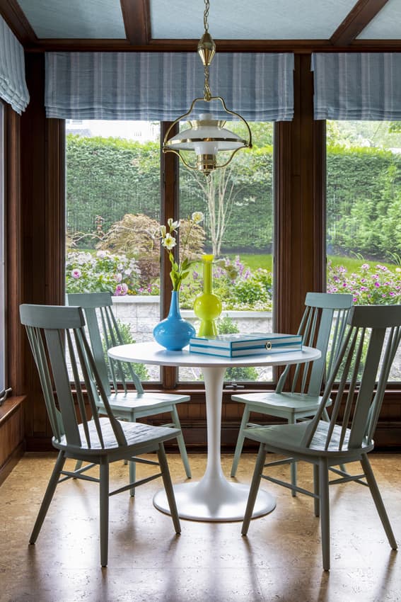
“Dome pendants and Sputnik chandeliers are iconic styles that will infuse vintage charm into your kitchen while also easily complementing a variety of other styles,” Verruto said.
DLux Editions
Suspend a vintage light fixture over the classic Saarinen table, and you can’t go wrong.
“Saarinen Tulip Tables are almost always guaranteed to deliver a home run in nearly any interior, especially a 1950s-themed kitchen,” Suvalsky said. “The simplicity of its form, especially in white, makes it nearly impossible to clash with.”
To really channel the vibe of this era, Verruto suggested local vintage stores and brands such as Drexel Heritage and Lexington. Dressing the windows counts, too. “Cafe curtains in a chintz pattern will make for a fabulous finishing touch,” she said.
Meanwhile, Yarosh delights in selecting tabletop items, including novelty stemware and other trappings ubiquitous in the 1950s. “Mid-century kitchens also need to have pedestal cake plates and maybe a cloche to keep a cake,” he mused. “I love the opportunity to curate these details down to the correct fork and serving pieces.”
 Copyright 2020, Dow Jones & Company, Inc. All Rights Reserved Worldwide. LEARN MORE





From making unpopular decisions to learning when to listen, leaders from five businesses reveal what nobody prepared them for — and how running a company has challenged their expectations.

Technology and semiconductor shares fell sharply as investors questioned the debt financing the AI infrastructure boom and confronted higher rates and Chinese competition.
Mirvac’s 45-level Trielle has topped out at Yarra’s Edge, pairing riverfront apartments with wellness facilities, private dining and resident services.
3 min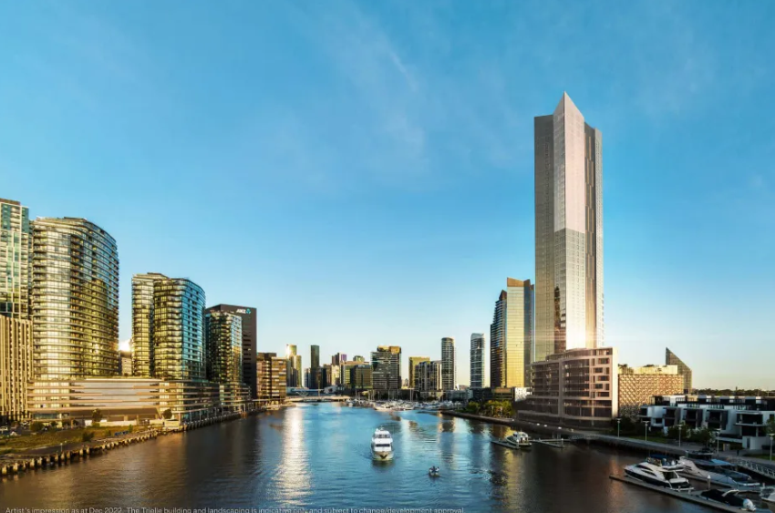
Mirvac has topped out Trielle at Melbourne’s Yarra’s Edge, with more than 70 per cent of the riverfront development sold and approximately 80 per cent of purchasers intending to make their apartment a home.
The figures, released on September 22, point to an owner-occupier audience for one of the precinct’s final residential towers. Mirvac began developing Yarra’s Edge in 2003, and its latest addition occupies one of the remaining absolute riverfront sites.
Mirvac CEO of Development Stuart Penklis said existing residents were among those moving up within the neighbourhood.
“Many purchasers already have a connection to Yarra’s Edge,” Mr Penklis said, describing buyers whose changing needs were encouraging an upgrade within the precinct.
“As one of the final residential towers within Yarra’s Edge, Trielle represents the culmination of more than two decades of creating one of Melbourne’s most established and sought-after waterfront communities,” Penklis said.
“Positioned on the Collins Street axis with absolute river frontage, Trielle offers residents a rare opportunity to enjoy sweeping views across the Yarra River, Melbourne skyline and Port Phillip Bay, while remaining seamlessly connected to the CBD. With Trielle now more than 70 per cent sold, we’re continuing to see strong demand from buyers seeking quality homes in established locations.”
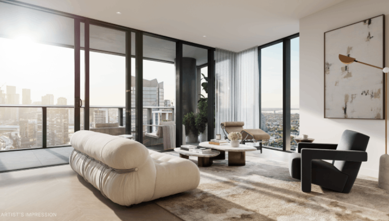
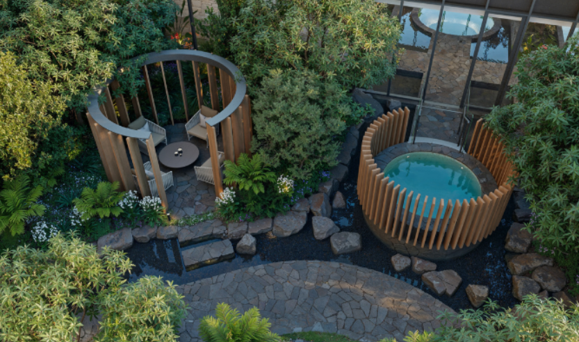
The developer also flagged a penthouse and sub-penthouse collection with larger layouts, premium finishes and broad outlooks. The planned wellness centrepiece, The Oasis, encompasses a 900-square-metre elevated urban rainforest.
Mirvac General Manager Residential Development Victoria Elysa Anderson said Trielle had resonated strongly with buyers seeking a rare lifestyle offering in Melbourne.
“Opportunities to secure a new luxury residence on a riverfront site of this calibre are incredibly rare, particularly within a community like Yarra’s Edge,” Anderson said.
“What makes Trielle unique is the combination of exceptional views, world-class residential facilities and the lifestyle that already exists around it. Residents are buying into a mature waterfront community with parks, promenades, dining, wellness and strong community connections already in place.”
The 45-level tower brings a substantial new presence to that waterfront. Its residential offering spans one-, two-, three- and four-bedroom apartments, with Signature, Prestige and Sub-Penthouse collections accommodating different household sizes. The north-facing position connects the apartments visually to the river and city beyond.
Seven storeys above the promenade, the planned Oasis combines planting and a running stream with a Scandinavian-inspired wellness club developed with spa specialist Naomi Gregory. Facilities include a 25-metre lap pool, hot magnesium pool, sauna, hydrotherapy, a gym, yoga and Pilates room, and treatment spaces.
The amenity extends beyond exercise. Residents will have access to The Biblioteca library and workspaces, ground-floor work pods, and The Salone piano lounge. A private Chef’s Table dining room offers a setting for larger gatherings, while a cinema, games room and sports lounge broaden the entertaining options. Concierge services and a dog-wash area support everyday routines.
Trielle comprises a collection of one, two, three and four-bedroom residences. Reflecting strong demand from owner occupiers, approximately 80 per cent of purchasers to date intend to live in their homes, highlighting the project’s appeal to those seeking a long-term waterfront lifestyle.
Mirvac has recently delivered The Albertine, a premium apartment development on the edge of Melbourne’s CBD, and is nearing completion of Prince & Parade in Brunswick, further strengthening its portfolio of thoughtfully designed apartment communities in some of Melbourne’s most sought-after urban locations.

From office parties to NYE fireworks, here are the bottles that deserve pride of place in the ice bucket this season.

Rising rates, construction inflation and shrinking investor confidence are pushing Australia deeper into a dangerous housing spiral that monetary policy alone cannot fix.