


The top interior design mistakes to avoid this year
A top Sydney designer walks through the common mistakes homeowners make – and how to fix them
 4 min
4 min
The days of white-on-white walls are fast disappearing, as we seek comfort and relaxation at home through a warm palette of colour and texture. But how to navigate the myriad options? Starting with where we get it wrong, Julia Green of Greenhouse Interiors sets the new rules for decorating through colour, calm and a little playfulness thrown in.
Using hero colours in isolation
Julia: A common mistake I see people make is not cohesively implementing their chosen hero colour throughout the space. Look at ways to unify hero colours so they aren’t standing alone without company, instead ensuring these hues are weaved through decorative objects and furniture. The most successful designs I have seen have managed to weave colour cohesively through their home like a well-made tapestry. The more subtle the tie-in is, the better!
Using only neutral colours
Homeowners often select a neutral shade on their walls and stick to white for their ceilings and trims. The downside of this is that contrast trims on walls and ceilings can draw your eye from top to bottom, rather than allowing the eye to wander seamlessly. Instead, consider painting walls, trims and even ceilings in a single colour, to make the space feel more cohesive. That being said, contrasting pops of colour add balance which is equally important to the look and feel of any space. So, to avoid that floating feeling, ensure your room has an element of grounding through the addition of accent shades from your colour scheme through soft furnishings, textures, florals or artwork as an alternative to doors, ceilings or trims.
Incorporating colour all at once
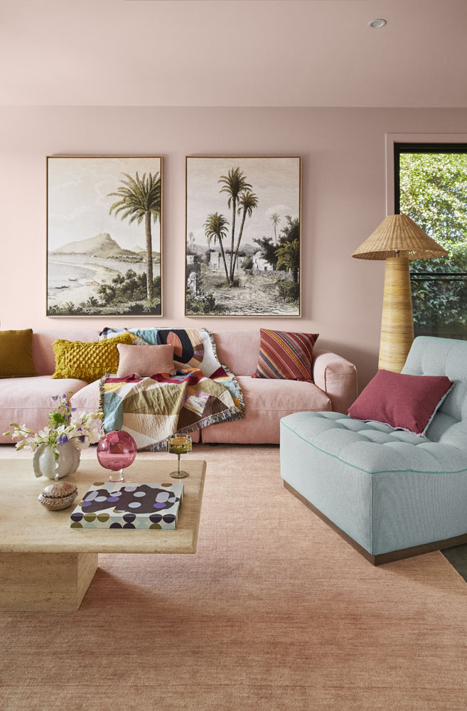
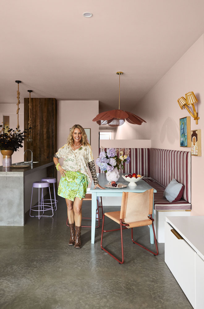
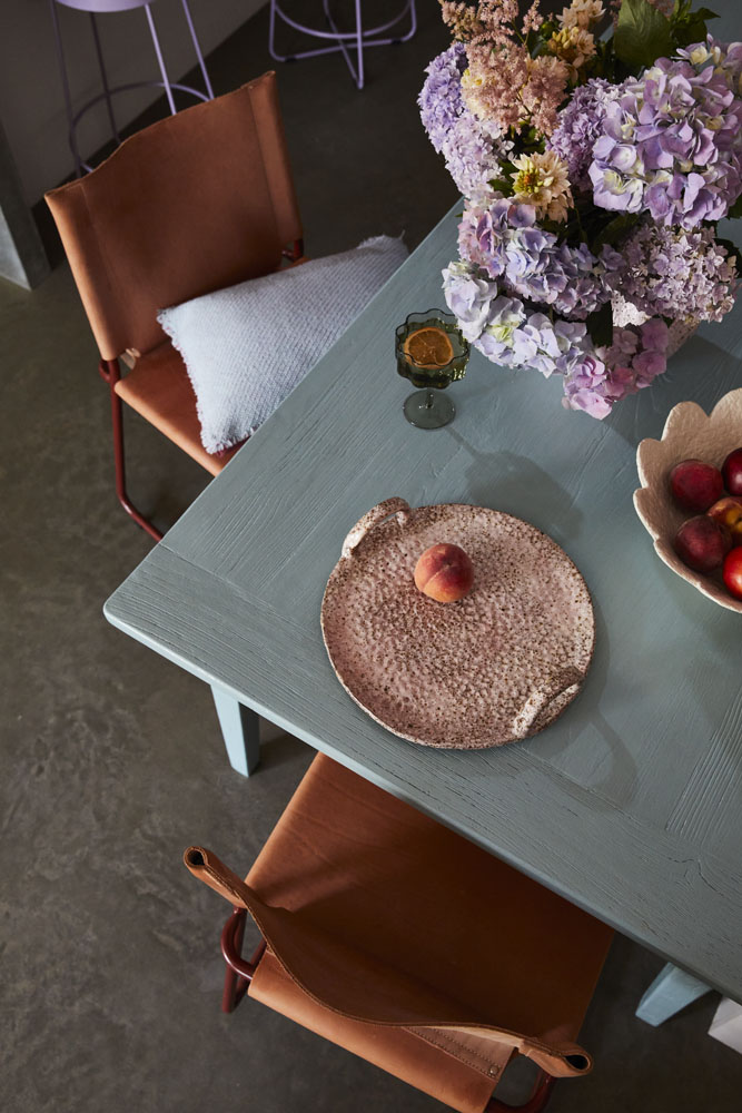
Another mistake people make is rushing to add colour throughout their home. Don’t feel pressured to do it all at once, start small and make measured, staggered choices. For a recent makeover I worked on in the Bellarine Peninsula, the walls were painted first in a neutral, greyed off pink shade – Dulux Lilac Light, from the 2024 Dulux Colour Forecast Journey palette – before any other choices were made. The clients lived with that for a few weeks to see how the light interacted with the colour throughout the day, before we approached the rest of the space and introduced bolder pops of colour from the palette to add layering and interest.
Forgetting about mood
Colours evoke different moods, so it’s important to consider the look and feel you want to create in the space before landing on your hero colour. For example, I always opt for a calmer palette for the bedroom, as it is a place of rest. A living room on the other hand is where you spend much of your waking hours, so it’s good to liven it up! Pale pink is known for its calming effect – it’s gentle, easy to live with and can add warmth to a space, compared to an austere white shade. It’s also extremely versatile. The emotion it evokes can change completely depending on how it’s styled, which is why it’s a shade I like not only for living areas but also bedrooms.
Selecting the wrong colour
Most homeowners are apprehensive of colour or they have concerns that colour may make their home feel too bold, which is why choosing the right colour is such a critical step in the design process. Incorporating colour is such an amazing opportunity to inject your own personality and story into the home, so I encourage it wherever possible. My biggest tip is to start with a neutral shade, to create a safe base that easily allows for the introduction of other colour and styling changes over time. If you’re new to using colour in your home, start small and make measured choices. Try living with colour, even if it’s a referenced cushion or decor object. The best thing about the 2024 Dulux Colour Forecast palettes is that all of the hard work is done for you. Their carefully considered palettes are designed to take the brain strain out of companion colours that work well, so when all else fails, look to the experts who have done the hard work for you – it’s foolproof.
From bushland greens to valley reds, the country’s most awarded designers are proving that the best colour palette was never on a swatch card; it was outside the window all along.

The Australian leather house has opened an immersive four-day pop-up in Manhattan, unveiling its Bloom Collection and redefining what a product launch can look like.
 2 min
2 min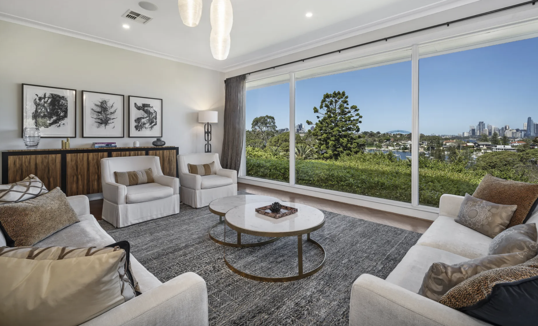
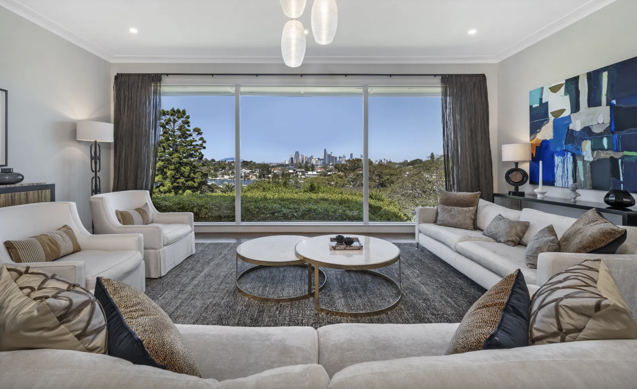
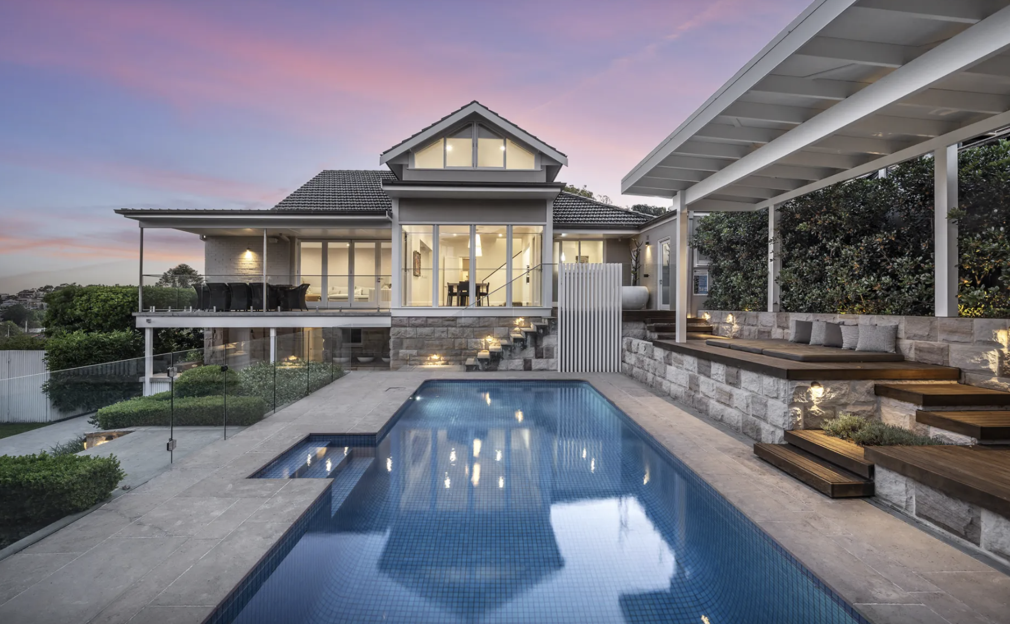
Held by the same family for 26 years, this Harbour Bridge-facing residence at Longueville is the type of property that rarely comes to market. Set on more than 1,100 sqm on one of Sydney’s most tightly held peninsulas, it combines complete privacy with uninterrupted views across the harbour to the city skyline.
It’s the sort of offering where the land is just as important as the home. Positioned directly opposite Aquatic Park with a prized northeast aspect, the residence captures sweeping harbour views from almost every main living space while remaining remarkably secluded from neighbouring properties.
Large picture windows frame the outlook throughout the home, flooding the interiors with natural light and making the harbour the centrepiece of everyday living.
Designed for family living
The home offers multiple living zones, including a formal lounge and dining rooms, a separate family room and an open-plan living and meals area. Blackbutt timber parquetry flooring, high ceilings and ducted reverse-cycle air conditioning feature throughout.
The kitchen sits at the heart of the home, with induction cooking, a generous island bench, and a walk-in pantry, connecting both the formal entertaining areas and the more casual family spaces.
A ground-floor master suite includes a walk-in robe, dressing area and ensuite, while upstairs are three additional bedrooms with built-in robes, together with a spacious home office or study.
The lower ground level adds another layer, with a temperature-controlled cellar and tasting room, plus a flexible gym, wellness or recreation space.
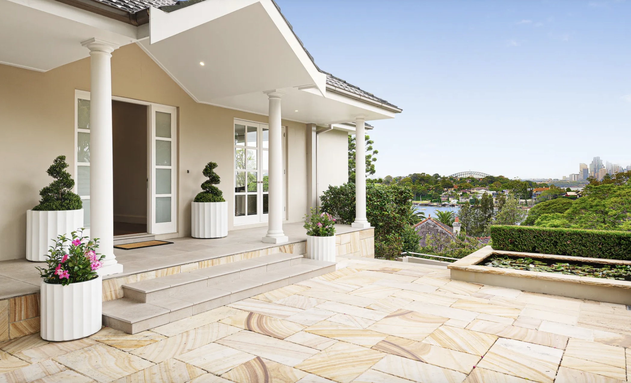
Resort-style setting overlooking Sydney Harbour
Outside, landscaped gardens wrap around a heated swimming pool, an expansive entertaining terrace, and a level lawn, creating a private resort-style setting against the backdrop of Sydney Harbour.
Additional features include a solar system with battery storage, remote lock-up garaging for three vehicles and generous storage throughout.
Beyond the home itself, the location remains one of Longueville’s biggest drawcards. Longueville Ferry Wharf sits around 150 metres away, providing direct access to the CBD while preserving the quiet character of one of Sydney’s most tightly held waterfront suburbs. The property is also within the catchments of Lane Cove Public School and Hunters Hill High School.
Simon Harrison and Kim Walters of Belle Property Lane Cove are marketing the property on a Contact Agent basis.
At a glance
Address: 3 Mary Street, Longueville NSW 2066
Configuration: 4 bedrooms | 3 bathrooms | 3-car garage
Land: Approximately 1,100 sqm
Highlights: Harbour Bridge and city skyline views, northeast aspect, heated pool, cellar, solar with battery storage
Held: First time offered in 26 years
Price: Contact Agent
Agents: Simon Harrison and Kim Walters, Belle Property Lane Cove
This article is produced by the Kanebridge Media editorial team. Property information has been supplied by the listing agent. Buyers should conduct their own due diligence before relying on any information contained in this article. Enquiries: propertyconcierge@kanebridge.com.au.

Chinese carmaker GAC will expand its Australian electric vehicle line-up with the city-focused AION UT hatchback.
High-end homeowners are choosing to upgrade rather than relocate, investing in bespoke design, premium finishes and long-term lifestyle value.