


Turn Your Devices From Distractions Into Time Savers
Declutter your digital workspace, save time with shortcuts and leverage an AI helper

 4 min
4 min
Every January, I usually purge old snail mail, clothes and unwanted knickknacks to start the year anew. This time, I focused on my digital spaces instead.
My virtual Marie Kondo-ing forced me to think about the indispensable apps and features on my devices—and on the flip side, the time thieves that make it hard to leave the couch. (Looking at you, YouTube.)
What did I learn? The most important thing we can do to improve our digital spaces is kill the wormholes. After culling apps on my devices, deleting Instagram from my iPad made the biggest impact. But there were many more.
I also learned that small tweaks—such as adding helpful shortcuts and setting up your screen only around essential apps—can make a difference. I’ve been spending less time on my devices, and I’m now more efficient at work. Here are some takeaways from the exercise that can help you turn distracting devices into time savers.
Digital decluttering
Cal Newport’s book “Digital Minimalism: Choosing a Focused Life in a Noisy World” inspired me to get rid of the junk on my phone and laptop. Clutter, even in digital form, is stressful, Newport writes. I could relate: I felt overwhelmed every time I turned on my devices.
Digital clutter includes unnecessary files on your computer desktop, promotional emails clogging your inbox and unused apps on your phone. I found that the most satisfying cleanse was clearing my phone’s default home screen—what I see as soon as I unlock the device.
An iPhone app called Blank Spaces (one-week free trial, then $14 annually or a $23 one-time fee) enabled the transformation. I picked my five most-important apps—Kindle, Signal, Messages, Maps and Docs—and let the app do its work. Blank Spaces replaced the usual grid of icons with an empty white background and large tappable text that can launch my chosen apps. I love the new Zen vibes and find myself mindlessly using my phone less often. If needed, I can still get back to my old layout by swiping left.
I spend most of my laptop time in a web browser, which is my most disorganised digital space. I am a terrible tab hoarder, and often have dozens open at once—something that makes my laptop slower.
One Tab, a free browser extension for Chrome, Safari and Firefox, has changed my hoarding habits. With one click, the extension closes all the tabs in an open window and saves the sites as a list of links on a dedicated page. It frees up memory needed for faster computer performance, and makes sure you don’t lose your links.
Timesaving shortcuts
Smartphone widgets are amazing. Instead of the tiny icons with the service’s logo, they’re bigger tiles that show you information like the current weather or what’s next on your calendar without having to open the apps.
My favourites include a multi-city world clock for managing colleagues in different time zones, a quick link to Google Translate’s camera function and a list of my tasks via the to-do app Twos.
On iOS, you can touch and hold any area on the home screen until your app icons jiggle. Tap the + button to look at all apps that have widgets available. You can also add a few to your lock screen to access information without opening your phone. And widgets can now be added to desktops on Macs running the latest software. On Android, touch and hold an empty space on the home screen, then tap Widgets.
You can take this timesaving even further with automations. Shortcuts is a powerful built-in app on iOS and Mac for creating custom workflows. For example, the Start Pomodoro shortcut triggers a 25-minute timer and enables Do Not Disturb for that period. I use the automation for short periods of focus. If you find the Shortcuts interface too intimidating, there’s a gallery with pre-made options.
Android users can set up automated routines with Google Assistant. Tasker ($3.49) is a more advanced—though more complex—Android alternative.
A souped-up clipboard
There are two benefits to having a clipboard manager. It saves everything you copy—that is, command + C on a Mac—so you don’t lose anything to copy-and-paste heaven if you accidentally use the shortcut on something else. It’s also a handy tool for quickly accessing often-repeated text.
The Copy ’Em Mac app costs a $15 one-time fee, and it’s worth every penny. It saves clipboard text and images on your device, and can create keyboard shortcuts for frequently pasted text, such as the short introductory paragraph I email people when reaching out for the first time.
If you’re on Windows, ClipClip is a good alternative. Chromebooks already save the last five copied items. Select the search or “Everything Button” + V to access copy history.
Apple’s Universal Clipboard is fantastic for copying-and-pasting between its devices, such as entering a code from your iPhone’s authentication app on your Mac. Enable Handoff in settings, then make sure the devices are signed in with the same Apple ID and have Bluetooth and Wi-Fi turned on.
Between Android and Windows machines, you can use Nearby Share (soon to be renamed Quick Share) to share text across those devices.
An AI helper
Some workplaces may be banning AI-powered chatbots, such as OpenAI’s ChatGPT and Google’s Bard, but they can shave hours off dreaded personal tasks.
The key to coaxing a high-quality response is starting with a specific, detailed prompt. Try: “Plan a three-course dinner for six people with easy gluten-free and vegetarian recipes. Identify any steps that can be prepared in advance and create a timeline for cooking the recipes. Arrange the ingredients in a list, organised by grocery store aisles.”
I love using chatbots for mixing up my workouts: “Create a five-day exercise plan for someone who is just getting back into shape,” and add any available equipment or necessary modifications.
Just remember, these systems can be wrong, so you may need to double check their work. Still, you’ll have plenty of freed-up time to ask ChatGPT what to binge-watch next.
 Copyright 2020, Dow Jones & Company, Inc. All Rights Reserved Worldwide. LEARN MORE


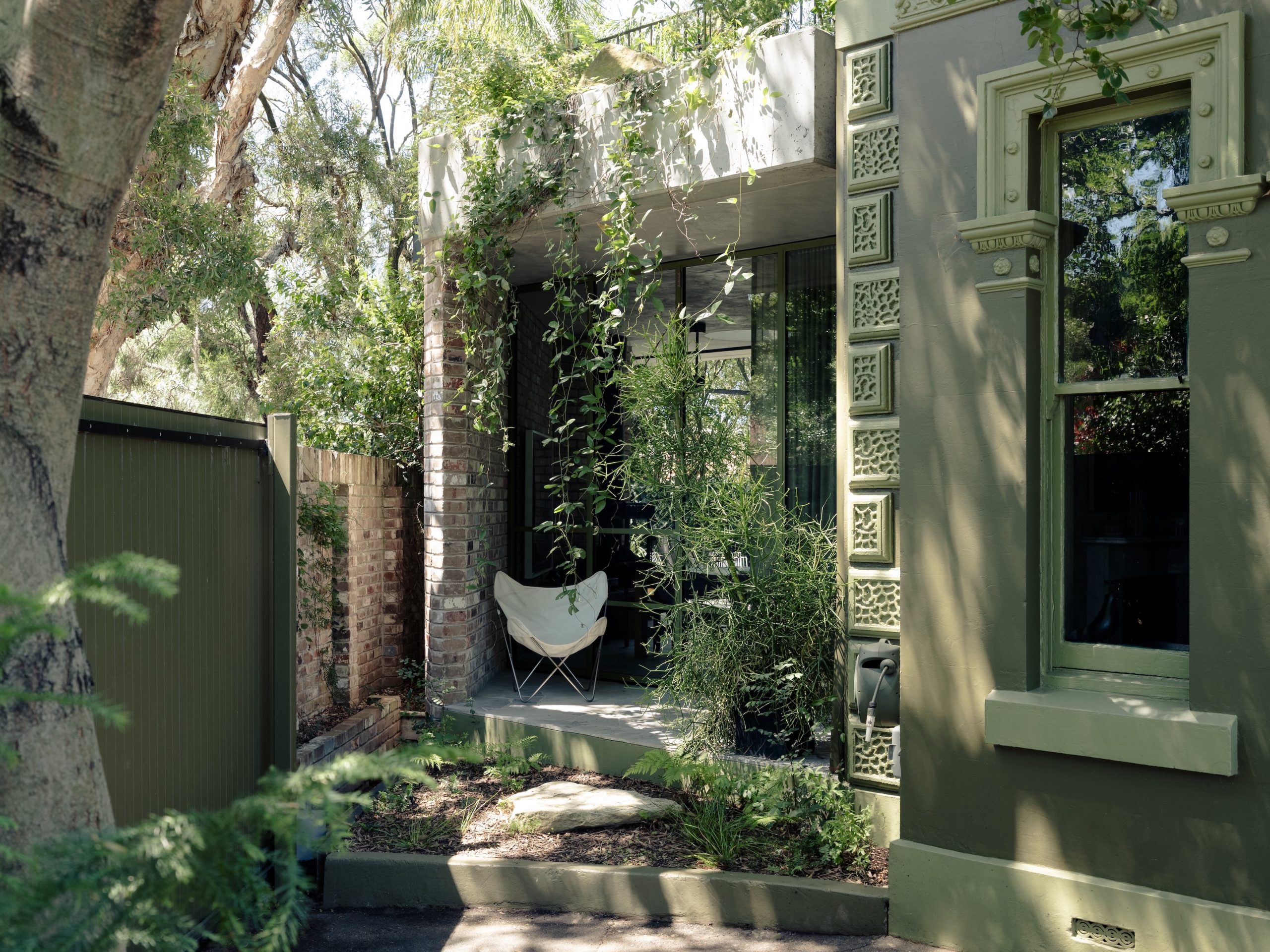
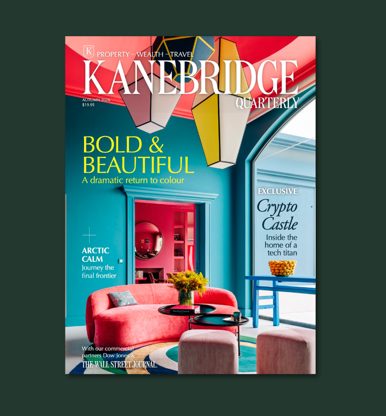
From bushland greens to valley reds, the country’s most awarded designers are proving that the best colour palette was never on a swatch card; it was outside the window all along.

The Australian leather house has opened an immersive four-day pop-up in Manhattan, unveiling its Bloom Collection and redefining what a product launch can look like.
 2 min
2 min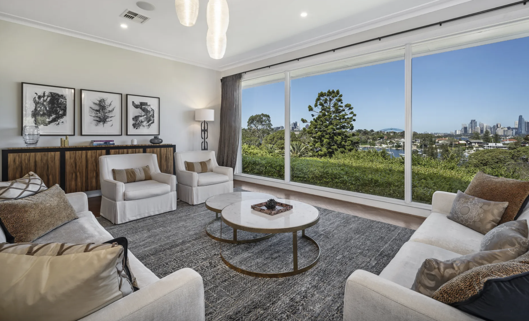
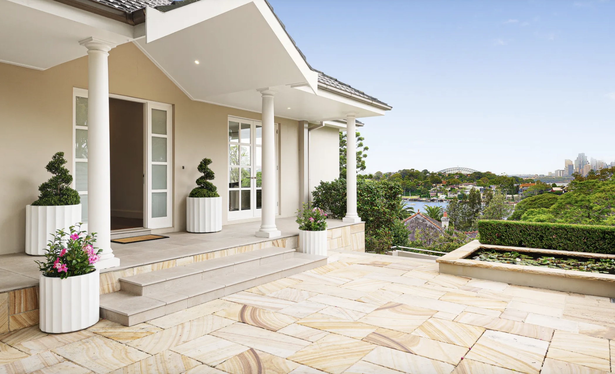
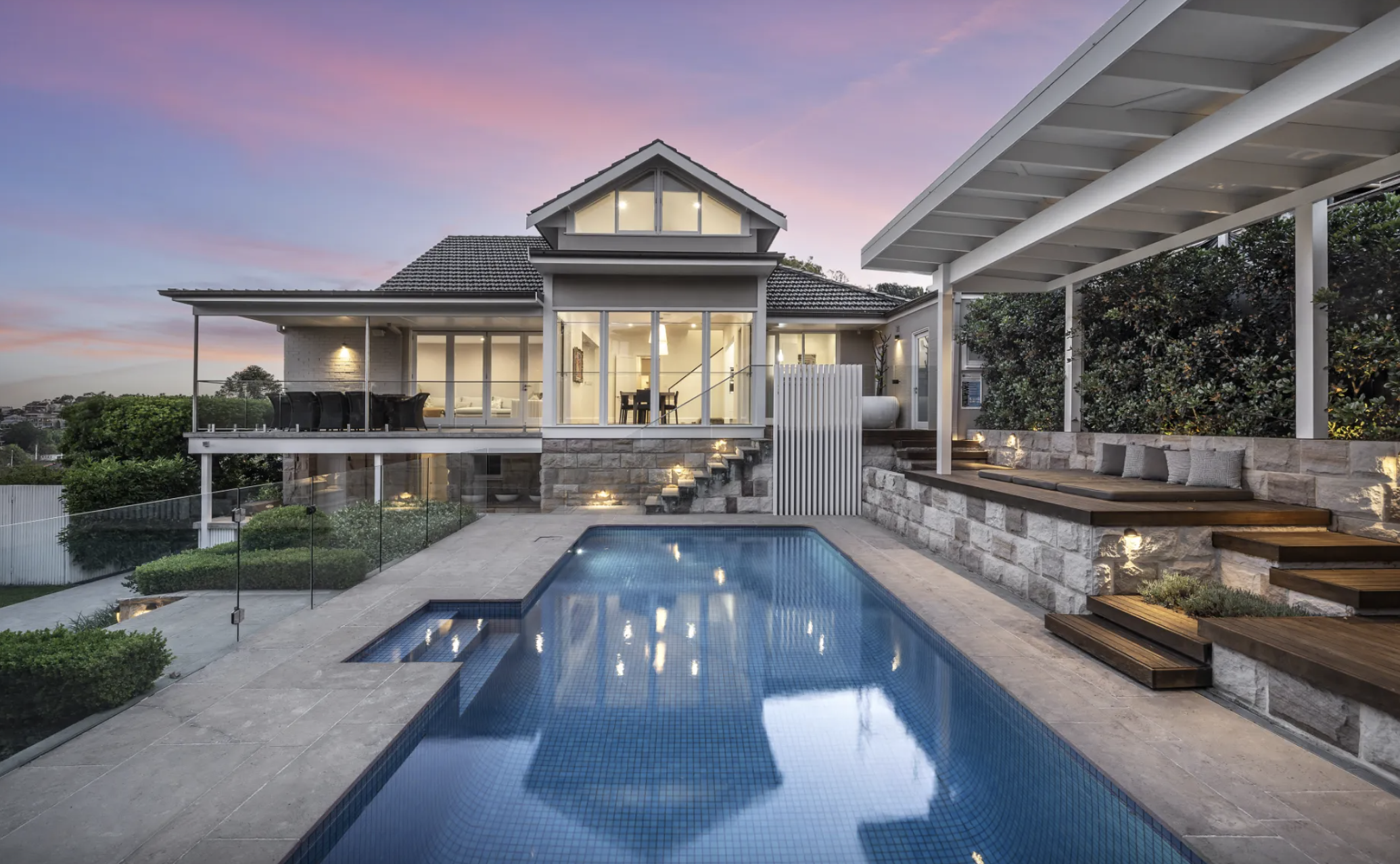
Held by the same family for 26 years, this Harbour Bridge-facing residence at Longueville is the type of property that rarely comes to market. Set on more than 1,100 sqm on one of Sydney’s most tightly held peninsulas, it combines complete privacy with uninterrupted views across the harbour to the city skyline.
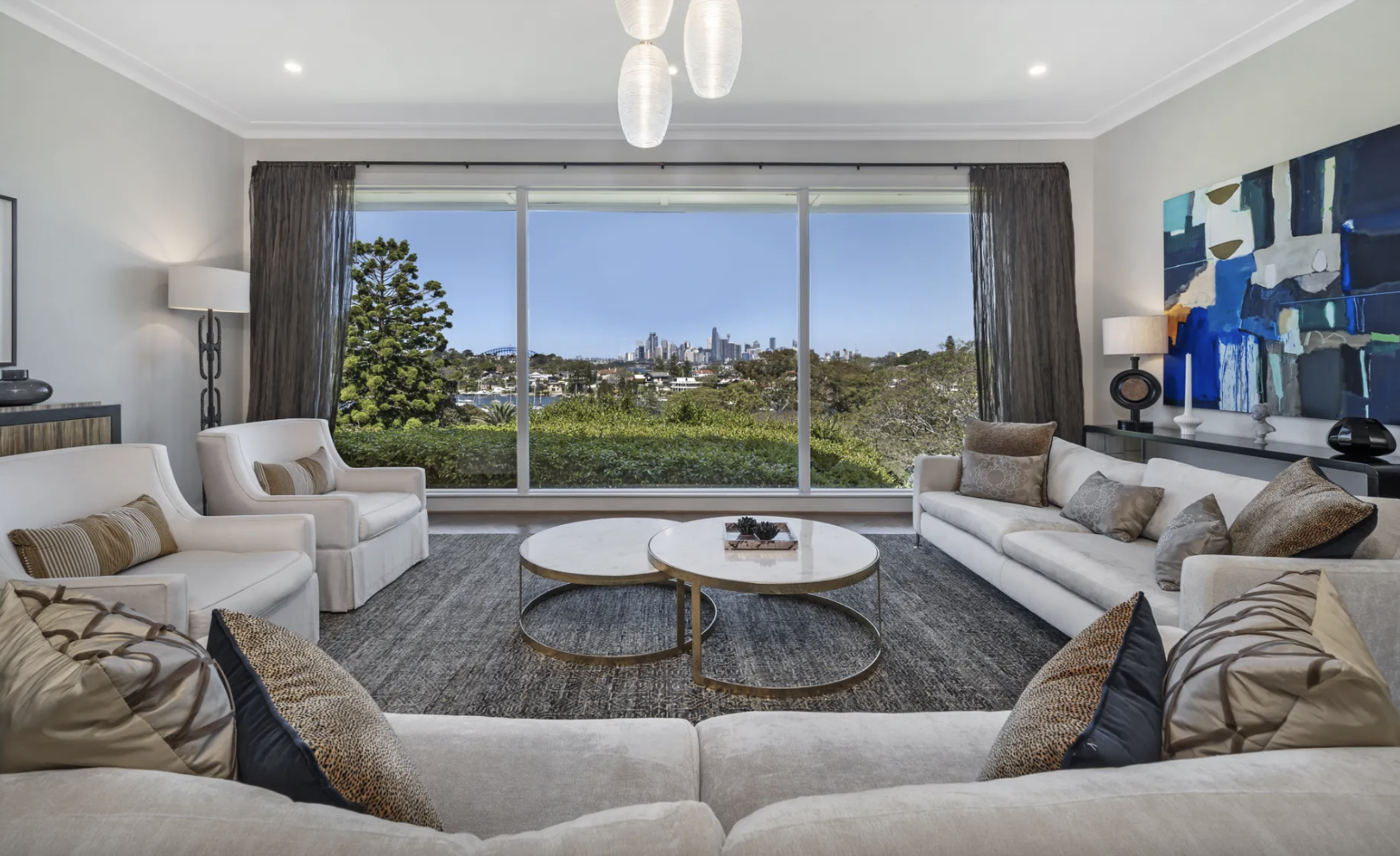
It’s the sort of offering where the land is just as important as the home. Positioned directly opposite Aquatic Park with a prized northeast aspect, the residence captures sweeping harbour views from almost every main living space while remaining remarkably secluded from neighbouring properties.
Large picture windows frame the outlook throughout the home, flooding the interiors with natural light and making the harbour the centrepiece of everyday living.
Designed for family living
The home offers multiple living zones, including a formal lounge and dining rooms, a separate family room and an open-plan living and meals area. Blackbutt timber parquetry flooring, high ceilings and ducted reverse-cycle air conditioning feature throughout.
The kitchen sits at the heart of the home, with induction cooking, a generous island bench, and a walk-in pantry, connecting both the formal entertaining areas and the more casual family spaces.
A ground-floor master suite includes a walk-in robe, dressing area and ensuite, while upstairs are three additional bedrooms with built-in robes, together with a spacious home office or study.
The lower ground level adds another layer, with a temperature-controlled cellar and tasting room, plus a flexible gym, wellness or recreation space.
Resort-style setting overlooking Sydney Harbour
Outside, landscaped gardens wrap around a heated swimming pool, an expansive entertaining terrace, and a level lawn, creating a private resort-style setting against the backdrop of Sydney Harbour.
Additional features include a solar system with battery storage, remote lock-up garaging for three vehicles and generous storage throughout.
Beyond the home itself, the location remains one of Longueville’s biggest drawcards. Longueville Ferry Wharf sits around 150 metres away, providing direct access to the CBD while preserving the quiet character of one of Sydney’s most tightly held waterfront suburbs. The property is also within the catchments of Lane Cove Public School and Hunters Hill High School.
Simon Harrison and Kim Walters of Belle Property Lane Cove are marketing the property on a Contact Agent basis.
At a glance
Address: 3 Mary Street, Longueville NSW 2066
Configuration: 4 bedrooms | 3 bathrooms | 3-car garage
Land: Approximately 1,100 sqm
Highlights: Harbour Bridge and city skyline views, northeast aspect, heated pool, cellar, solar with battery storage
Held: First time offered in 26 years
Price: Contact Agent
Agents: Simon Harrison and Kim Walters, Belle Property Lane Cove
This article is produced by the Kanebridge Media editorial team. Property information has been supplied by the listing agent. Buyers should conduct their own due diligence before relying on any information contained in this article. Enquiries: propertyconcierge@kanebridge.com.au.

From Italy’s $93,000-a-night villas to a $20,000 Bowral château, a new global ranking showcases the priciest Airbnbs available in 2026.

A long-standing cultural cruise and a new expedition-style offering will soon operate side by side in French Polynesia.

