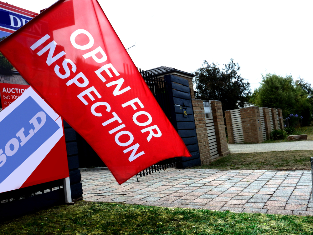


COST OF LIVING CONTINUES TO RISE AS AUSTRALIANS FEEL THE PINCH
If it feels like everything is more expensive right now, that’s because it is
 < 1 min
Mortgage interest charges were responsible for the greatest increase in living costs over the December quarter for employee households, data released by the Australian Bureau of Statistics yesterday shows. This uptick in costs follows decisions by mortgage lenders to pass on consecutive cash rate rises by the Reserve Bank of Australia which saw it increase by 300 basis points or 3 percent in 2022.
The statistics, showing price increases across all five Living Cost Indexes (LCI) in Australia — the largest rise since the September 2000 quarter — paint a picture of households under increasing pressure to balance budgets while maintaining their current lifestyles.
While interest rates accounted for a 26.6 percent rise, Recreation and Culture, including travel rose by 5.5 percent over the holiday period, followed by Housing at 2.2 percent and Furnishings, household equipment and services at 1.8 percent.
National electricity prices also increased as the Western Australian Government’s $400 electricity credit offer came to an end. However, this was mitigated by the Queensland Government’s $175 Cost of Living rebate which came into effect in September last year. The Tasmanian Government has also introduced a $119 Winter Bill Buster electricity discount for concession households.
The RBA board is due to meet next week for the first time this year with most experts predicting a further rate rise of 0.25 percent.

A record-breaking $11 million sale at The Centennial Collection has set a new benchmark for luxury apartment living in Bondi Junction.

As interest rates, inflation and market sentiment fluctuate, investors are being urged to focus on data, not panic.

Sydney Children’s Hospitals Foundation CEO Kristina Keneally says Australia’s culture of large-scale philanthropy is becoming more sophisticated as Gold Dinner raises $75.5 million for children’s health, research and innovation.
3 min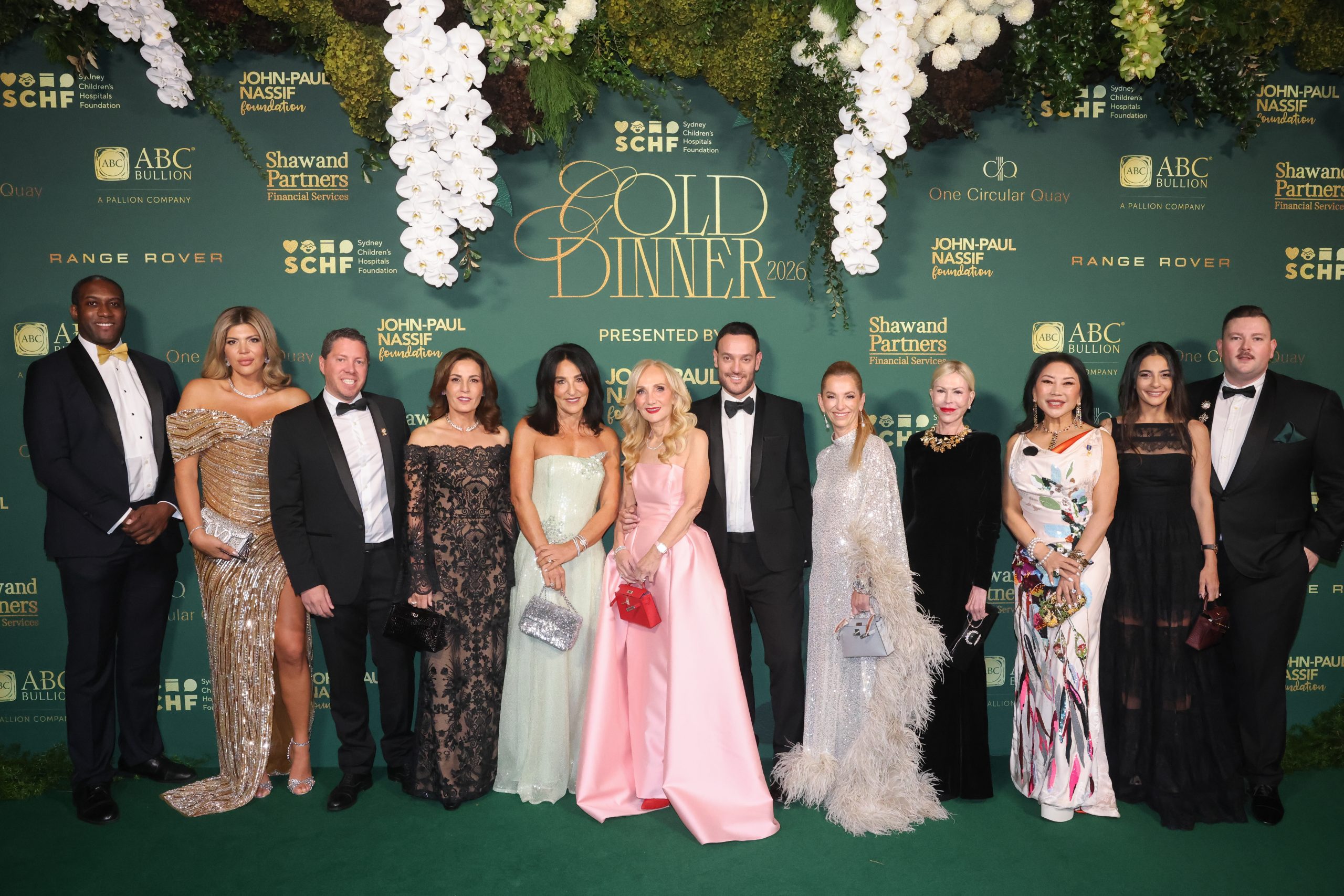
Australia’s wealthiest donors are becoming more strategic, more ambitious and increasingly focused on creating measurable impact, according to Sydney Children’s Hospitals Foundation chief executive Kristina Keneally.
Speaking after the 2026 Gold Dinner, held last week in Sydney, Keneally said Australia was experiencing a significant shift in how major philanthropy is viewed, with large-scale giving increasingly part of conversations about leadership, legacy and social impact.
The annual Gold Dinner, now in its 29th year, brought together some of the country’s most influential business leaders, philanthropists and cultural figures, raising $75.5 million and counting in support of the Sydney Children’s Hospitals Network.
While the event has become one of Australia’s most prestigious fundraising gatherings, Keneally said its significance extends far beyond a single evening.
“Gold Dinner, the flagship event of Sydney Children’s Hospitals Foundation, represents far more than a single evening. It is a powerful demonstration of what a committed community can achieve together over 12 months,” she said.
“The strength of that community, and the trust built over nearly three decades, means people return not just for the event, but for the impact they know it delivers.”
A NEW ERA OF PHILANTHROPY
Large-scale philanthropy has long been a feature of American society, where charitable foundations and major donors often play a prominent role in funding medical research, education and social programs.
Keneally believes Australia is moving in a similar direction.
“Australia is building a stronger culture of large-scale philanthropy, but it is still evolving compared to the United States, where giving at scale is more deeply embedded and widely recognised,” she said.
She said the country’s philanthropic landscape was becoming more sophisticated as successful business leaders increasingly sought opportunities to create meaningful change through their giving.
“In Australia, while generosity has always been strong, large-scale giving has historically been less visible, but that is changing rapidly as more leaders embrace philanthropy as a powerful way to drive meaningful outcomes.”
According to Keneally, events such as the Gold Dinner are helping reshape public perceptions of philanthropy by demonstrating the tangible outcomes that major donations can achieve.
“Gold Dinner is helping to reshape how philanthropy is perceived in Australia, making it more visible, more aspirational and more connected to real-world outcomes,” she said.
WHERE THE MONEY GOES
The funds raised through Gold Dinner support clinical care, research and innovation across the Sydney Children’s Hospitals Network.
Over the past 12 months, more than $75.5 million has been raised to help fund advanced medical equipment, innovative care models and world-leading medical research. Areas of focus include precision medicine and early diagnosis, where emerging technologies are already changing how childhood illnesses are detected and treated.
Keneally said the impact is felt directly by children and families facing some of the most difficult moments of their lives.
“For children and families, this translates into very real and immediate impact. It means faster diagnoses, earlier access to life-saving treatments, and care that is more personalised and effective,” she said.
“It also ensures hospitals are equipped not just to respond to illness, but to reimagine what care can look like, giving children the best possible chance not only to survive, but to live full, healthy lives.”
BUSINESS LEADERS BACKING CHANGE
One of the defining characteristics of Gold Dinner is the calibre of its supporters.
The event has evolved into a meeting point for influential leaders from business, culture and philanthropy, many of whom see charitable giving as an extension of their professional and personal legacy.
“It speaks to a community that is not only generous, but increasingly ambitious in how it gives, combining influence, expertise and purpose to achieve outcomes at scale,” Keneally said.
Among the major supporters of this year’s event were Presenting Partner, John-Paul Nassif Foundation; Major Partners, ABC Bullion, Shaw and Partners Financial Services and One Circular Quay by Lendlease; and Premier Partner, Range Rover, whose ongoing support reflects a shared philosophy of legacy and long-term impact.
The evening also featured performances, premium hospitality experiences and fundraising initiatives designed to encourage further support for children’s health services and research.
LOOKING BEYOND NEW HOSPITALS
With major new children’s hospital developments at Randwick and Westmead progressing, Keneally said the focus is increasingly turning towards what comes next.
“The long-term vision is to ensure every child has access to world-leading healthcare, care that continues to evolve through innovation, research and global collaboration,” she said.
The foundation’s future priorities include accelerating medical discovery, expanding access to cutting-edge treatments and helping position New South Wales as a global leader in children’s health.
Keneally said the Gold Dinner remains central to achieving those ambitions because it does more than raise money.
“Gold Dinner is critical to making that vision possible. It not only provides significant funding, but also unites a powerful network of supporters who are driving the future of philanthropy in Australia,” she said.
As Australia’s culture of philanthropy continues to mature, Keneally believes that the network will play an increasingly important role in shaping the future of healthcare for generations to come.
“The result is a community that is helping to shape the future of paediatric care, not just for today’s patients, but for generations to come.”

Now complete, Ophora at Tallawong offers luxury finishes, 10-year defect insurance and standout value from $475,000.

By improving sluggish performance or replacing a broken screen, you can make your old iPhone feel new agai