Indoor or Outdoor Dining? With These Hybrid Spaces, You Don’t Have to Choose
Homeowners are ditching elaborate dining rooms and separate outside setups for a more blended eating environment
When building his Sonoma, Calif., home, Mukesh Patel had a request: He wanted a simple way to enjoy farm-to-table meals. He meant it literally.
Mr. Patel had purchased a 100-acre lot with his wife, Harsha Patel, 59, for $5.7 million in 2016 that included a small fruit and vegetable farm. He then worked with architect Christie Tyreus to construct a 2,100-square-foot, two-bedroom home for $3 million.
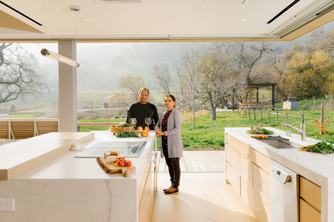
The home features a glass-enclosed kitchen-dining room with exterior pocket doors that open up on two sides to make it easy to walk from the terrace to pick fresh food: tomatoes, avocados, lettuce. The other side of the dining area leads to the living room. “You pick, you cook, then you eat—it’s a smooth transition,” says Mr. Patel, 64, a technology executive. The two moved into the new house from Pleasanton in 2020 but kept their Pleasanton house as a secondary home.
Homeowners are rethinking their indoor dining setups, replacing formal, enclosed rooms with elaborate spaces that give the feel of dining al fresco, with the option to be protected from the elements.
The interior designs also offer greater access to the kitchen, by direct proximity or by combining the cooking and dining areas in an open plan. At the same time, architects are being asked to make the most of killer views, installing automated glass doors and screens to create a seamless transition with the exterior.
“This is as close to dining outside you can get without being outside,” says Paul Masi, principal of Bates Masi + Architects, an East Hampton, N.Y., architecture firm.
Recently, a dining area Mr. Masi designed included two dining-room tables next to each other, with one indoors and the other outdoors. When the homeowners entertain in good weather, they can open the pocket doors to double the room space. Insect screens make it comfortable to eat even at dusk. Wide-plank Ipe wood floors outside mimic the wood floors indoors, and an oak wood ceiling stretches between the indoor and outdoor spaces to create a uniform look.
Another project includes a dining area that opens directly to the outside via two sides of glass doors, with pocket doors separating the space from the kitchen.
“There is nothing abrupt that changes from the interior to the exterior,” says Mr. Masi. Creating these hybrid dining spaces means there are fewer requests for separate outdoor kitchen and eating areas, especially in colder climates, he adds.
After purchasing a Manhattan Beach, Calif., home for $8.5 million in 2019, Michael Mothner, 41, wanted a dining room the family was “actually going to use.”
During a 2½-year renovation, Mr. Mothner created a formal dining space that borders an upstairs living room and kitchen, and opens up to a private terrace with a view over the family pool and the ocean. The indoor-outdoor setup makes it easier to host family dinners that are casual but not like a picnic. “We wanted something that doesn’t feel super formal and is going to be functional,” says the digital-marketing agency founder.
Wendy Word, an interior designer who worked with Mr. Mothner and his wife, Savanna Mothner, says she was able to extend meals from the dining room to the outside by making the table and the rug easy to position partially outdoors. Another dining table is outside on a covered terrace. “They want to be able to gather spontaneously and be able to use the outdoor footprint,” Ms. Word says.
With open floor plans, setting off the dining room while making it conveniently close to the kitchen is a challenge, says Ms. Tyreus, who worked with Mr. Patel.
Instead of creating a separate space, Ms. Tyreus added three kitchen islands. The island bordering the dining area has a decorative sintered stone facade, making the dining space more like a sleek bar area. Kitchen islands farther away include hidden refrigerator drawers and underneath storage. “When in the dining room, [the counter] looks like this beautiful stone block,” she says.
Los Angeles real-estate agent Rayni Williams says luxury homeowners pay a premium for dining rooms that blend into separate spaces. She sees dining areas that are separated by a wall of art, or another dividing element, from the main living area, providing easy access to the exterior and to the kitchen.
The idea is to create an eating area that gives priority to exterior views. “They know that’s the real money shot—that’s the way to maximise the dollar,” she adds.
Ms. Williams and her husband, Branden, are representing off market a $48 million home in Los Angeles that has nearly 7,000-square feet of outdoor space and a dining area with a large glass wall that can retract vertically to open to the exterior. The dining table inside the home is on wheels to make it easy to relocate throughout the area, including to a spot near an outdoor fireplace, she says.
Even in colder climates, homeowners are finding creative ways to craft scenic indoor-outdoor dining spots. After buying a vacation home for $765,000 in Hyde Park, N.Y., in 2021, Thorsten Hayer, 42, was thrilled to use what he calls a fancy garage as a dining area that opens to the exterior through two sets of barn doors. With a dining table and bar, the exterior room allows him to entertain while enjoying the outdoors.
The main home, built in 1876, has a formal dining area, but the family eats dinners mainly in the outside space. When the doors are open, it feels like they are dining in the garden. “It’s a nice progression from grilling a hot dog on the fire pit and going into a garage space,” he adds.
 Copyright 2020, Dow Jones & Company, Inc. All Rights Reserved Worldwide. LEARN MORE
From elevated skincare to handcrafted home pieces, this year’s most thoughtful gifts go beyond the expected.
A haven for hedge-fund titans and Hollywood grandees, Greenwich is one of the world’s most expensive residential enclaves, where eye-watering prices meet unapologetic grandeur.
A stellar field of performance cars was recognised at Robb Report’s annual event, with Citizen Kanebridge backing the experience alongside leading luxury partners.
Aston Martin’s Vanquish has been crowned overall winner of Robb Report Australia & New Zealand’s 2025 Car of the Year, taking top honours at an exclusive event in Sydney.

Held at the Harbourside Residences Display Gallery by Mirvac, the evening brought together drivers, partners and industry figures for the long-awaited announcement of the 2025 Car of the Year.
Exclusive private member’s club Citizen Kanebridge was among the partners supporting the event, which has become a fixture on the luxury automotive calendar, showcasing the very best in performance, design and innovation across the global car market.
Across a tightly contested field, category winners reflected the breadth of today’s high-end automotive landscape, from traditional combustion engines to hybrid and fully electric performance models.
Among the standout winners, the Ferrari 12Cilindri Spider took out Best Combustion Supercar, while the Aston Martin Vanquish was named Best Super-GT before ultimately securing the overall title.
Other notable winners included the Mercedes-Benz G580 as Best Off-Roader, the Audi RS Q8 Performance for Best SUV Coupe, and the Aston Martin DBX 707 for Best Super-SUV.
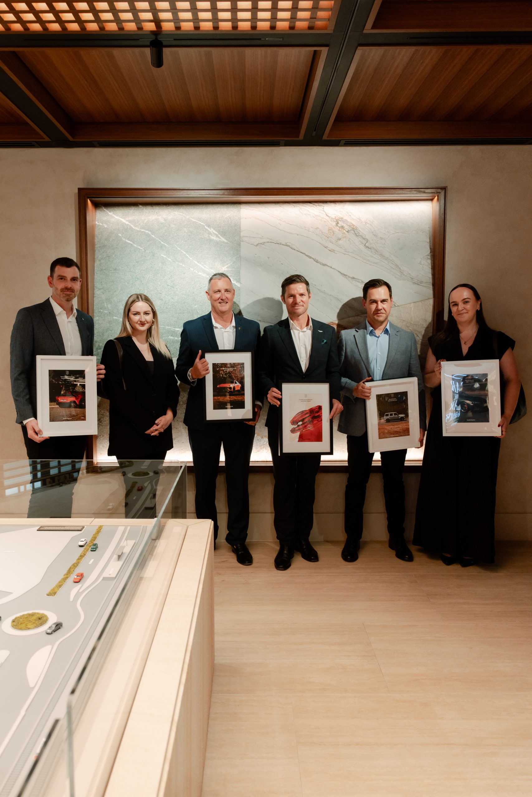
Electrification continued to shape the upper end of the market, with the Chevrolet Corvette E-Ray named Best Hybrid Supercar and the Audi RS e-Tron GT Performance taking out Best Electric GT.
The Lamborghini Urus SE was recognised as Best Hybrid SUV and also placed third overall, while the Mercedes-AMG GT 63 S E Performance secured second place overall in the coupe category.
Guests were also given a first look at a short film capturing the spirit of the two-day Car of the Year program, produced by SONDR, alongside photography that will feature in a dedicated 40-page portfolio in the upcoming issue.
Guests were welcomed alongside a curated group of Car of the Year partners, including Jacob & Co. and La Prairie, with Peter Lehmann Wines and Glenfiddich ensuring the evening unfolded in suitably polished fashion.
The broader program was supported by partners including Citizen Kanebridge, Msquared Capital, Hardy Brothers, Bell Helicopters, Saddles and Spicers Retreats, reflecting the wider luxury ecosystem that underpins the event.
With full results set to be published in the next issue of Robb Report Australia & New Zealand, attention now turns to the next instalment of the program, with this year’s Car of the Year drive scheduled for September.
For those in the room, however, the message was already clear. In a field defined by innovation and performance, the Vanquish still knows how to stand apart.
With full results published in the next issue of Robb Report Australia & New Zealand, attention now turns to the next instalment of the program, with this year’s Car of the Year drive scheduled for September.
From office parties to NYE fireworks, here are the bottles that deserve pride of place in the ice bucket this season.
Micro-needling promises glow and firmness, but timing can make all the difference.


