

BOLD COLOUR IS THE NEW CONFIDENCE
The beige era is fading. In its place, luxury homes are rediscovering the confidence to use deeper colour, layered emotion and bold palettes.
 8 min
8 min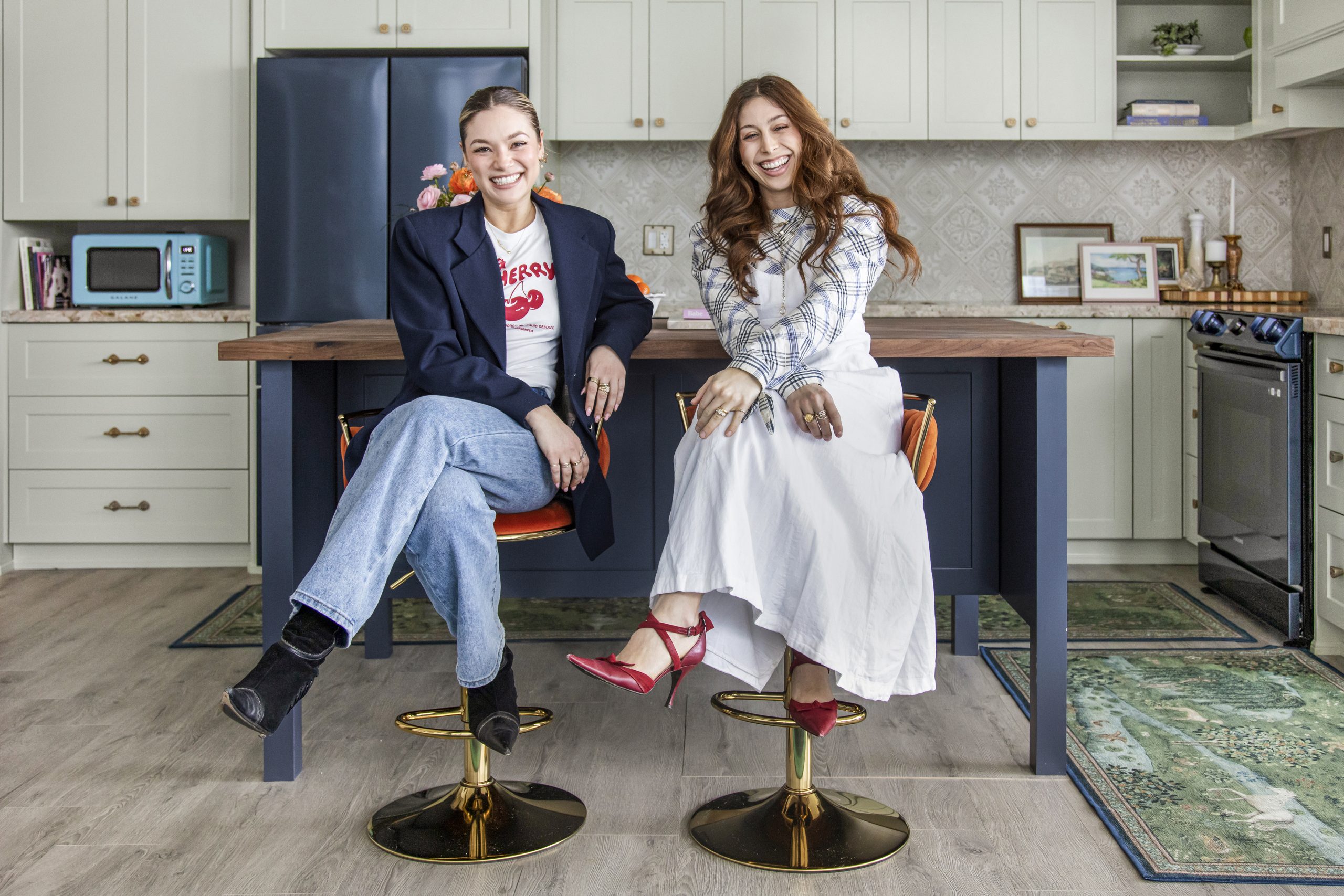
For almost a decade, interiors whispered. Minimalism took over, neutral palettes dominated, and many homes drifted into a safe sameness built from beige, cream and careful restraint.
But something has shifted. As the world becomes more chaotic, homeowners are leaning toward spaces that offer warmth, optimism and personality.
Colour has returned to luxury design because it delivers exactly that, but in a considered, modern way, far from the brash maximalism of the 2010s or the timid pastels of the early pandemic years.
The new wave is thoughtful, layered and emotionally led, a resurgence shaped by a desire to feel grounded in our own space.
From Sydney to Melbourne, Atlanta to Toronto and Portugal, colour is back with conviction.
Why Colour Matters
Major global paint houses see the shift clearly. Warm earth tones and gentle pastels are now sitting comfortably beside deeper colours like burnt orange, moss green, berry shades and vintage rose.
Forecasts suggest a swing back to expressive palettes shaped by nostalgia, slower living and a renewed pull toward nature.
This shift reflects what people are living through: rising costs, global tension, digital overload and plain old burnout. People want comfort, a sense of connection and something that lifts the mood. Designers are responding with palettes that feel warm, grounded and human.
Colour is no longer about trends, but about emotional resonance.
Lauren Treloar, Dulux Colour and Design Manager, says homes are increasingly becoming “canvases of personal storytelling.”
She notes a growing willingness to use colour to bring “energy, joy and personal character throughout the space,” driven by the desire for warmth, individuality and emotional connection.
The broader colour movement is also reflected in the 2026 Dulux Colour Forecast, distilled into three palettes: Ethereal, Elemental and Evoke.
Together they champion warm earth-based neutrals, rich burnt oranges, caramels, sage, moss and spearmint greens, alongside soft pinks, vintage rose tones and muted berries. One of the strongest shifts, Treloar says, is the rise of spearmint green, which pairs effortlessly with earthy pinks, browns and burgundies.
Sydney’s Coastal Blues
In one Sydney penthouse, the shift towards colour begins with quiet confidence. Soft aqua and Mediterranean blues wind through the kitchen, living and bathroom in a way that feels serene rather than showy.
The goal, says Nathalie Scipioni, principal architect and director of Nathalie Scipioni Architects, was to unify what had once been a disconnected, boxed-in layout.
“My aim was to open up what had been a closed, disconnected layout and create a home where the kitchen, living and dining areas feel connected and calm,” she says.
“I used one feature colour (blue) to tie the spaces together, applying it in different ways so it feels consistent but not repetitive.”
The palette works because it’s balanced with soft greys, pale timber, brushed brass and plenty of texture.
“I controlled saturation by choosing muted shades and finishes with texture. I used pale timber, brushed gold and soft greys so the blue stands out without overpowering the overall sense of calm,” she says.
Even so, Australia is still colour-cautious.
“I don’t see bold colour making a major return in Australia just yet,” she says. “The market still leans towards neutrals… clients are hesitant to embrace colour because they don’t see it used around them. It is not part of the visual landscape in the same way it is Europe.”
Yet she sees her work as a quiet education, showing that colour can be gentle, refined and deeply personal.
Earthy Depth
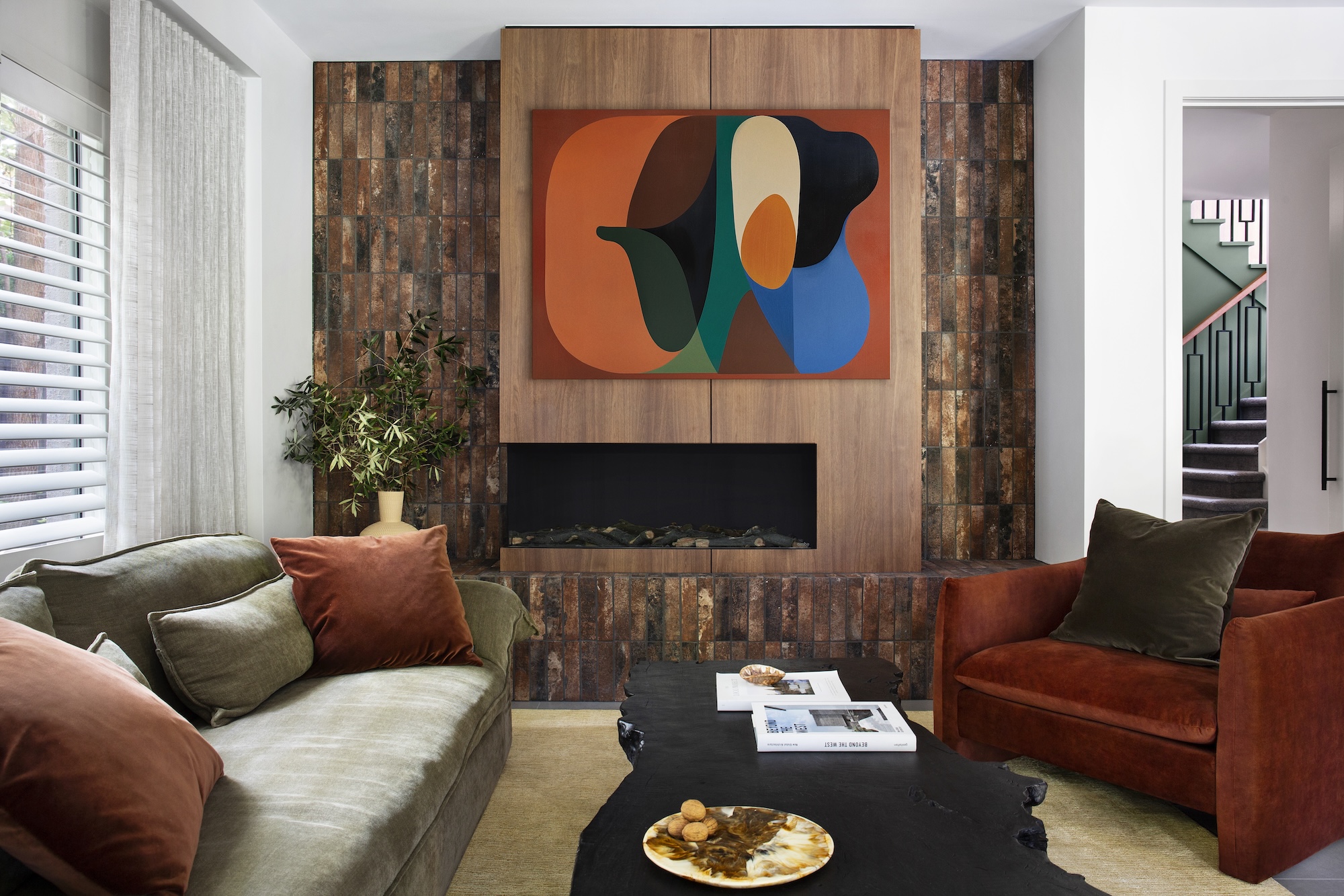
Further south, another family home takes colour in an entirely different direction. Here, deep greens, walnut timber, brushed brass, mustard, rust and black stone fill the rooms with a rich, tactile warmth.
The brief was clear: no more beige.
“The brief was to completely move away from the beige and neutral tones that once defined the home and to reintroduce personality through a palette that felt both sophisticated and nurturing,” says Richard Misso, creative director of The Stylesmiths.
“Deep greens and walnut were chosen for their connection to nature… Brushed brass details added warmth and subtle reflection.”
In the living area, an artwork becomes the anchor that unites rust armchairs, an olive sofa, terracotta tones and black stone.
“A multi-tone palette like this works when each hue earns its place and connects through tone rather than saturation,” he explains.
“Texture plays an equal role to colour… creating variation and visual rhythm without overwhelming the eye.”
What’s ahead?
“Bold colour is already making its return, but in a more refined, tonal way… It’s less about maximalism and more about authenticity through colour.”
The American Case
Across the Pacific, a roughly 930-square-metre manor near Atlanta champions a cinematic approach to colour, says Seth van den Bergh, principal designer at The Drawing Room.
Long architectural sightlines demanded strong punctuation points, bold red moments, black walls, saturated accents and warm neutrals.
“At Milton Manor, the palette was built around rhythm and a restrained use of colour,” van den Bergh says.
“Boldness only works when it is balanced with restraint… the ‘fearless palette’ gains its strength from warm neutrals, white painted wood floors and a thoughtful use of colours and objects.
These elements allow the saturated gestures to feel intentional rather than overwhelming. It is that balance that lets the home breathe.”
Even the black walls are handled with precision.
“We layered the surfaces and filled the negative space with related tones… the key is to treat black as a finish rather than a colour,” he says.
For those scared to commit, he recommends beginning with emotion, studying the light, understanding the room’s vistas, then editing to one clear direction.
“Think of it like a film. You would not have all your lead characters speaking at once, so let the room have one clear voice to follow,” van den Bergh says.
For homeowners nervous about bold shades, Treloar suggests starting with how a space should feel and introducing colour slowly through architectural details or textures. Moodboards and real paint samples remainessential.
“Colour can change substantially in different lighting or when colour from other furnishings reflects on the wall,” she says. “It’s all about experimentation and allowing your personal style to evolve.”
Playful Confidence in Toronto
In a Toronto condo belonging to actress Amalia Williamson, colour takes on a joyful, youthful energy.
The space started as a blank, characterless developer shell. With a careful mix of custom cabinetry and budget retail pieces, the palette evolved into a vibrant blend of navy, blush, gentle greens, bold orange and saturated green.
Crucially, the bold accents came last.
“We actually selected those accents at the very end,” designer Isabel Clune of Isabel Clune Design says. “The foundation of the room was already rich with colour but in a soft, muted way.
The saturated green pendants and bold orange stools became the perfect counterbalance… It’s a controlled pop, not a swing into ultra-maximalism.”
Even the surfaces balance practicality with beauty.
“I always design with equal consideration for function and beauty… Marble can be refinished, it’s naturally heat-resistant… its subtle imperfections and patina add character over time.”
The embossed tile was chosen purely for its visual impact, with marble behind the stove for everyday practicality.
It proves colour doesn’t require huge budgets – just intentionality.
Colour Me Happy
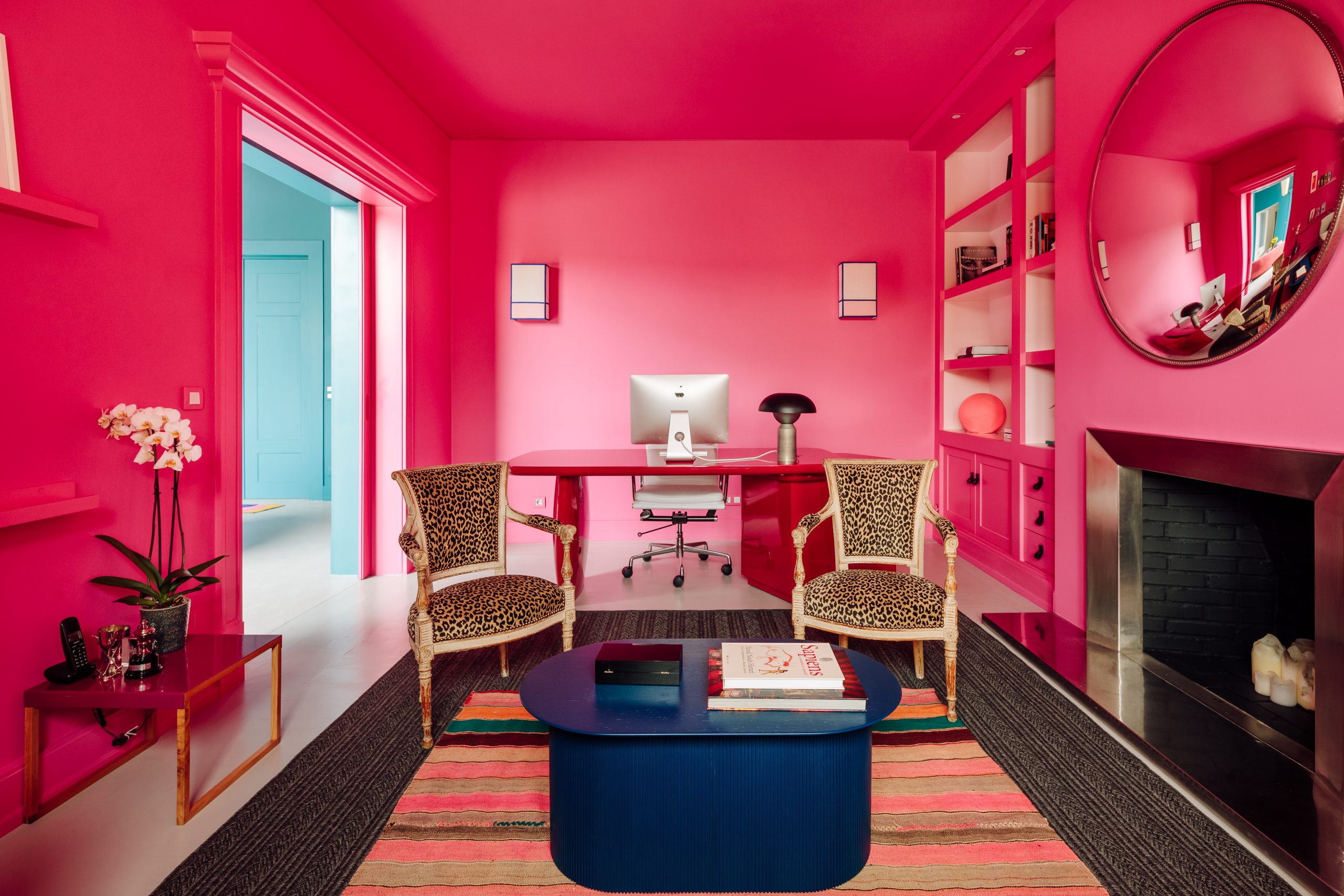
Colour at Portugal’s Viterbo Interior Design begins with feeling, not pigment. As Gracinha Viterbo and Miguel Vieira da Rocha explain, “we never begin by selecting colours, we begin by talking about how people live.”
The team worked with the family to map the emotional temperature of each room, asking what mood each part of the home should hold: where they should feel energised, where they should slow down, where they should decompress and where they should gather with others.
The palette grew out of that emotional map, refined on site with large samples and fabrics at different hours of the day so that each hue produced the exact feeling the family wanted.
The home’s bold moments never spill into chaos because strict principles anchor the palette.
“Each room was given one strong chromatic gesture – never two,” the designers say, ensuring character without competition.
A restrained architectural backdrop and a tight family of colours allowed tones to reappear through the house in different intensities, creating continuity.
The result is a home that feels expressive and dynamic, yet the flow is seamless.
19th Century Revival
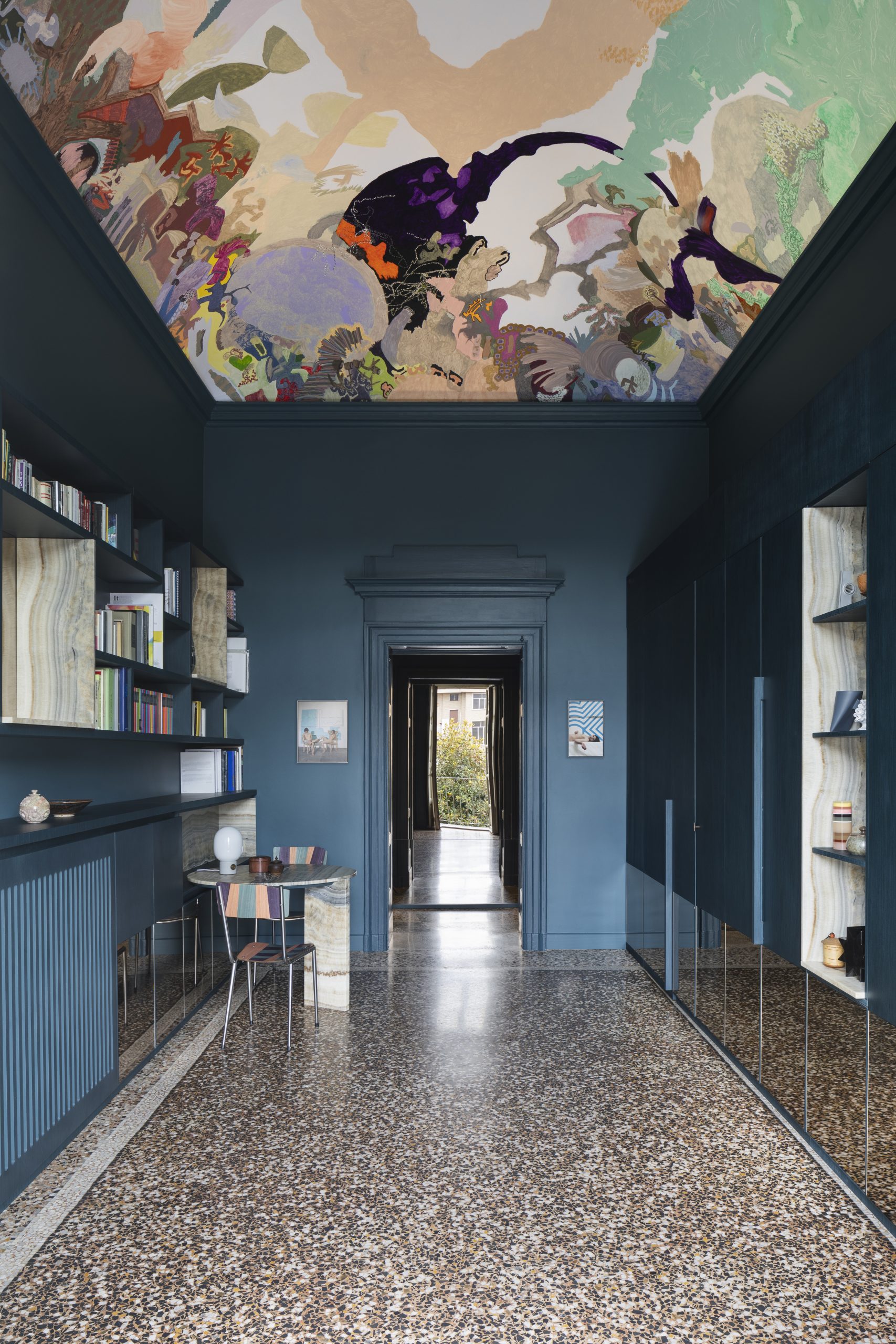
In Turin, colour becomes a bridge between eras. A 19th-century apartment restored by BRH+ Studio has been reimagined as a dialogue between heritage architecture and a vivid contemporary art collection.
Nowhere is that tension more captivating than in the entryway, where deep octanium walls and a site-specific fresco ignite a striking conversation between past and present.
Victoria Stoian’s fresco transforms the vaulted ceiling into an imagined sky, drawing the eye upward the moment visitors enter the apartment and signalling that this is a home shaped as much by art and narrative as by architecture.
BRH+ Studio treat colour not as decoration but as architecture, using it to connect the original terrazzo floors with new interventions and give the apartment a cohesive rhythm.
BRH+ on Colour and Heritage
For architects Barbara Brondi and Marco Rainò, founders of BRH+Q, the entrance to the Turin apartment was conceived as more than a hallway.
“The entrance to an apartment can be understood not only as the threshold to private living spaces, but also as a symbolically charged environment where the personality of the inhabitant can be expressed,” they explain.
In this case, the space was designed to reveal the owners’ passion for contemporary art while connecting that sensibility with the building’s nineteenth-century architecture.
The large tempera fresco by Moldovan artist Victoria Stoian transforms the vaulted ceiling into an imaginary landscape suspended between past and present. At the same time, the deep chromatic treatment of the walls connects visually with the apartment’s terrazzo flooring, creating a dialogue between decorative surfaces.
For Brondi and Rainò, the key to working within historic buildings is restraint. Every project begins with a close study of the context so that new interventions complement rather than overwhelm the architecture.
Pasadena: A Cocoon of Blue
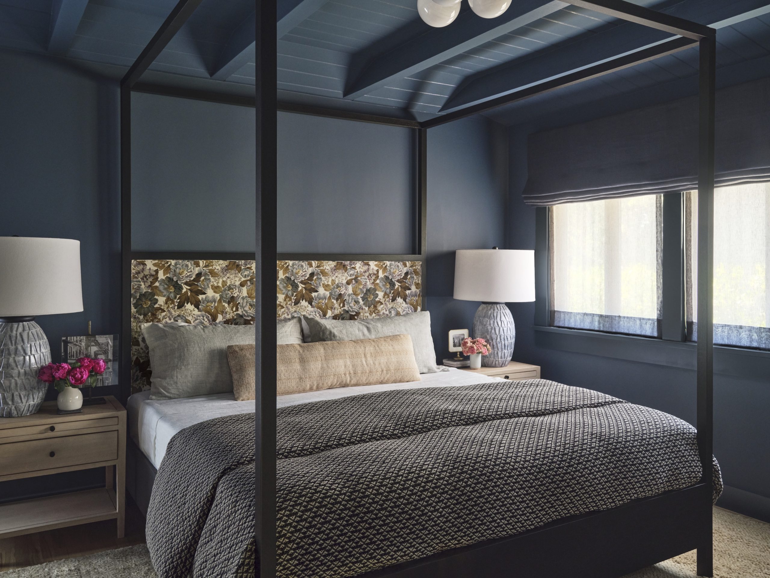
In Pasadena, a second-floor bedroom suite became the perfect test case for how far colour can transform a small space when used with conviction.
The room sits apart from the home’s communal areas, giving interior designer Jennifer Vaquero of September Workshop the freedom to create a space centred entirely around her client’s favourite hue.
“While we loved the idea of creating a relaxing and serene space, it was equally important that the rooms also feel energetic and joyful,” she says.
Warm accents, reflective textures and subtle sheen in the window sheers ensure the deep blue palette never feels flat.
“When that light bounces off the golden and purple hues in the marble or the warm woods, the whole suite seems to come alive.”
Where Colour Is Heading
Across continents, a consistent story emerges. Colour is returning not as trend but as therapy, craftsmanship and identity.
Homes no longer want to whisper. They want to reflect the lives within them, joyful, complex, grounded and expressive.
Design is shifting from minimalism to meaning. From quiet to considered. From safe to soulful.
The new colour confidence isn’t loud or chaotic. It’s intentional, emotional and human, and one of the most powerful tools in luxury design.
This article appeared in the Autumn 26 issue of Kanebridge Quarterly, which you can buy here.

Victorian auction buyers will soon receive a piece of information that has traditionally been withheld until bidding reaches it: the vendor’s reserve price. Under new property-sale and underquoting laws, agents must publish the agreed reserve at least seven days before an auction or fixed-date sale. Most changes begin on 1 October 2026 and apply to …
Continue reading “Victoria’s New Auction Rules Will Force Reserve Prices Into the Open”

Four decks, 34.5 metres and a made-to-measure interior: step aboard the new Custom Line Navetta 35, unveiled at Cannes.
Could fears of an AI apocalypse be distracting us from the dangers already here? Experts debate whether regulation should focus on speculative existential threats or present-day harms, including cyberattacks, weapons and unsafe autonomous agents. Read more via the link in bio.
5 min
There is ample and alarming evidence that artificial intelligence can help humans do bad things, such as committing cyberattacks, building weapons and even killing themselves or others. The Hugging Face hacking episode—and a growing list of others by poorly constrained swarms of agents—indicate just how powerful and potentially dangerous AI has quickly become.
Yet many inside the U.S. AI industry insist far worse is coming, on account of the imminent arrival of AI with superhuman and self-improving abilities.
Plenty of experts, including many who study AI harms for a living, are skeptical. The so-called doomers’ assertion that AI might decide to wipe out all of humanity—or even “just” topple human civilization—is contingent on it achieving a pace of development not yet seen.
And if the assumptions behind this global-doomsday scenario are wrong, it could lead us to curb or regulate AI in ways that don’t address its real harms.
At the center of this debate is the claim that current AI systems might take over the job of training their next versions, a process called “recursive self-improvement.” Think of it like evolution on steroids—billions of years happening at light speed within vast AI supercomputers. Anthropic Chief Executive Dario Amodei recently proposed a global agreement to slow down the pace of releasing new AI models, with the goal of delaying the arrival of recursive self-improvement.
“I don’t think we’re anywhere near ‘artificial general intelligence,’” says Melanie Mitchell, a professor at the nonprofit research group Santa Fe Institute who studies AI. She said AI is making impressive strides but thinks claims by engineers that they’ve achieved recursive self-improvement don’t stand up to scrutiny.
She is hardly alone. A recent paper by two dozen academics at Princeton, Stanford and other institutions found that even the most cutting-edge AIs are incapable of doing the original research required to advance the AI frontier.
Two of the authors involved in that paper also threw cold water on the idea that the Hugging Face swarm hack by OpenAI agents occurred because of a breakthrough in intelligence. The attack succeeded primarily because of a lack of basic technical guardrails, not an unmanageable explosion in AI capability, they wrote.
Yann LeCun, former chief AI scientist at Meta, posted that this analysis was “a welcome dose of sanity in an otherwise insane debate.”
OpenAI and Anthropic didn’t respond to several requests for comment.
The people who disagree with the doomers still consider AI to be dangerous, and point out that such systems don’t have to be particularly capable to be powerful. Some argue that AI should undergo regular evaluation by outsiders and that the companies that make it should be held responsible when their systems do harm. AI should also be treated the same as airplanes and elevators, and should be designed to do the least harm possible, they say.
“If you believe that technology is powerful enough to create novel, dangerous viruses, or to essentially take over the whole planet for some reason, then it must also be strong enough to create cures for cancer, to cure aging, to fix socio-economic or political problems,” says Christopher Canal, CEO of EquiStamp, a company that helps companies and governments evaluate AIs.
AI has shown an ability to rapidly advance because it is matching the abilities of humans who are constantly feeding it their knowledge. Sometimes it can recombine that knowledge and exceed what people have been capable of, through a kind of post-training known as reinforcement learning, as we’ve seen in mathematics.
Today’s LLMs are “models of knowledge” rather than actually intelligent, wrote Yi Ma, professor of AI at Hong Kong University.
Researchers at universities and commercial AI research labs in China wrote in a recent paper that autonomous, self-improving AI is likely to be a long way off, due to the sheer number of breakthroughs required. They also argue that humans will probably remain in the loop, supervising that process—and gating how fast it can occur.
Vals AI, a company that evaluates today’s AI models, maintains an RSI Index that benchmarks whether models can “do the research that builds the next model.” So far, no publicly released model is even close.
Yet Rayan Krishnan, CEO of Vals AI, says his team projects models will exceed humans’ ability to improve the next generation of AIs by August 2027, or sooner, and at that point could start building their successors all on their own.
“Once we get to recursive self-improvement, the fear is that all bets are off,” he says. “You could end up with a ‘fast takeoff’ situation, where the models quickly acquire skills and eclipse humans across every possible domain.”
In a reply to the resignation tweet heard round the world from Jacob Coxon, another Anthropic engineer declared his belief that those odds were at least 10% over the next decade. Many others in the industry chimed in to say they thought the percentage was even higher.
Some who argue the end is nigh say they calculate their personal p(doom) based on a chain of conditional probabilities—a bit like the Drake equation for calculating the likelihood of intelligent alien life. Since all those probabilities are based on speculation, estimates range from 0% to nearly 100%. Many land around 10%.
“The weird thing is that if you go back and look at the predictions on this over the last 10 years or more, it’s always been 10%—it’s just a nice round number,” says Mitchell. “I think it’s all vibes, and there’s no actual evidence or calculation.”
One argument against worrying about superintelligent AI is that the world is full of unlikely humanity-ending disasters, and trying to avert them all can make it impossible to prioritize, says Canal.
This has led AI experts and the policymakers who listen to them to propose remedies that don’t get at its real and present dangers.
AI companies’ proposals to “pace the frontier” aren’t addressing the problem in the right way, argues Stuart Russell, a computer-science professor at the University of California, Berkeley, and the president of the International Association for Safe and Ethical Artificial Intelligence.
“It’s like saying we’re driving toward the cliff at 60 miles per hour and we’re going to drive toward it at 40 miles per hour instead, and everything will be OK,” he says.
Russell and his peers have proposed that AI companies should have to meet the same standards that govern other areas of everyday life, from air travel and buildings to food and drugs. They highlight the “behavioral red lines” AI should not be allowed to cross. Breaking into other computer systems, stealing information or advising terrorists on how to build biological weapons are all illegal for a human to do, and should be illegal for companies’ AIs as well, he argues.
The challenge for AI companies in such a proposal, he adds, is that it would be a de facto ban on today’s advanced AI systems, since the companies behind them don’t know how to make them respect such boundaries all of the time.
Others have proposed something like the Food and Drug Administration, but for AI, but setting up a new agency has so far been a nonstarter in Congress. And some prominent voices in tech have said such a structure would give up America’s AI edge to China.
Given the bipartisan groundswell of support for curbing AI companies and their creations, however, that may soon change.
“The tech industry has had this mantra for decades that regulation is bad,” says Russell. “They don’t accept the liability for any harm, and they hide behind free speech. That, I think, has to change.”

In the lead-up to the country’s biggest dog show, a third-generation handler prepares a gaggle of premier canines vying for the top prize.

Paine Schwartz joins BERO as a new investor as the year-old company seeks to triple sales.