

WORLD’S BEST SHIRAZ SELLS FOR JUST $25
A McLaren Vale Shiraz has beaten more than 100 global rivals to be crowned the world’s best at one of the wine industry’s most respected competitions.
 2 min
2 min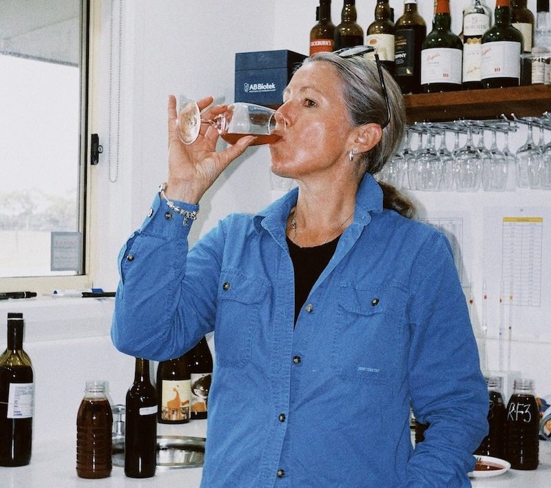
A $25 bottle of Shiraz from South Australia has achieved something few wines ever do: it has claimed the top spot in a prestigious international competition and outperformed rivals many times its price.
The 2023 Classic Shiraz from Beresford Estate in McLaren Vale was awarded the International Syrah Trophy at the 2026 International Wine Challenge, one of the wine industry’s most respected judging events.
The wine also received 97 points, a Gold Medal and four major trophies, making it the highest-scoring Australian trophy winner in this year’s competition.
The result placed the wine first among 111 Shiraz entries from around the world and ahead of several highly regarded Australian trophy-winning wines.
For wine lovers, the award is notable not only for the competition’s standing but also for the price. At a recommended retail price of just $25, the Beresford Classic Shiraz sits firmly in the everyday-drinking category rather than the rarefied world of collector wines.
Head winemaker Natalie Cleghorn said the result reflected the quality of fruit produced in McLaren Vale.
“This result is a genuine reflection of what McLaren Vale is capable of. When you let the fruit and the site do the talking, the quality speaks for itself.”
According to the tasting notes, the wine opens with blueberry and plum aromas alongside floral notes and spice, while the palate delivers red cherry, plum, dried fruit, eucalyptus, and savoury spice, supported by bright acidity and fine-grained tannins.
The accolade adds to the growing reputation of Beresford Estate, which was founded in 1985 and has accumulated more than 2,000 medals and 200 trophies globally. The estate is located on a 70-acre vineyard in McLaren Vale and produces a range of wines including Shiraz, Grenache, Cabernet Sauvignon and Chardonnay.
While luxury wine collectors often chase bottles costing hundreds or even thousands of dollars, Beresford’s latest success is a reminder that world-class wine does not always come with a world-class price tag.

Waldorf Astoria Kuala Lumpur is scheduled to open on 30 October, introducing the Hilton luxury brand to Malaysia with an all-suite hotel in the city’s Golden Triangle.

Located steps from Crows Nest Metro, the near-complete development brings luxury living to Sydney’s Lower North Shore.
3 min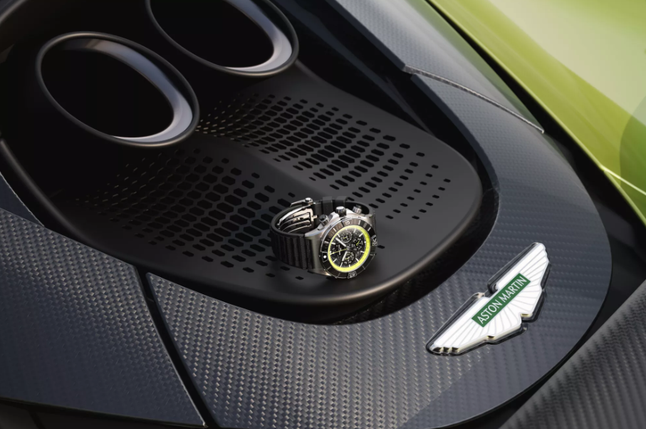
Buyers of Aston Martin’s 1,079PS Valhalla can commission one of two bespoke Breitling Super Chronomat watches, with colours and personalised details inspired by their individual car.
The relationship between cars and watches has produced countless branded chronographs, racing editions and logo-bearing collaborations. Breitling and Aston Martin are taking a more personal route with a new watch program reserved exclusively for owners of the Valhalla supercar.
Rather than offering every customer the same limited-edition watch, Breitling is opening part of its Super Chronomat design process to Valhalla owners. A dedicated configurator will allow each buyer to commission a timepiece inspired by the specification of their car and their individual tastes.
Two Super Chronomat models are available: a technically ambitious 44mm perpetual-calendar chronograph and a more compact 38mm automatic watch.
The flagship is the Super Chronomat B19 44 Perpetual Calendar Chronograph. Presented in a 44mm titanium case with Breitling’s distinctive Rouleaux bracelet, it combines a carbon-fibre dial with one of mechanical watchmaking’s most sophisticated complications.
Its automatic perpetual calendar accounts for months of different lengths, leap years and the phases of the moon. Provided it continues running, the calendar will not require manual correction until 2100—the next centurial year that will not be recognised as a leap year.
The B19 movement also provides a 96-hour power reserve, allowing the watch to be left unworn for four days without stopping. A display caseback exposes the movement and black rotor.
Valhalla owners can customise the colour of the inner bezel, seconds hand and chronograph counter hands. The rotor can also be engraved, creating a more permanent connection between the watch and its owner.
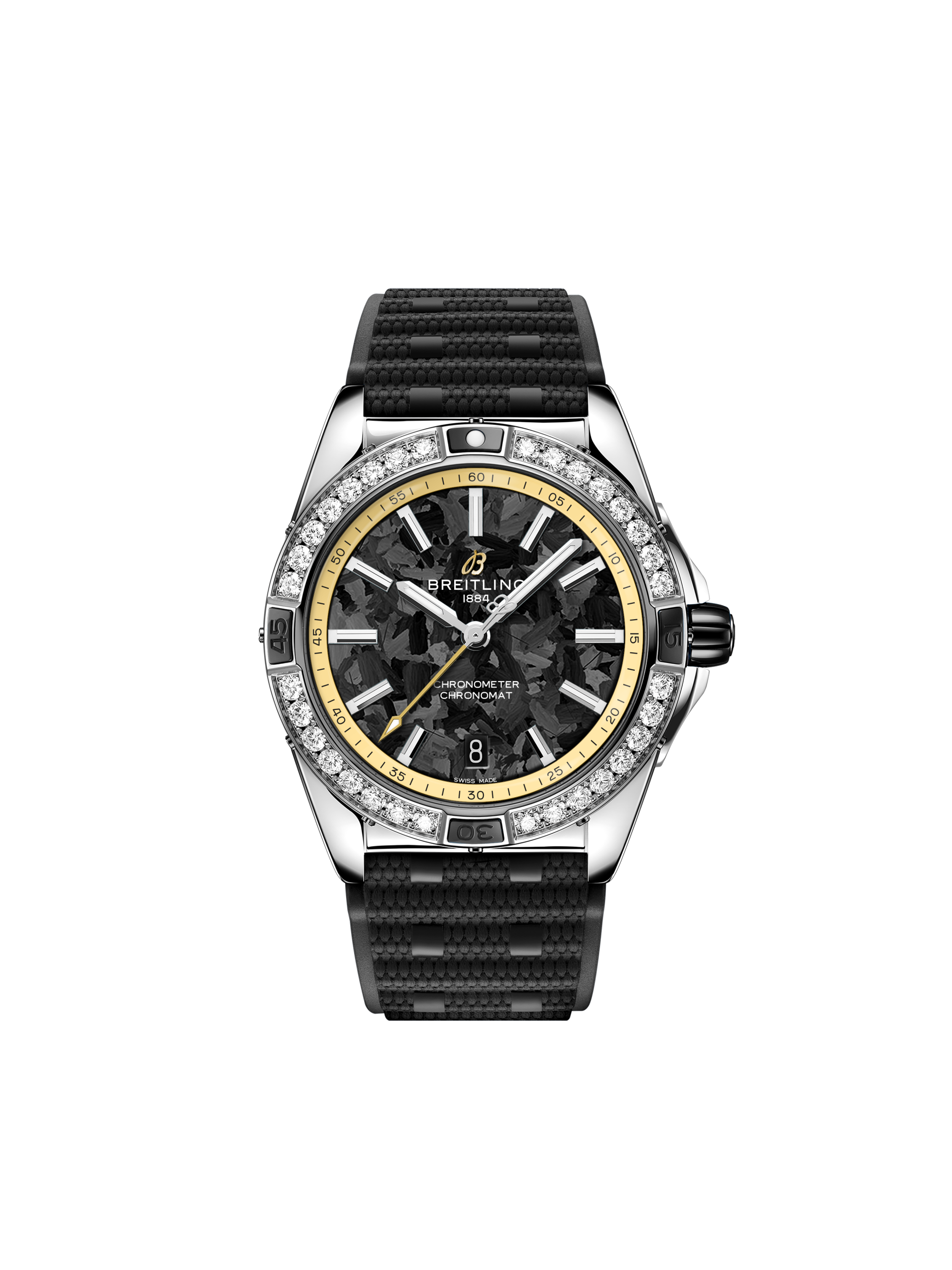
The second option, the Super Chronomat Automatic 38, offers a less complicated and more restrained interpretation.
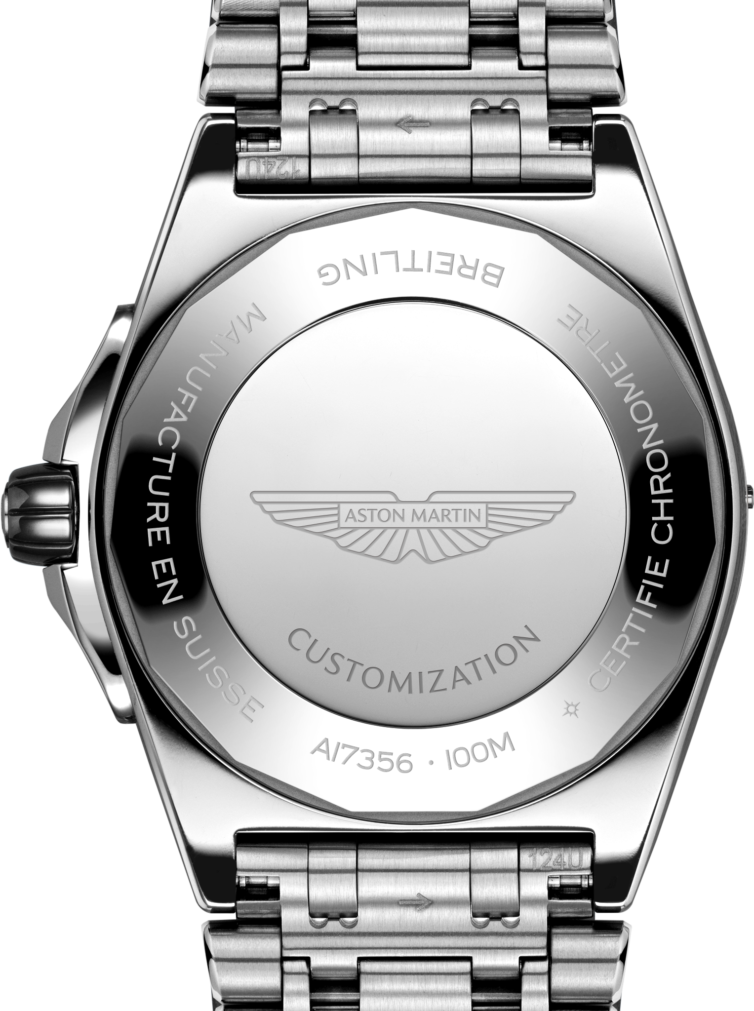
Its 38mm stainless-steel case is paired with a textured carbon-fibre dial, a titanium crown and a diamond-set bezel. The automatic three-hand display incorporates a date window at six o’clock, while customisation extends to the colours used for the inner bezel and hands, together with a personalised caseback engraving.
The combination of carbon fibre and diamonds might appear contradictory, but it captures the dual character of the Valhalla: a car built around highly technical performance that remains unmistakably positioned as a luxury object.
The watch program draws directly from Aston Martin’s first series-production, mid-engined plug-in hybrid supercar.
Valhalla combines a 4.0-litre twin-turbocharged V8 with three electric motors to produce 1,079PS. Aston Martin claims it can accelerate from zero to 62mph—approximately 100km/h—in 2.5 seconds and reach 217mph, or about 349km/h.

Production is limited to 999 examples worldwide.
Formula One-derived technology and aerodynamic development have played central roles in the car’s engineering, but customisation is equally important to its ownership proposition. Breitling’s configurator extends that process from the Aston Martin specification studio to the wrist.
Each car will be produced at Aston Martin’s headquarters in Gaydon, England, while the watches will be made at Breitling’s Chronometrie in La Chaux-de-Fonds, Switzerland.
The program also reflects a broader change in the luxury market. Exclusivity is increasingly being defined by access rather than the simple production of another numbered edition. These watches cannot be purchased merely by joining a waiting list or paying a premium on the secondary market; the commission begins with ownership of the corresponding car.
That restriction gives the project greater authenticity than a conventional co-branded release. The strongest configurations should be those that use colour and engraving to create a subtle relationship with a particular Valhalla, rather than attempting to reproduce the car too literally.
For Valhalla buyers, the choice ultimately comes down to two very different expressions of the same idea. The 44mm B19 is the serious collector’s proposition, built around a rare combination of perpetual calendar and chronograph. The Automatic 38 is simpler, smaller and likely more versatile as an everyday watch.
Both turn the usual automotive-watch collaboration into something more individual: a timepiece configured alongside one of Aston Martin’s most significant new cars.
Watch summary
Program: Bespoke Breitling Super Chronomat watches for Aston Martin Valhalla owners
Available models: Super Chronomat B19 44 Perpetual Calendar Chronograph and Super Chronomat Automatic 38
B19 case: 44mm titanium
B19 power reserve: Approximately 96 hours
B19 complication: Automatic perpetual calendar chronograph
Automatic 38 case: 38mm stainless steel
Shared design element: Textured carbon-fibre dial
Customisation: Selected colours and personalised engraving
Availability: Exclusively for Aston Martin Valhalla owners
Valhalla production: Limited to 999 cars worldwide

Porsche’s Cayenne Turbo Electric produces up to 1,156PS and reaches 100km/h in a claimed 2.5 seconds.

As housing drives wealth and policy debate, the real risk is an economy hooked on growth without productivity to sustain it.