


Property of the Week: Longueville harbour home listed for the first time in a quarter of a century
 2 min
2 min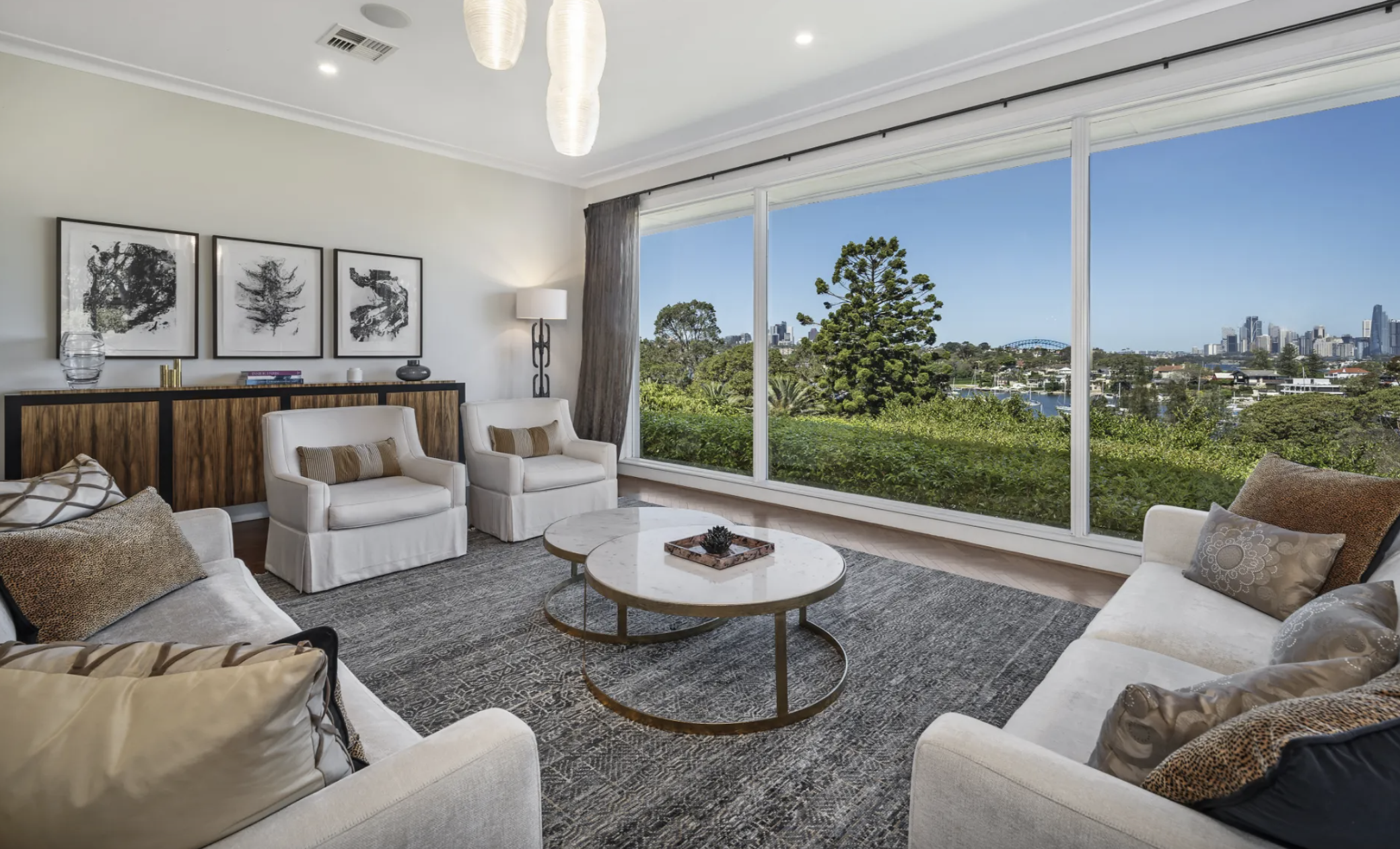

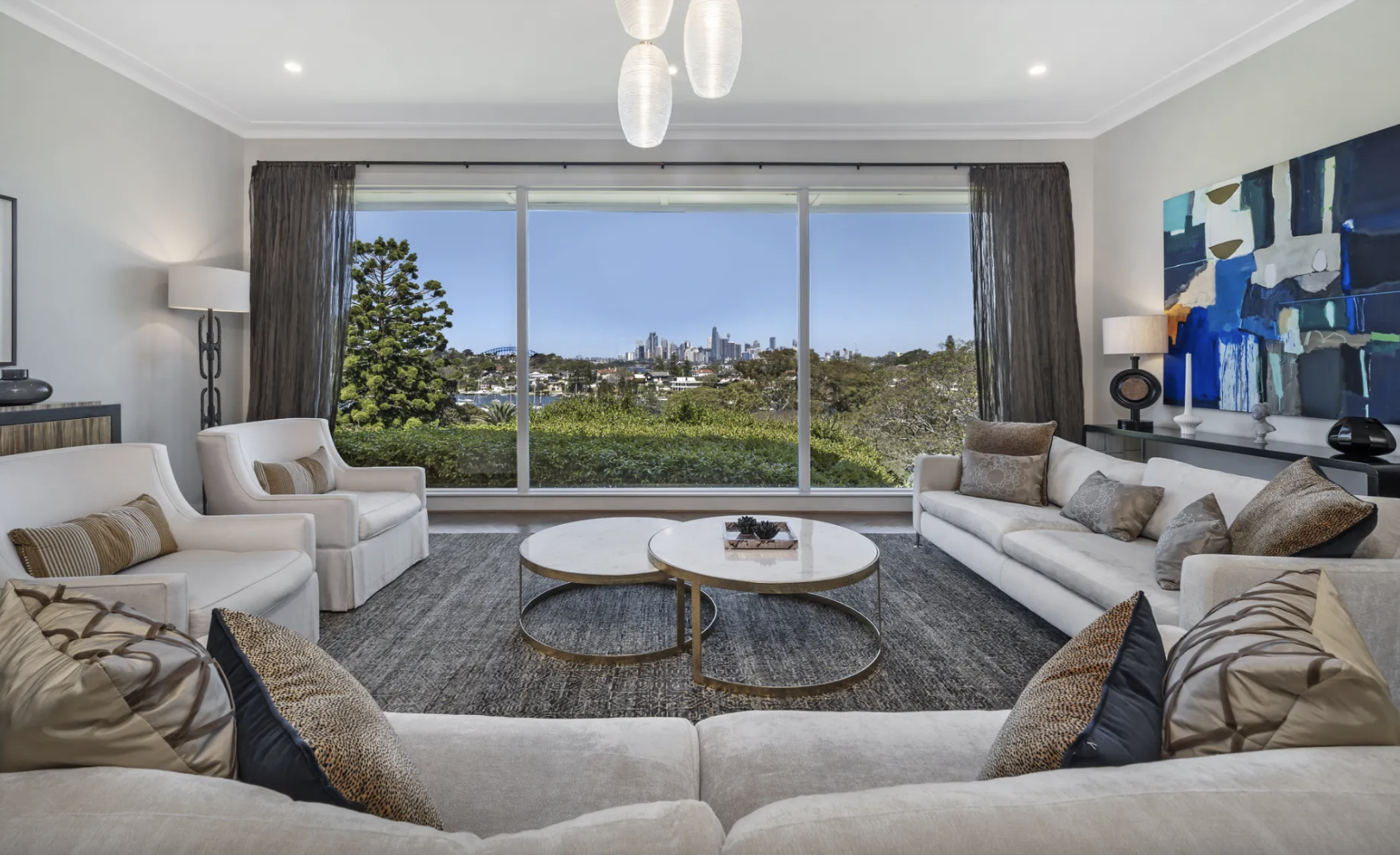
Held by the same family for 26 years, this Harbour Bridge-facing residence at Longueville is the type of property that rarely comes to market. Set on more than 1,100 sqm on one of Sydney’s most tightly held peninsulas, it combines complete privacy with uninterrupted views across the harbour to the city skyline.
It’s the sort of offering where the land is just as important as the home. Positioned directly opposite Aquatic Park with a prized northeast aspect, the residence captures sweeping harbour views from almost every main living space while remaining remarkably secluded from neighbouring properties.
Large picture windows frame the outlook throughout the home, flooding the interiors with natural light and making the harbour the centrepiece of everyday living.
Designed for family living
The home offers multiple living zones, including a formal lounge and dining rooms, a separate family room and an open-plan living and meals area. Blackbutt timber parquetry flooring, high ceilings and ducted reverse-cycle air conditioning feature throughout.
The kitchen sits at the heart of the home, with induction cooking, a generous island bench, and a walk-in pantry, connecting both the formal entertaining areas and the more casual family spaces.
A ground-floor master suite includes a walk-in robe, dressing area and ensuite, while upstairs are three additional bedrooms with built-in robes, together with a spacious home office or study.
The lower ground level adds another layer, with a temperature-controlled cellar and tasting room, plus a flexible gym, wellness or recreation space.
Resort-style setting overlooking Sydney Harbour
Outside, landscaped gardens wrap around a heated swimming pool, an expansive entertaining terrace, and a level lawn, creating a private resort-style setting against the backdrop of Sydney Harbour.
Additional features include a solar system with battery storage, remote lock-up garaging for three vehicles and generous storage throughout.
Beyond the home itself, the location remains one of Longueville’s biggest drawcards. Longueville Ferry Wharf sits around 150 metres away, providing direct access to the CBD while preserving the quiet character of one of Sydney’s most tightly held waterfront suburbs. The property is also within the catchments of Lane Cove Public School and Hunters Hill High School.
Simon Harrison and Kim Walters of Belle Property Lane Cove are marketing the property on a Contact Agent basis.
At a glance
Address: 3 Mary Street, Longueville NSW 2066
Configuration: 4 bedrooms | 3 bathrooms | 3-car garage
Land: Approximately 1,100 sqm
Highlights: Harbour Bridge and city skyline views, northeast aspect, heated pool, cellar, solar with battery storage
Held: First time offered in 26 years
Price: Contact Agent
Agents: Simon Harrison and Kim Walters, Belle Property Lane Cove
This article is produced by the Kanebridge Media editorial team. Property information has been supplied by the listing agent. Buyers should conduct their own due diligence before relying on any information contained in this article. Enquiries: propertyconcierge@kanebridge.com.au.
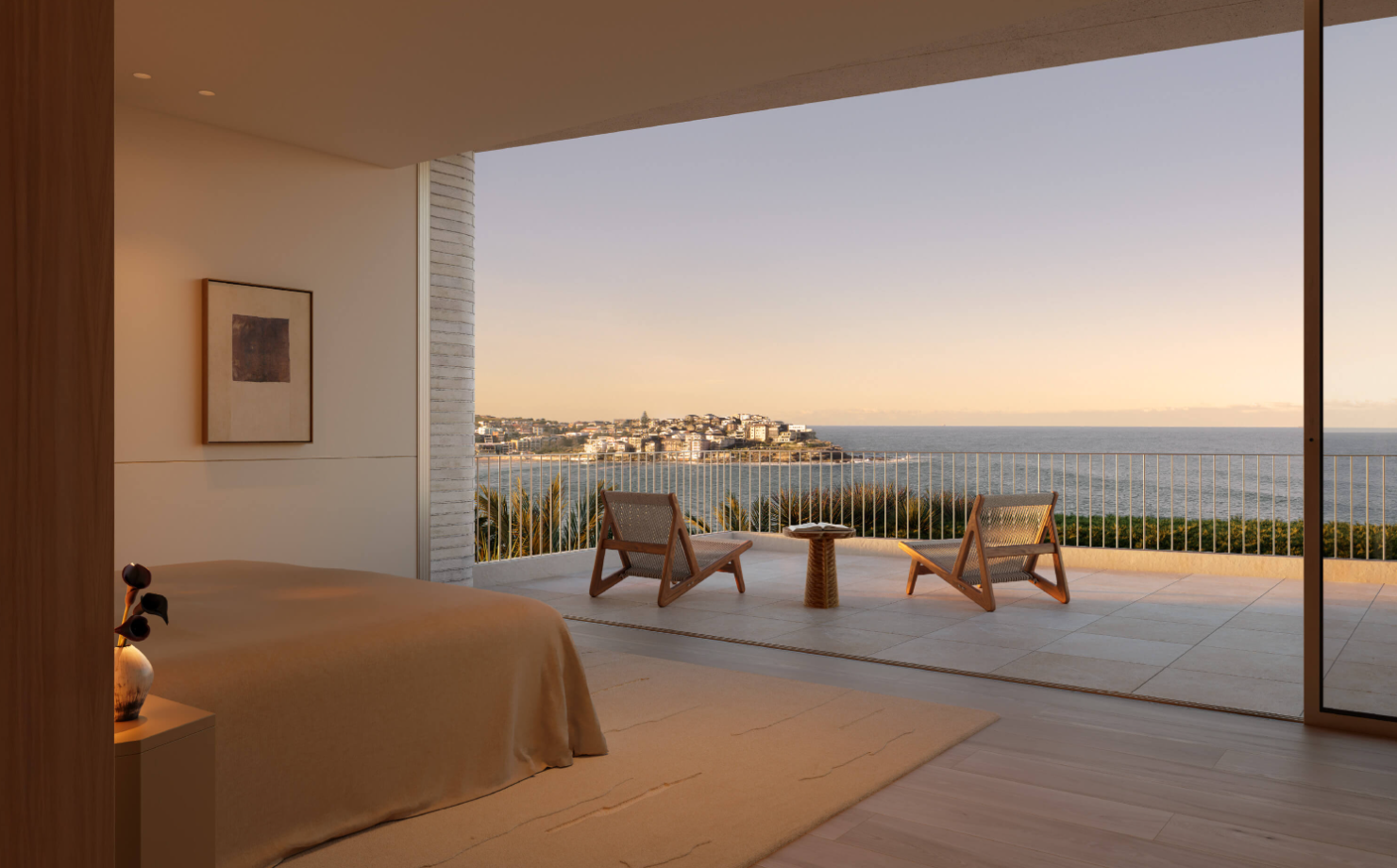
For Central Element, the start of work at Pearl represents another step in the company’s growing eastern suburbs pipeline.

All three vehicles will form part of a broader charitable initiative benefiting Big Brothers Big Sisters of America, the American Red Cross and Starlight Children’s Foundation

Randy Boyagoda’s new novel, “Lords of Serendipity,” delivers a biting satire of cheating, politics and dysfunction across modern universities.
5 min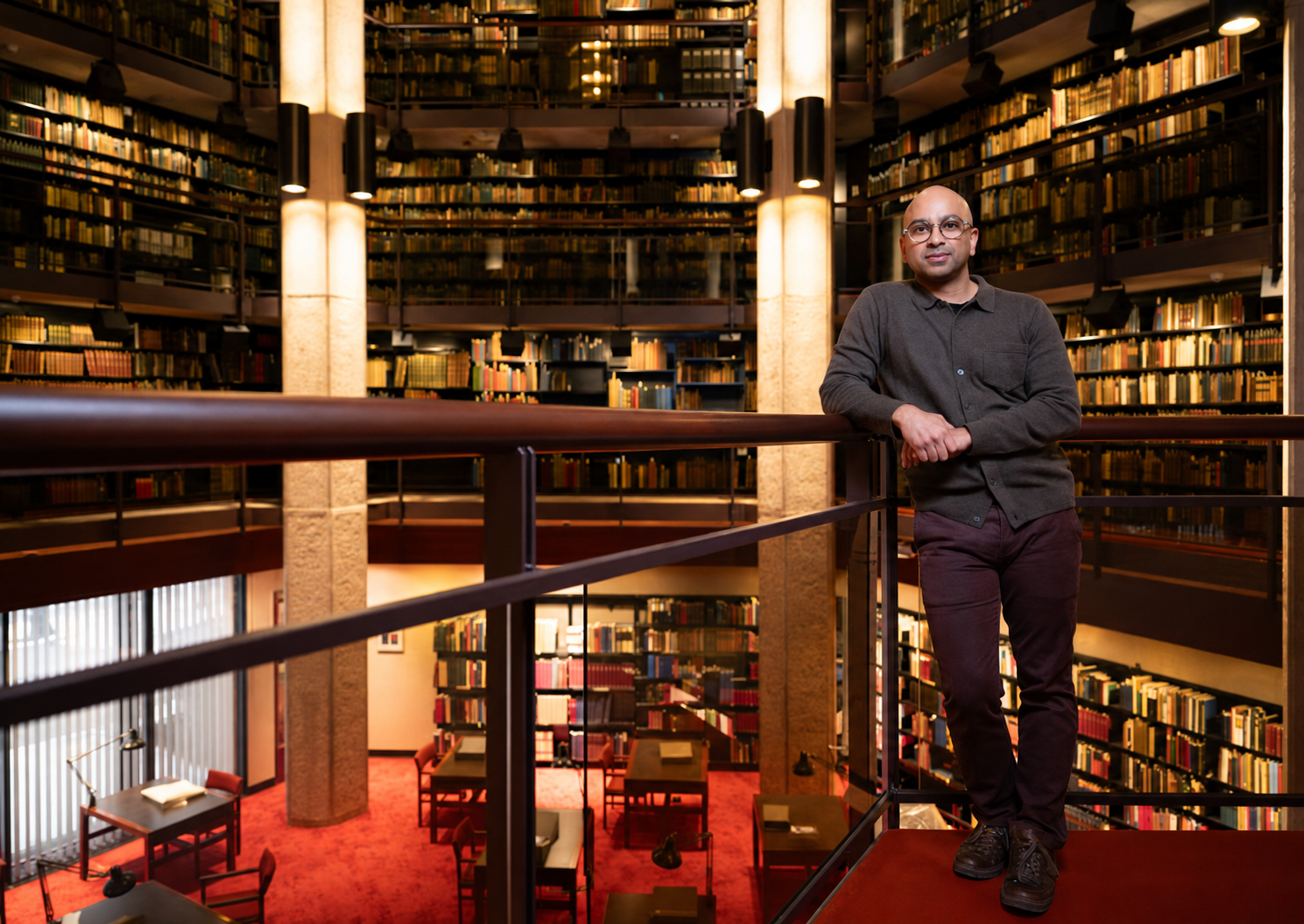
Administrative cowardice. Rampant cheating. The soaking and scamming of undergrads and grad students. Performative wokeism. Intensifying competition for international tuition dollars from an expansive China.
These are either the latest dire headlines about American higher ed or the myriad subplots of “Lords of Serendipity,” an ambitious new novel by Randy Boyagoda. Unlike most campus fiction, its scope extends well beyond the cloister of the liberal arts classroom to whammy the entire university system, from its financial model to its function within a globalized economy. Along the way, it skewers its lightning-rod targets with a precision too sharp to be considered entirely fictional.
That its author is not only well-versed in satire, having written four other novels in the genre, but is also a professor of English at the University of Toronto and an experienced college administrator, further blurs the lines between comic fiction and brutal fact. It’s the kind of no-holds-barred book only a consummate insider would know to write—but only one who is also conveniently outside the American university system could get away with writing.
“This is someone who’s got the inside dope on what can go on at universities, especially with international students, and what kind of con games are going on,” said Margaret Atwood, a friend and fellow Torontonian.
The novel, like Boyagoda himself, is often very funny—even as the dilemmas its characters face read as tragedy. Its cast includes the bickering members of a Sri Lankan hotel cleaner’s family, insecure American freshmen, dead-end third-tier college professors and their highflying Ivy League counterparts and dispirited university functionaries. An old-fashioned Dickensian tale, it sweeps across continents and campuses, from a classic liberal-arts college to a stand-in for Harvard University to an urban technical school to the dilapidated buildings of a state-run university in Sri Lanka.
“I’m a joyful person,” Boyagoda said in an interview, though he prefers to see his outlook on academia as “hopeful” rather than optimistic. He smiles and laughs frequently. He bikes everywhere. He derives energy from his students and from his four daughters, ages 14 to 20. They help him and his American wife, Anna, also an educator, care for Boyagoda’s father, an immigrant from Sri Lanka who has dementia and lives with the family.
The germ of the novel came to Boyagoda during the pandemic, when he was serving as a vice-dean. An urban legend was circulating about a statistics grad student selling passing grades to international students. The cheating scheme itself may well have been apocryphal, but it felt tantalizingly plausible.
“As a novelist, it stayed with me,” Boyagoda said. “Who would sell grades for a stats course? Why would someone buy grades? What’s motivating them? Why wouldn’t the university be doing something about it?” What he didn’t want to do, he explained, was write “another novel about a creative writing professor and his drama with students.”
In addition to writing novels—the first of which was a finalist for Canada’s prestigious Giller Prize; he’s written eight books in total—Boyagoda teaches literature full-time. For his students next semester, kids raised in a purportedly “post-literature era,” he’s assigning three 700-page novels, he noted mischievously, books by George Eliot, Ralph Ellison and Kiran Desai.
On RateMyProfessors, students remark on Boyagoda’s heavy assignments, tough grading and distaste for cellphones, but also hail his “comedy.” When alerted to these reviews, Boyagoda laughed. “Guilty as charged,” he said.
“Randy’s one of those people in academia who is very well educated but doesn’t have an ounce of superiority about him,” said John Irving, who frequently guest lectures in Boyagoda’s classroom. “It’s amazing to see how willing students are to talk in his classrooms, how little afraid they feel of being mocked or put down—he gets complete candor out of them.”
Negotiating competing interests seems to come naturally to him. Like many college campuses, after the Oct. 7 Hamas attack on Israel, the University of Toronto was embroiled in protests, encampments and discord; part of the school’s response was to convene a working group on civil discourse. Boyagoda was put in charge, serving for two years. It’s the kind of thankless task many professors would flee from, but Boyagoda relished the prospect and thinks the group, which is ongoing, made progress.
He has since pivoted to another formidable academic concern: the waning prestige of the humanities. In July, Boyagoda became the director of the Jackman Humanities Institute and special advisor on the humanities to the dean of arts and science. This fall, he is starting a series of gatherings he calls the Dead Book Club. (Dead writers feature heavily among his favorites: St. Augustine, Dante, William Faulkner, Evelyn Waugh, Saul Bellow.)
“The goal is to encourage students to read for its own sake and have conversation for its own sake,” Boyagoda said. “The importance of the humanities will be revealed to those who participate.”
“Lords of Serendipity,” which publishes next week, reflects Boyagoda’s commitment to the pursuit of knowledge: “I’m supposed to say I learn more from my students than they do from me, but no,” Boyagoda said. “I enjoy sharing my excitement and joy about literature and ideas. There are these moments when you are teaching and you can see someone’s face change because they didn’t know something and then they did. That moment when you’re actually watch someone enlarge themselves is deeply satisfying.”
In literary circles, Boyagoda is often referred to as a Catholic novelist, a description he embraces. “A novelist willing to give shape and voice to contemporary religious experience is needed,” Boyagoda said. “I understand myself as a Catholic novelist, provided that I’m not only a Catholic novelist, I’m also a South Asian novelist and I’m a Canadian novelist. I don’t want to be captive to one label.”
His characters, he said, are subjected to what he calls “Graham Greene character situations.”
“They are trying to do good in a fallen world and realize the most they can do is less harm than someone else would do in that same role,” he explained. “They have to accept they are complicit in something that provides some good thing to others. It’s a very Graham Greene way of thinking about sacrifice.”
The campus green they inhabit is a febrile zone in which lofty ideals and cynicism regularly collide. It’s a place where a traditional holiday college celebration is now an occasion for political protest. Kids freely police one another inside and out of the classroom with social media their constant, ready weapon of choice. International students, knowing their family’s financial futures hinge on their degrees, operate in terror of failure and deportation.
Early readers of the book include Gary Shteyngart and Junot Diaz, both of whom have taught at universities and written comic novels. They each contacted Boyagoda midway through to say, in essence, “You nailed it.”
As biting as “Lords of Serendipity” can be, Boyagoda’s faith in higher education remains undaunted.
“It’s absurd that we live in societies that make the decision to take people between the ages of 18 and 22, when they are most physically capable of contributing to our nations and communities, and tell them, ‘Go away for four years, and read and learn and have conversations,’” he said. “I want students to be aware of what an incredible privilege that is.”
Corrections & Amplifications
Randy Boyagoda is a special advisor on the humanities to the dean of arts and science at the University of Toronto. An earlier version of this article incorrectly said he is a special adviser to the dean of humanities. (Corrected on Sept. 2)

New research suggests that bonuses make employees feel more like a mere cog in a wheel.

The Australian leather house has opened an immersive four-day pop-up in Manhattan, unveiling its Bloom Collection and redefining what a product launch can look like.