

The Australian Palette: How Landscape Is Rewriting the Colour Rulebook
From bushland greens to valley reds, the country’s most awarded designers are proving that the best colour palette was never on a swatch card; it was outside the window all along.
 4 min
4 min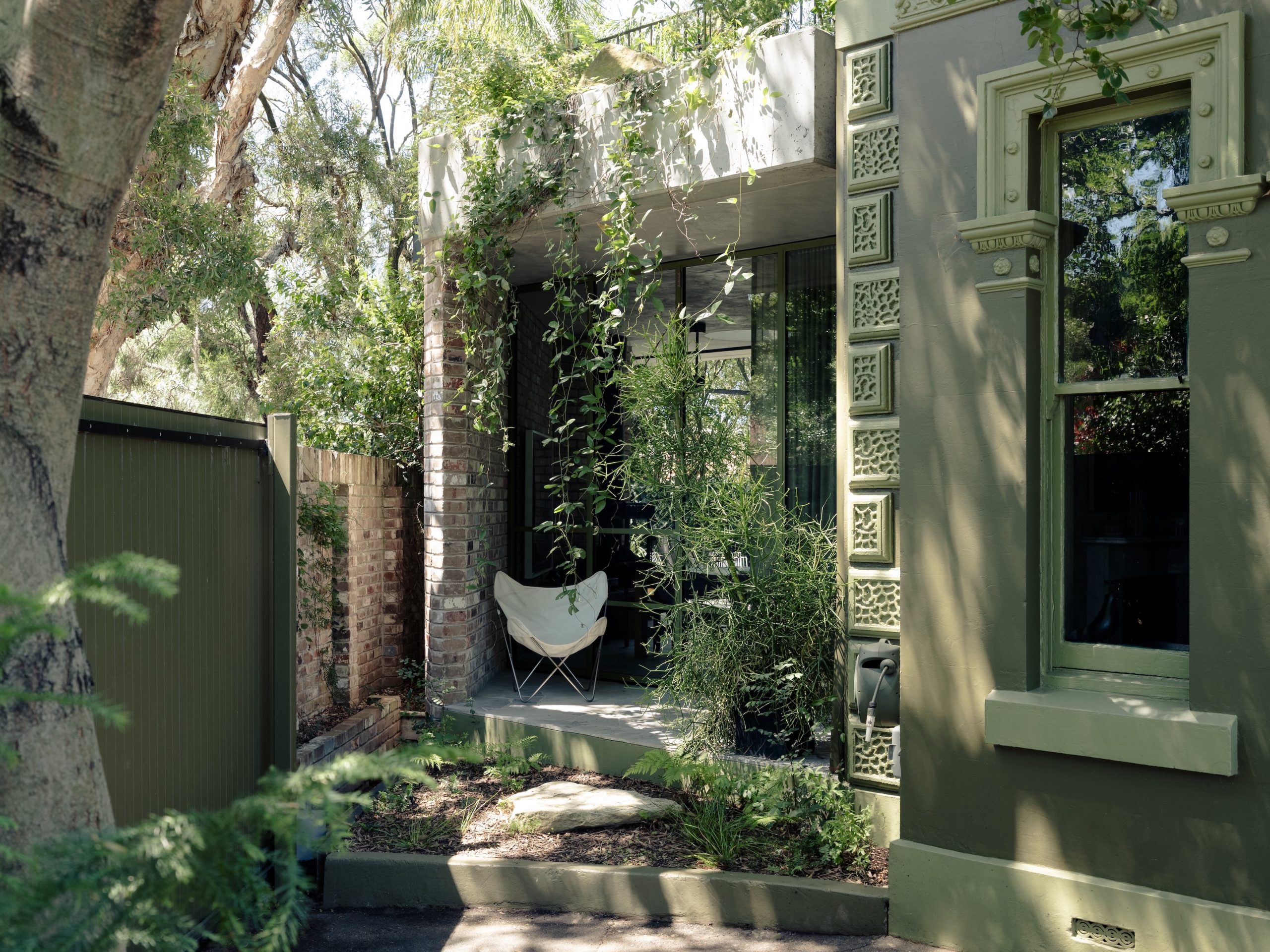
Walk through the Australian bush, and you’ll find a green that no paint chart quite captures. Eucalyptus canopy filtered through dust, heat and distance, grey at the edges, sometimes almost silver, never one fixed shade.
For decades, Australian interiors avoided it for exactly that reason. It was much easier to paint the walls white and look at the landscape.
That is no longer the case. Across this year’s Dulux Colour Awards, the celebrated projects shared an unmistakable thread: colour drawn not from trend forecasts or mood boards, but from the ground the buildings stand on.
Bushland greens, harbour blues, valley reds, coastal aquas are a palette with terroir, if such a thing can be said of paint.
“There’s a strong sense that designers are moving beyond safe, uniform schemes and embracing colours that reflect the local Australian landscape,” says Dulux Colour and Design Manager Lauren Treloar.
She points to greyish greens echoing coastal bushland, cool blues that nod to Sydney’s harbourside light, and rust-toned reds pulled from inland, rural country. “These shades feel rich, earthy and versatile.”
White walls, grey stone, maybe navy if a client was game, that was the old formula. Now colour is being used to describe where a house actually is, not just how it looks.
The house that disappears into its garden
Few projects made that argument more persuasively than Nithsdale, an 1890s villa in Stanmore, restored and extended by Studio Prineas as an intergenerational family home.
Once compromised by decades of unsympathetic renovation, the house has been restored to something like coherence, and colour has done much of the heavy lifting.
Architect Rachel Prineas didn’t stop at a front door or a strip of trim.
She drenched the entire exterior in two deep tones, Dulux Bronze Icon and Tambo Tank, pulling render, timber and ironwork into one chromatic field, lifted straight from the native planting around the house, species indigenous to Wangal Country. The building and its garden start to blur into each other.
Judge Ben Peake, Principal at Carter Williamson Architects, called the result mature and sophisticated, praising the discipline behind it: deliberate selections lifted from the immediate native landscape rather than abstracted from it.
The effect is a house that no longer sits in its garden so much as it recedes into it, camouflage as design strategy, and a quietly radical rebuttal to the idea that heritage colour has to mean caution.
A valley, painted from the inside out
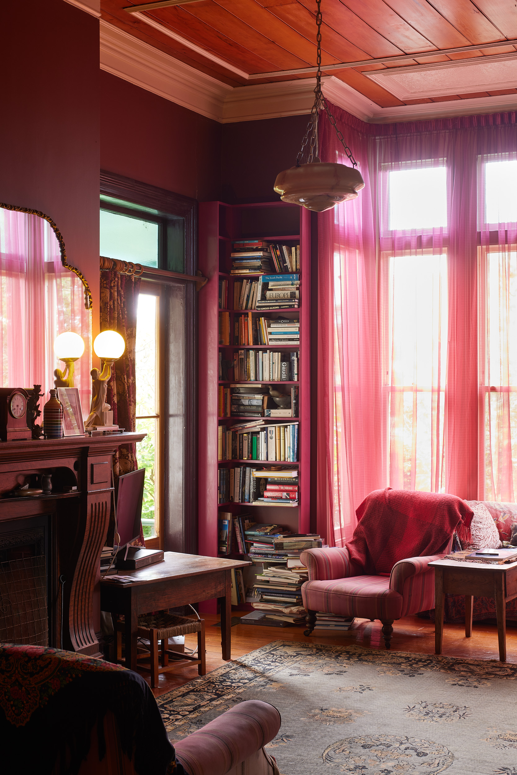
If Nithsdale shows landscape dictating a single, disciplined hue, The View, this year’s Residential Interior winner, designed by Studio Shields in the treetops of the Yarra Valley, shows what happens when an entire palette is built from the shifting conditions of a single place over time.
Seven years, start to finish. The colour scheme evolved right alongside the build, tones tested on site, adjusted through the seasons, checked against the light as it moved across the valley.
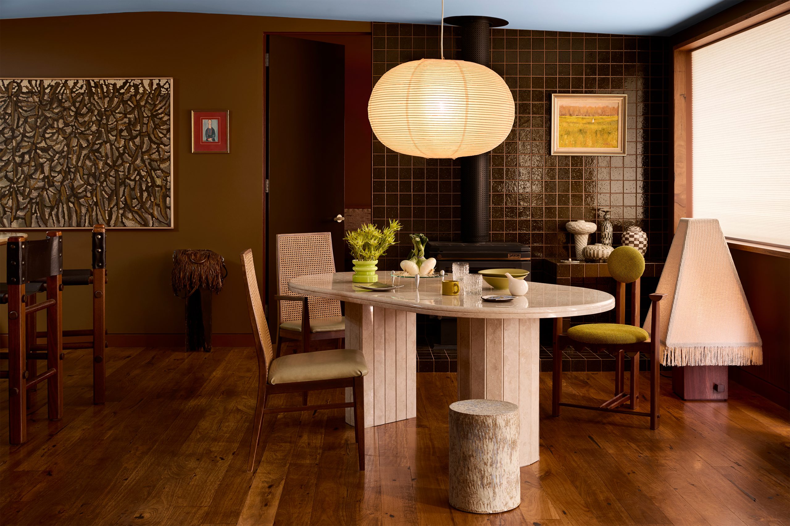
“The palette draws from oxidised earth, eucalyptus canopy, dry grasses and shifting skies, allowing the interior to feel inseparable from the landscape,” says designer Ruby Shields.
Chartreuse and olive pick up the bushland outside the windows. Burgundy and earthy reds anchor the more intimate rooms, echoing soil and aged timber. Powdered electric blues cut through the warmth for clarity.
It is, in Shields’ words, less a single decision than a tonal narrative, unfolding room by room as a considered journey.
Judge Sarah Jane-Pyke, of Arent&Pyke, singled out the precision of that placement, and the cohesion it created, proof, she said, of how thoughtfully deployed colour can enhance the texture of everyday life.
It’s a long way from colour as decoration. Here, it functions closer to memory: a way of encoding a specific valley, its light and its seasons, into the walls of a house.
When the landscape is the coastline
Not every project translating “place” into paint sits in the Australian bush.
Te Pākau Maru, a 63-home development on former brownfield sites in New Brighton, Christchurch, took its name, meaning “the sheltering wing,” or “the place of joy”, from a gift by Ven Dr Lyndon Drake, and built its exterior palette around the beach, sea and sky.
What ties Nithsdale, The View and Te Pākau Maru together isn’t a shared shade; it’s a method.
Each project treats its palette as more of a site survey than a style choice, asking what a place already looks like before deciding how a building should be painted.
Treloar sees this as central to where Australian and New Zealand design is heading.
Warm neutrals are doing particularly well in the Australian climate right now, she says, softening rooms without losing their contemporary edge, and sitting easily next to the timber, linen and stone that anchor so many of these projects. The bigger shift, though, is about provenance. Designers can increasingly tell you why a colour belongs in a house, not just that it looks good in it.
There’s a practical lesson in all this for anyone renovating or building right now: skip the trend report. Step outside instead. Look at the ground, the trees, the light at a particular time of day. Ask what the house is already surrounded by.
As these award-winning projects prove, the answer was often there all along; you just have to be willing to bring it inside.

Porsche’s Cayenne Turbo Electric produces up to 1,156PS and reaches 100km/h in a claimed 2.5 seconds.
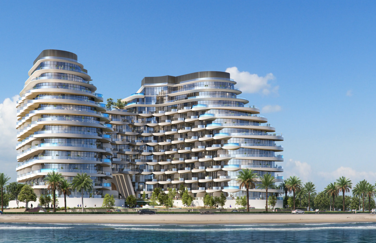
BNW Developments has established a Sydney presence, joining Arada and Sobha Realty among the growing number of UAE developers pursuing Australian buyers and development opportunities.
Dolly Parton’s former Hollywood Hills residence has hit the market for $7.95 million. The nearly 4,700-square-foot home features four bedrooms, panoramic city-to-ocean views, a pool and spa, library, media room and private outdoor spaces.
2 min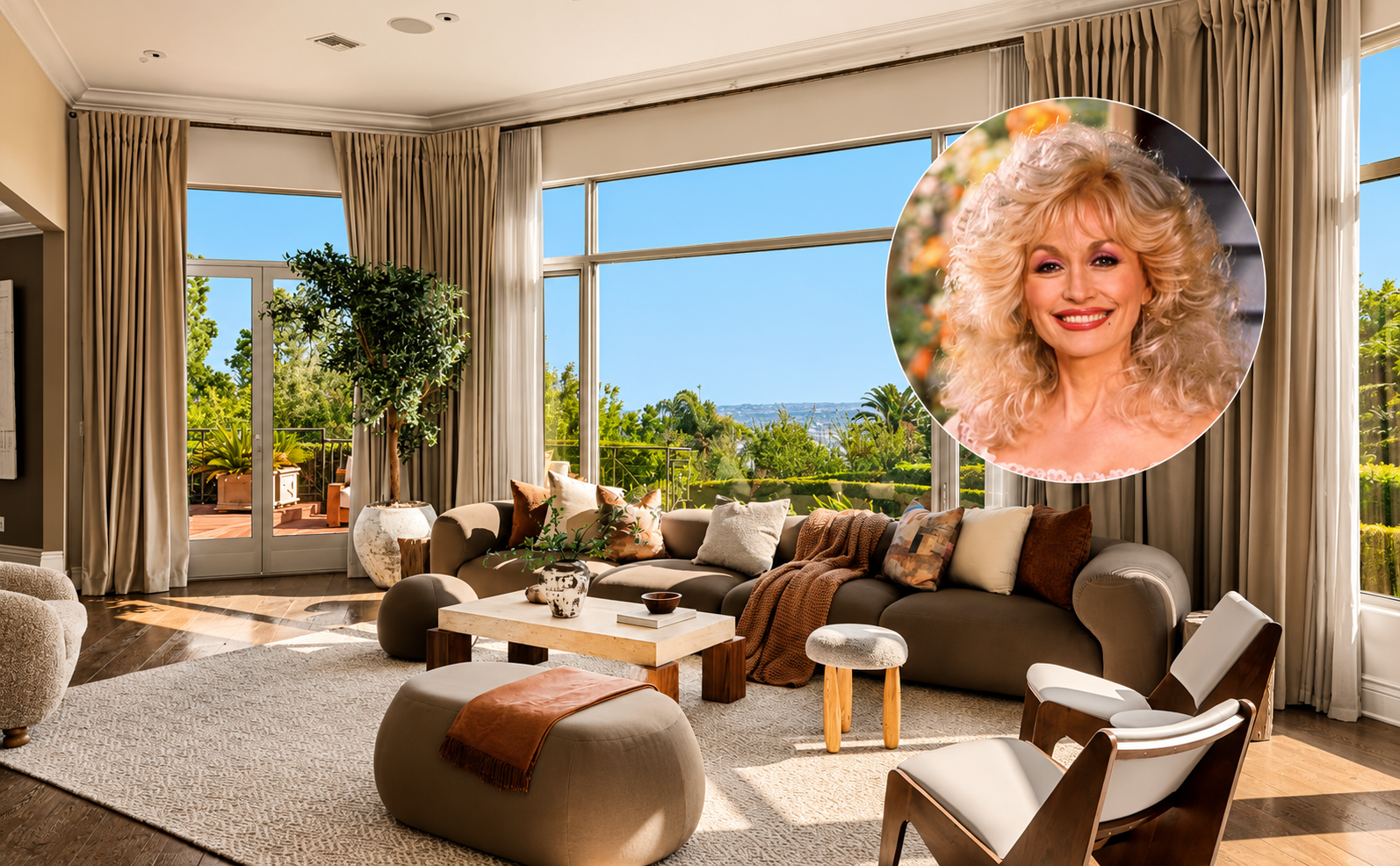
A residence in the Hollywood Hills that was once home to the late Dolly Parton has hit the market for $7.95 million.
The country singer and her late husband, Carl Dean, bought the house in 1985 for $750,000 and sold it in 1990 for $1.2 million, according to listing records.
The property, aptly known as the Dolly Parton House, hasn’t been on the market for 25 years, according to the listing with Edward Tinney of Nourmand & Associates and Kurt Rappaport of Westside Estate Agency.
It’s unlikely Parton and Dean would recognize the house as it stands today though; it was rebuilt in 2009, and upgraded further in the years since, the listing said.
Across its almost 4,700 square feet, the house has living and dining rooms with walls of glass that frame the views that stretch across the city to the Pacific Ocean.
MORE: Flea of the Red Hot Chili Peppers Puts Heptagonal California Home Up for Sale
There’s also a library and media room, a family room and an eat-in kitchen. There are four bedrooms, including the primary suite, which has a coffee bar, a fireplace, two bathrooms, a space for an office or gym, a walk-in closet and a private deck.
Outside, there’s a pool and spa, with space for outdoor dining and entertaining. Plus there’s a two-car garage, electrical infrastructure for an EV charger and a Zen trail, according to the listing.
The seller, who couldn’t be reached for comment, paid $2.05 million for the home in 2001, records with PropertyShark show.
MORE: Tiger Woods’s Mini-Golf Business Partner Lists South Florida Home for $18.5 Million
Parton died on August 25 at the age of 80 after a battle with cancer.
She released 50 studio albums over the course of her career—resulting in 27 gold and platinum albums—and starred in films including “9 to 5,” “The Best Little Whorehouse in Texas” and “Steel Magnolias.”
A philanthropist, she was behind the Imagination Library, which donated more than 200 million books to children around the world. In 2020, she helped fund early research for Moderna’s Covid 19 vaccine with a $1 million donation to Vanderbilt University.

From office parties to NYE fireworks, here are the bottles that deserve pride of place in the ice bucket this season.
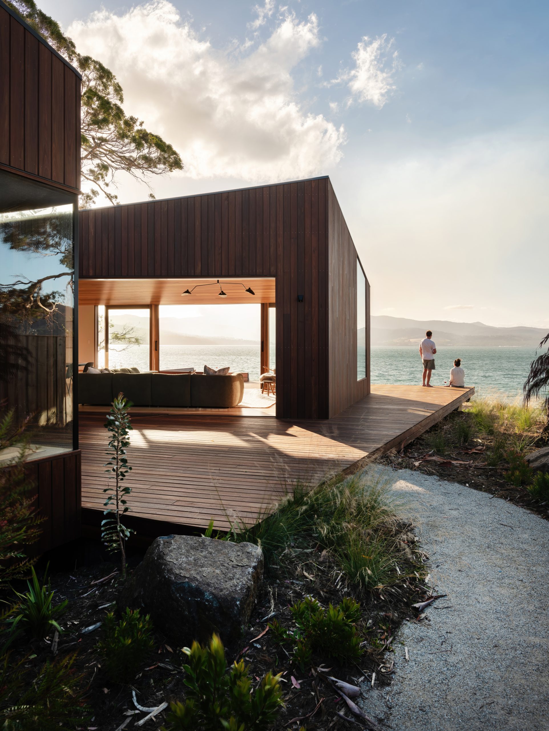
From the shacks of yesterday to the sculptural sanctuaries of today, Australia’s coastal architecture has matured into a global benchmark for design.