


Decorating With Yellow: One of Home Décor’s Hottest Colours in 2025
Whether it’s a soft butter or a rich shade of mustard, the sunny shade is showing its versatility in interior design.

 4 min
4 min
Art enthusiasts may wax poetic about yellow, one of the oldest hues in the history of art. The colour can be seen in some of the world’s most ancient works from Egypt and Rome, and pieces by Gauguin and Van Gogh reveal that these iconic painters were wild about yellow.
Although it may be the lightest hue on the basic colour wheel, yellow’s not the most timid. Sure, yellow can be soft and sweet, but it can also pack a punch. Designer Matthew Boland of MMB Design in Scottsdale, Arizona, praises the hue’s power in interiors.
“Yellow can be soothing or electric; it is a very versatile colour,” Boland said. “The warmth of yellow and the flexibility of yellow make it extremely appealing to all.”
Mansion Global asked Boland and three other interior designers to share suggestions on decorating with the myriad moods of yellow, one of home décor’s hottest colours in 2025.

Coat a Room in Soft Yellow
“Butter yellow is a beautiful soft colour that doesn’t read feminine, which is why you are seeing it pop up on the men’s and women’s runways. It is a colour that is beautiful with all skin tones and reads neutral when paired with other colours. It is warm and inviting while being whisper quiet. undefined undefined “I love red and butter yellow, they are both warm tones and they pair well together. I also like cobalt blue and a great bright green. Turquoise is also extremely complimentary.
“I love yellow drapery, it catches and reflects light beautifully. I love it for outdoor upholstery as it looks amazing with green plants and grass, and I love it in lacquered furnishings because it changes with the light during the day.”
—Matthew Boland, MMB Studio in Scottsdale, Arizona
 `
`
Dust a Room With Yellow Accents
“From butter yellow to citron and canary to goldenrod, this optimistic and cheerful hue lends itself well to interiors and fashion as it ignites a smile and happy mood. The bright yellow in this classic check pattern [pictured] with a white background adds charm to the room.
“Consider adding a pair of yellow velvet pillows to your sofa; a bright yellow throw over your favourite chair, or maybe even just a large bouquet of yellow flowers for your coffee table. (Or try) painting a bathroom cabinet and trim for a fun refresh.”
—Designer Maggie Griffin in Gainesville, Georgia

Balance Bold Yellow With Neutrals Like Grey, Black and Navy
Yellow can be used as an accent colour in just about any single piece of furniture or accessory, or as the focal shade in a space.
“If you use yellow throughout a space or on large surfaces, keep the other colours in the room on the neutral side. It can be difficult to add other shades of yellow or introduce another colour into the space, so keep other furnishings and accessories neutral, allowing the yellow to be the focal point.
“In this room, yellow is the primary colour of the wallpaper, evoking warmth and calm. This yellow wallpaper also reflects natural light, making the room brighter. [Yellow] enhances vintage spaces, such as this older, historic residence, but can also be used in more contemporary designs.
“Grey and white are the primary accent colours because they are subtle, allowing the yellow to shine. But other neutrals, such as black or navy, look beautiful with yellow as well and act as a secondary colour that enhances the yellow tones without taking away from it.”
—Designer Kelley Proxmire in Bethesda, Maryland

Drench a Room in Goldenrod Yellow
“I love using yellow in rooms that need to echo positive energy–– everything from kitchens, laundry and mudrooms, to kid bedrooms and playrooms. Yellow belongs everywhere.
“Pairing yellow with too many bright colours versus balancing it out can make it too loud or overbearing. Use colour theory to ensure balance and harmony with your selections in a space. Examples of this include pairing yellow with its complementary colour, blue (complementary colours are any two colours that are directly opposite each other on the colour wheel) or its analogous colour, orange or green (analogous colours are located next to each other on the colour wheel). Pairing yellow with a colour like red would be more harsh and not as compatible.
“I used this colour, Sherwin-Williams Tassel, in this guest bedroom [pictured] to create a colour-drenched, beautiful oasis that feels like a boutique hotel. We balanced out the bright colours with neutral furnishings and bedding, and bolder colours on the upholstered bed, rug and artwork.”
—Amber Guyton, Blessed Little Bungalow in Atlanta
 Copyright 2020, Dow Jones & Company, Inc. All Rights Reserved Worldwide. LEARN MORE


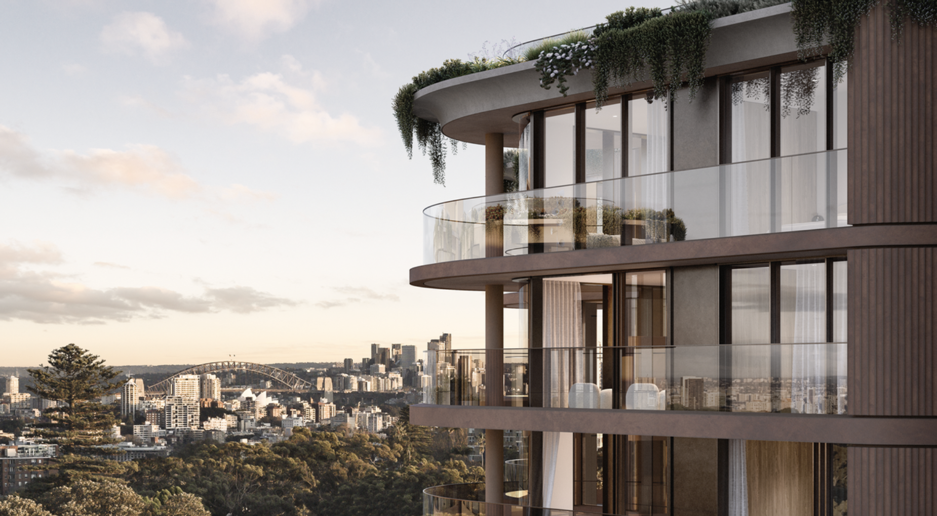
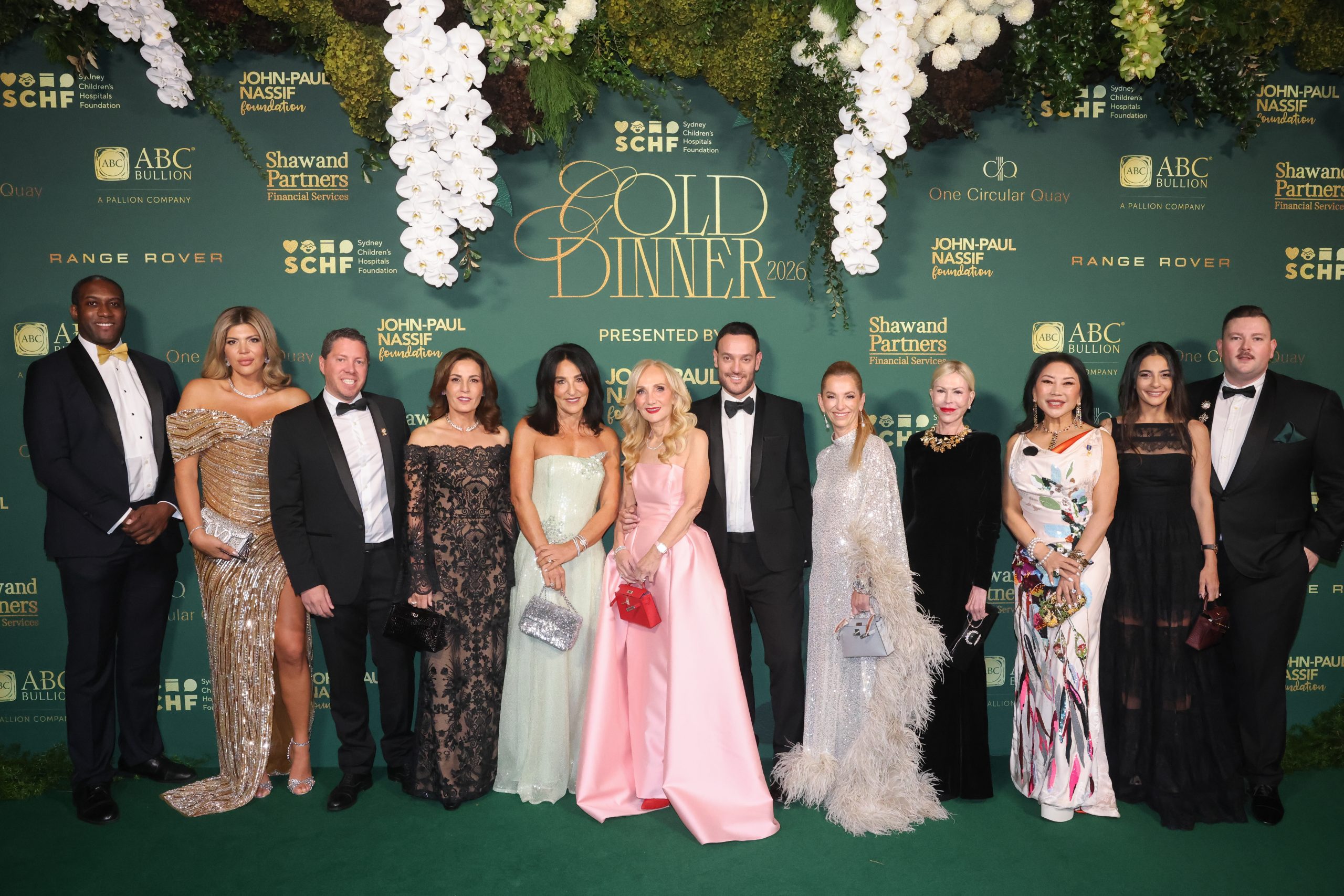
A record-breaking $11 million sale at The Centennial Collection has set a new benchmark for luxury apartment living in Bondi Junction.

As interest rates, inflation and market sentiment fluctuate, investors are being urged to focus on data, not panic.

Police, paramedics, firefighters and the public will walk from Newcastle to Penrith this September for World Suicide Prevention Day.
2 min
NSW schools, gyms, 000 services and the public are being called on to lace up for Steps for the Love of Living, a four-day, 200km walk from Newcastle to Penrith held in honour of World Suicide Prevention Day.
The walk will draw star power as well as solidarity: legendary MMA fighter and former WIBA and WBF world champion boxer Arlene Blencowe, known as “The Aussie Girl ‘Angerfist'” and a respected youth mentor, will join the walk’s final leg from Parramatta to Penrith.
She’ll be joined by five-time Olympian and diving icon Melissa Wu, Ambassador for the Step Into Action Foundation.
The walk runs from September 10 to 13, beginning on World Suicide Prevention Day itself, and starts at Newcastle’s McDonald Jones Stadium before finishing at Penrith Showground.
It’s a joint initiative between The Australian Man Cave Support Group Inc and the Step Into Action Foundation, two organisations working on the frontline of suicide prevention in NSW.
The Australian Man Cave provides a safe, non-judgmental space for men to speak openly, with a focus on reducing the rate of male suicide, while Step Into Action concentrates on youth suicide prevention through resilience-building and early-intervention programs.
This year’s event also features a friendly inter-service challenge between NSW Police, NSW Ambulance, Fire & Rescue NSW, SES, Surf Life Saving NSW and the Rural Fire Service, who’ll compete to walk the furthest and raise the most for suicide-prevention initiatives.
“This walk is about hope, connection, and standing together,” said Lou Greco, President and Co-Founder of The Australian Man Cave Support Group Inc. “Every step taken is a step toward saving a life.”
Leading the charge is Chris Barton, Founder of the Step Into Action Foundation and a long-distance walking adventurer, who is taking on the full 200km route.
He’ll be joined for part of the way by the “Bakery Brothers”, Tyson Pedro and Rama Pattison, who are trading in punches and pastries for kilometres, walking the full distance alongside Chris.
How to get involved
The event is open to everyone, not just those able to walk the full distance. Participants can:
- Walk the full 200km from Newcastle to Penrith
- Join for a single day or section of the route
- Take part virtually from anywhere in Australia — at school, the gym, work or in the local community, logging kilometres through walking, running, rowing, cycling or treadmill sessions
000 services can enter as teams for the inter-service challenge, and schools and gyms are encouraged to form their own teams to complete the distance collectively.
Funds raised will go towards mental health first aid training, crisis response support, community outreach programs, support services for at-risk men and families, and youth suicide awareness and prevention programs.
Suicide remains one of the leading causes of death among Australian men and young people. Both organisations say the walk is about ensuring no one feels alone in their struggle.
To register or find out more, visit stepsforloveofliving.com.au.
This is a sensitive topic. If this raises any issues for you, Lifeline is available on 13 11 14.

Here’s how they are looking at artificial intelligence, interest rates and economic pressures.
International AI strategist Justin Kabbani will headline the Kanebridge Property Summit in Sydney on June 18, with tickets selling fast.