


The Workers Opting to Retire Instead of Taking on AI
Their careers spanned the personal computing, internet and smartphone waves. But some older workers see AI’s arrival as the cue to exit.

 4 min
4 min
Luke Michel has already lived through two technology overhauls in his career, first desktop publishing in the 1980s and online publishing later on. But AI? He’s had enough.
So when his employer, the Dana-Farber Cancer Institute, made an early-retirement offer to some staff last year, the 68-year-old content strategist decided to speed up his exit. Before, he had expected to work a couple more years.
“The time and energy you have to devote to learning a whole new vocabulary and a whole new skill set, it wasn’t worth it,” he said.
It isn’t that he’s shunning artificial intelligence—he is learning Spanish with the help of Anthropic’s Claude. But, at this point, he’s less than eager to endure all the ways the technology promises to upend work.
“I just want to use it for my own purposes and not someone else’s,” he said.
After rising for decades and then hovering around 40% in the 2010s, the share of Americans over 55 years old in the workforce has slipped to 37.2%, the lowest level in more than 20 years.
The financial cushion of rising home equity and stock-market returns is driving some of the decline, economists and retirement advisers say.
But for some older professionals, money is only part of the equation.
They say they don’t want to spend the last years of their career going through the tumult of AI adoption, which has brought new tools, new expectations and a lot of uncertainty.
Many people retire when key elements of their work lives are disrupted at once, said Robert Laura , co-founder of the Retirement Coaches Association and an expert on the psychology of retirement.
“Maybe their autonomy is being challenged or changed, their friends are leaving the workplace, or they disagree with the company’s direction,” he said.
“When two or three of these things show up, that’s when people start to opt out.”
“AI is a big one,” he adds. “It disrupts their autonomy, their professionalism.”
Michel, whose work required overseeing and strategizing on website content, has been here before.
When desktop publishing arrived in the 1980s, he was a graphic designer using triangles and rubber cement.
The internet’s arrival changed everything again. Both developments required new skills, and he was energized by the challenge of learning alongside colleagues and peers.
It felt different this time around. “Your battery doesn’t hold a charge as long as it used to,” he said.
He would rather spend his energy volunteering, making art, going to operas and chairing the Council on Aging in North Andover, Mass., where he lives.
In an AARP survey last summer of 5,000 people 50 and over, 25% of those who planned to retire sooner than expected counted work stress and burnout as factors.
About half of those retired said they had left work at least partly because they had the financial security to do so.
In general, older Americans are less likely than younger counterparts to use AI, research shows.
About 30% of people from ages 30 to 49 said they used ChatGPT on the job, nearly double the share of those 50 and older, according to a 2025 Pew Research Center survey of more than 5,000 adults.
Baby boomers and members of Generation X also experienced the sharpest declines in confidence using AI technology, according to a ManpowerGroup survey of more than 13,900 workers in 19 countries.
“We as employers aren’t doing a good enough job saying (to older workers), we value the skills that you already have, so much so that we want to invest in you to help you do your job better,” says Becky Frankiewicz , ManpowerGroup’s chief strategy officer.
Jennifer Kerns’s misgivings about AI contributed to her departure last month from GitHub, where the 60-year-old worked as a program manager.
Coming from a family of artists, she said, it offends her that AI models train on the creative work of people who aren’t compensated for their intellectual property. And she worries about AI’s effect on people’s critical-thinking skills.
So she was dismayed when GitHub, a Microsoft-owned hosting service for software projects, began investing heavily in AI products and expecting employees to incorporate AI into much of their work. In employee-engagement surveys, the company had begun asking them to rate their AI usage on a scale of 1 to 5.
When it came time to write reports and reviews, colleagues would suggest that she use ChatGPT.
“I’d be like, ‘I have no idea how to use that and I have no interest in using AI to write anything for me,’” she said.
It would have been more prudent to work until she was closer to Medicare eligibility, she said. But by waiting until her children were out of college and some of her stock grants had vested, the math worked.
Her first act as a nonworking person: a solo trip to Scotland, where she took a darning workshop and learned how to repair sweaters.
“The opposite of AI,” she said.
Employers already under pressure to cut workers—such as in the tech industry—may welcome some of these retirements, said Gad Levanon , chief economist at Burning Glass Institute, which studies labor-market data.
“The more people retire, the fewer they have to let go,” he said.
Some of the savviest tech users are also balking at sticking around for the AI upheaval. Terry Grimm, who worked in IT for 40 years, retired from his senior software consultant role at 65 last May.
His firm had just been acquired by a bigger firm, which meant learning and integrating the parent company’s AI and other tech tools into his work.
Until then, Grimm expected he might work a couple more years, though he felt that he probably had enough saved to retire.
“I just got to the point where I was spending 40 hours at work and then 20 hours training and studying,” said Grimm, who has since moved with his wife from the Dallas area to a housing development on a golf course in El Dorado, Ark.
“I’m like, ‘I’ll let the younger guys do this.’”
 Copyright 2020, Dow Jones & Company, Inc. All Rights Reserved Worldwide. LEARN MORE


Rugged coastal drives and fireside drams define a slow, indulgent journey through Scotland’s far north.

Two coming 2027 models – the first of the “Neue Klasse” cars coming to the U.S. early next year – have been revealed.

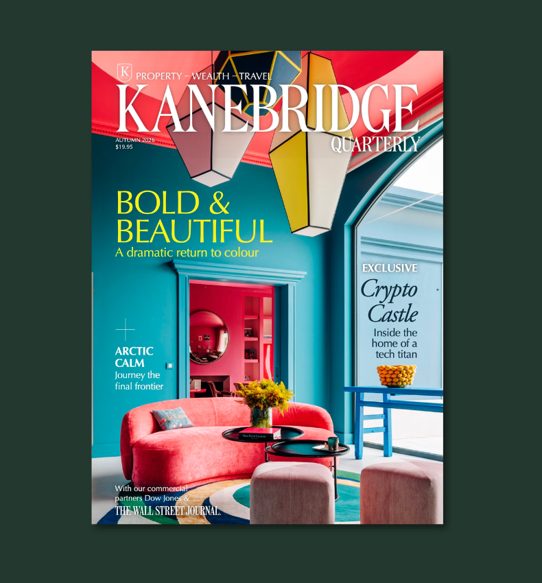
The beige era is fading. In its place, luxury homes are rediscovering the confidence to use deeper colour, layered emotion and bold palettes.
8 min
For almost a decade, interiors whispered. Minimalism took over, neutral palettes dominated, and many homes drifted into a safe sameness built from beige, cream and careful restraint.
But something has shifted. As the world becomes more chaotic, homeowners are leaning toward spaces that offer warmth, optimism and personality.
Colour has returned to luxury design because it delivers exactly that, but in a considered, modern way, far from the brash maximalism of the 2010s or the timid pastels of the early pandemic years.
The new wave is thoughtful, layered and emotionally led, a resurgence shaped by a desire to feel grounded in our own space.
From Sydney to Melbourne, Atlanta to Toronto and Portugal, colour is back with conviction.
Why Colour Matters
Major global paint houses see the shift clearly. Warm earth tones and gentle pastels are now sitting comfortably beside deeper colours like burnt orange, moss green, berry shades and vintage rose.
Forecasts suggest a swing back to expressive palettes shaped by nostalgia, slower living and a renewed pull toward nature.
This shift reflects what people are living through: rising costs, global tension, digital overload and plain old burnout. People want comfort, a sense of connection and something that lifts the mood. Designers are responding with palettes that feel warm, grounded and human.
Colour is no longer about trends, but about emotional resonance.
Lauren Treloar, Dulux Colour and Design Manager, says homes are increasingly becoming “canvases of personal storytelling.”
She notes a growing willingness to use colour to bring “energy, joy and personal character throughout the space,” driven by the desire for warmth, individuality and emotional connection.
The broader colour movement is also reflected in the 2026 Dulux Colour Forecast, distilled into three palettes: Ethereal, Elemental and Evoke.
Together they champion warm earth-based neutrals, rich burnt oranges, caramels, sage, moss and spearmint greens, alongside soft pinks, vintage rose tones and muted berries. One of the strongest shifts, Treloar says, is the rise of spearmint green, which pairs effortlessly with earthy pinks, browns and burgundies.
Sydney’s Coastal Blues
In one Sydney penthouse, the shift towards colour begins with quiet confidence. Soft aqua and Mediterranean blues wind through the kitchen, living and bathroom in a way that feels serene rather than showy.
The goal, says Nathalie Scipioni, principal architect and director of Nathalie Scipioni Architects, was to unify what had once been a disconnected, boxed-in layout.
“My aim was to open up what had been a closed, disconnected layout and create a home where the kitchen, living and dining areas feel connected and calm,” she says.
“I used one feature colour (blue) to tie the spaces together, applying it in different ways so it feels consistent but not repetitive.”
The palette works because it’s balanced with soft greys, pale timber, brushed brass and plenty of texture.
“I controlled saturation by choosing muted shades and finishes with texture. I used pale timber, brushed gold and soft greys so the blue stands out without overpowering the overall sense of calm,” she says.
Even so, Australia is still colour-cautious.
“I don’t see bold colour making a major return in Australia just yet,” she says. “The market still leans towards neutrals… clients are hesitant to embrace colour because they don’t see it used around them. It is not part of the visual landscape in the same way it is Europe.”
Yet she sees her work as a quiet education, showing that colour can be gentle, refined and deeply personal.
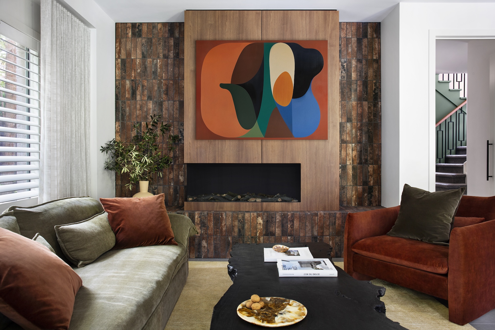
Earthy Depth
Further south, another family home takes colour in an entirely different direction. Here, deep greens, walnut timber, brushed brass, mustard, rust and black stone fill the rooms with a rich, tactile warmth.
The brief was clear: no more beige.
“The brief was to completely move away from the beige and neutral tones that once defined the home and to reintroduce personality through a palette that felt both sophisticated and nurturing,” says Richard Misso, creative director of The Stylesmiths.
“Deep greens and walnut were chosen for their connection to nature… Brushed brass details added warmth and subtle reflection.”
In the living area, an artwork becomes the anchor that unites rust armchairs, an olive sofa, terracotta tones and black stone.
“A multi-tone palette like this works when each hue earns its place and connects through tone rather than saturation,” he explains.
“Texture plays an equal role to colour… creating variation and visual rhythm without overwhelming the eye.”
What’s ahead?
“Bold colour is already making its return, but in a more refined, tonal way… It’s less about maximalism and more about authenticity through colour.”
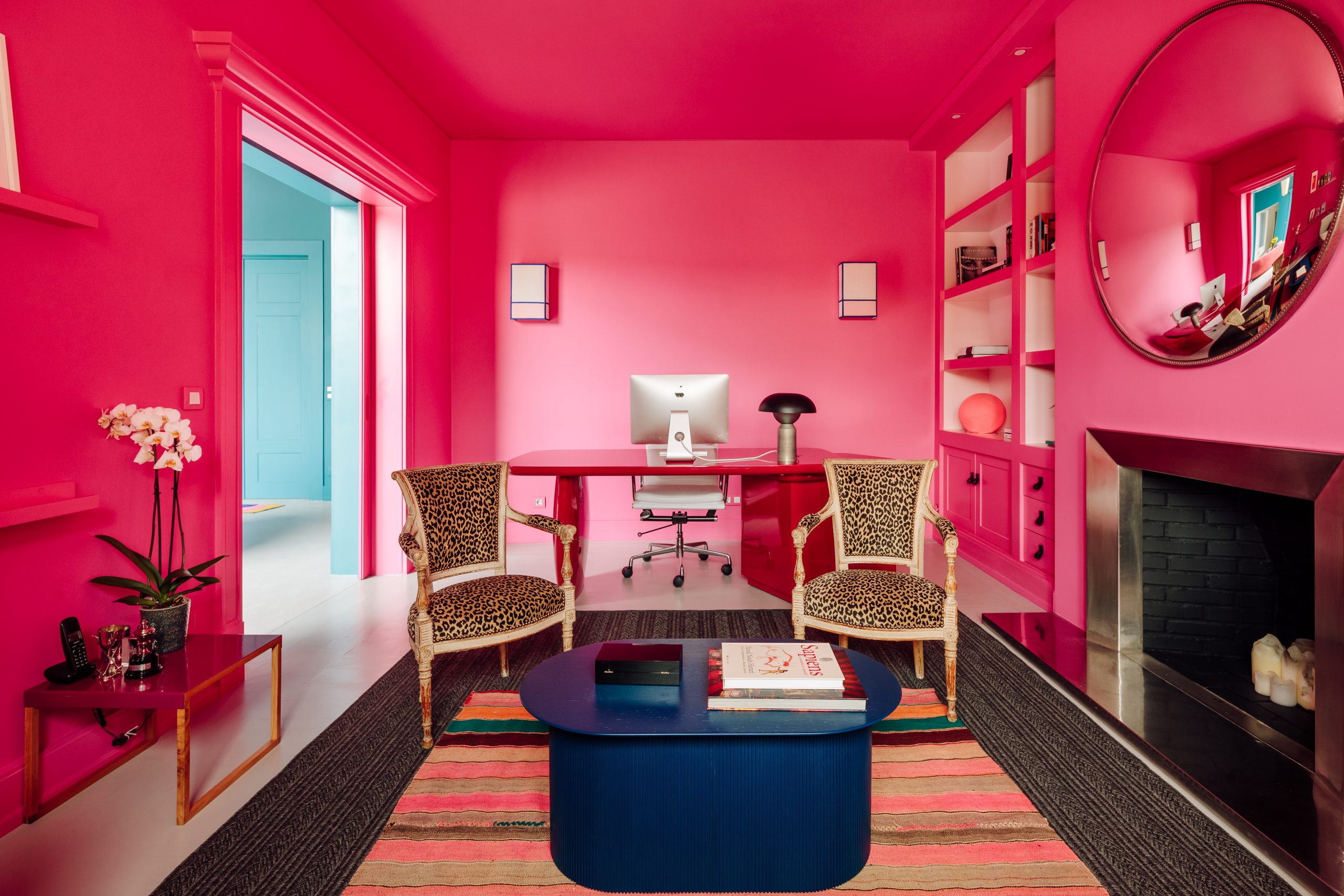
The American Case
Across the Pacific, a roughly 930-square-metre manor near Atlanta champions a cinematic approach to colour, says Seth van den Bergh, principal designer at The Drawing Room.
Long architectural sightlines demanded strong punctuation points, bold red moments, black walls, saturated accents and warm neutrals.
“At Milton Manor, the palette was built around rhythm and a restrained use of colour,” van den Bergh says.
“Boldness only works when it is balanced with restraint… the ‘fearless palette’ gains its strength from warm neutrals, white painted wood floors and a thoughtful use of colours and objects.
These elements allow the saturated gestures to feel intentional rather than overwhelming. It is that balance that lets the home breathe.”
Even the black walls are handled with precision.
“We layered the surfaces and filled the negative space with related tones… the key is to treat black as a finish rather than a colour,” he says.
For those scared to commit, he recommends beginning with emotion, studying the light, understanding the room’s vistas, then editing to one clear direction.
“Think of it like a film. You would not have all your lead characters speaking at once, so let the room have one clear voice to follow,” van den Bergh says.
For homeowners nervous about bold shades, Treloar suggests starting with how a space should feel and introducing colour slowly through architectural details or textures. Moodboards and real paint samples remainessential.
“Colour can change substantially in different lighting or when colour from other furnishings reflects on the wall,” she says. “It’s all about experimentation and allowing your personal style to evolve.”
Playful Confidence in Toronto
In a Toronto condo belonging to actress Amalia Williamson, colour takes on a joyful, youthful energy.
The space started as a blank, characterless developer shell. With a careful mix of custom cabinetry and budget retail pieces, the palette evolved into a vibrant blend of navy, blush, gentle greens, bold orange and saturated green.
Crucially, the bold accents came last.
“We actually selected those accents at the very end,” designer Isabel Clune of Isabel Clune Design says. “The foundation of the room was already rich with colour but in a soft, muted way.
The saturated green pendants and bold orange stools became the perfect counterbalance… It’s a controlled pop, not a swing into ultra-maximalism.”
Even the surfaces balance practicality with beauty.
“I always design with equal consideration for function and beauty… Marble can be refinished, it’s naturally heat-resistant… its subtle imperfections and patina add character over time.”
The embossed tile was chosen purely for its visual impact, with marble behind the stove for everyday practicality.
It proves colour doesn’t require huge budgets – just intentionality.
Colour Me Happy
Colour at Portugal’s Viterbo Interior Design begins with feeling, not pigment. As Gracinha Viterbo and Miguel Vieira da Rocha explain, “we never begin by selecting colours, we begin by talking about how people live.”
The team worked with the family to map the emotional temperature of each room, asking what mood each part of the home should hold: where they should feel energised, where they should slow down, where they should decompress and where they should gather with others.
The palette grew out of that emotional map, refined on site with large samples and fabrics at different hours of the day so that each hue produced the exact feeling the family wanted.
The home’s bold moments never spill into chaos because strict principles anchor the palette.
“Each room was given one strong chromatic gesture – never two,” the designers say, ensuring character without competition.
A restrained architectural backdrop and a tight family of colours allowed tones to reappear through the house in different intensities, creating continuity.
The result is a home that feels expressive and dynamic, yet the flow is seamless.
19th Century Revival
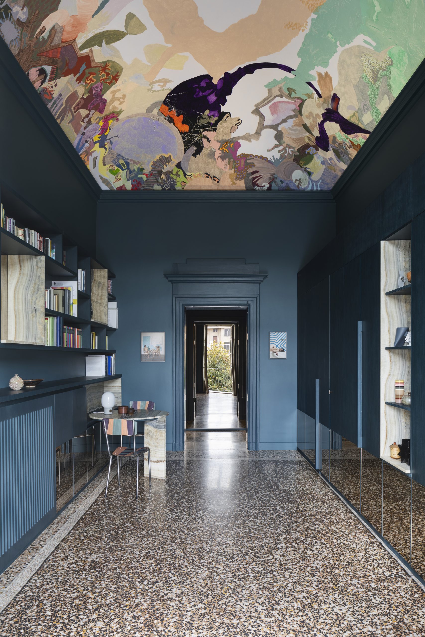
In Turin, colour becomes a bridge between eras. A 19th-century apartment restored by BRH+ Studio has been reimagined as a dialogue between heritage architecture and a vivid contemporary art collection.
Nowhere is that tension more captivating than in the entryway, where deep octanium walls and a site-specific fresco ignite a striking conversation between past and present.
Victoria Stoian’s fresco transforms the vaulted ceiling into an imagined sky, drawing the eye upward the moment visitors enter the apartment and signalling that this is a home shaped as much by art and narrative as by architecture.
BRH+ Studio treat colour not as decoration but as architecture, using it to connect the original terrazzo floors with new interventions and give the apartment a cohesive rhythm.
BRH+ on Colour and Heritage
For architects Barbara Brondi and Marco Rainò, founders of BRH+Q, the entrance to the Turin apartment was conceived as more than a hallway.
“The entrance to an apartment can be understood not only as the threshold to private living spaces, but also as a symbolically charged environment where the personality of the inhabitant can be expressed,” they explain.
In this case, the space was designed to reveal the owners’ passion for contemporary art while connecting that sensibility with the building’s nineteenth-century architecture.
The large tempera fresco by Moldovan artist Victoria Stoian transforms the vaulted ceiling into an imaginary landscape suspended between past and present. At the same time, the deep chromatic treatment of the walls connects visually with the apartment’s terrazzo flooring, creating a dialogue between decorative surfaces.
For Brondi and Rainò, the key to working within historic buildings is restraint. Every project begins with a close study of the context so that new interventions complement rather than overwhelm the architecture.
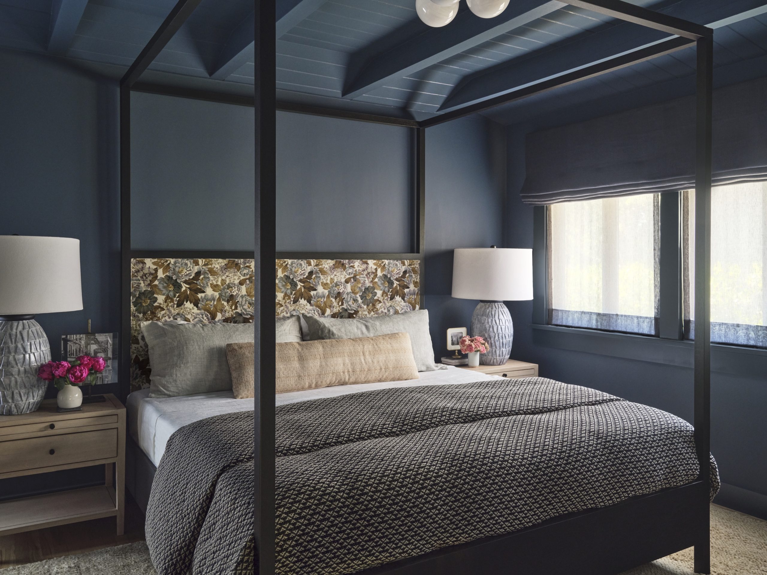
Pasadena: A Cocoon of Blue
In Pasadena, a second-floor bedroom suite became the perfect test case for how far colour can transform a small space when used with conviction.
The room sits apart from the home’s communal areas, giving interior designer Jennifer Vaquero of September Workshop the freedom to create a space centred entirely around her client’s favourite hue.
“While we loved the idea of creating a relaxing and serene space, it was equally important that the rooms also feel energetic and joyful,” she says.
Warm accents, reflective textures and subtle sheen in the window sheers ensure the deep blue palette never feels flat.
“When that light bounces off the golden and purple hues in the marble or the warm woods, the whole suite seems to come alive.”
Where Colour Is Heading
Across continents, a consistent story emerges. Colour is returning not as trend but as therapy, craftsmanship and identity.
Homes no longer want to whisper. They want to reflect the lives within them, joyful, complex, grounded and expressive.
Design is shifting from minimalism to meaning. From quiet to considered. From safe to soulful.
The new colour confidence isn’t loud or chaotic. It’s intentional, emotional and human, and one of the most powerful tools in luxury design.
This article appeared in the Autumn 26 issue of Kanebridge Quarterly, which you can buy here.

From the Caribbean to Australia’s east coast, Oyster’s latest world rally promises a bluewater voyage designed for owners seeking ultimate sailing experiences.

Warmer minimalism, tactile materials and wellness focused layouts are redefining luxury interiors as homeowners design for comfort, connection and lasting appeal.