


The young Sydney designer banishing beige
Jewel-like colours add depth and personality to this architect-designed inner city apartment
 4 min
4 min
T here are people who enjoy living in gallery-inspired, zen-like spaces in shades of antique white and linen finished with layers of soft grey and beige materials.
And then there’s Nic Kaiko.
The young interior designer burst onto the Sydney market more than a decade ago with a thirst for colour and a love of ‘dynamic eclecticism’, a style he describes as a mix of contemporary and timeless design. Since then, he has created his own signature style based on rich colour skilfully imbued with pattern, working across residential and hotel environments.
But despite his experience in hospitality and hotel interior design, when he had the opportunity to create his own space to call home in Sydney’s Waterloo, Kaiko paused.
“Working for myself, I knew I could be a little more flexible but it’s tricky being your own client,” he said. “You can’t just pick up things you like and hope they work together. There needs to be a rationale behind your choices. You can’t have too many ideas.”
Want more stories like this? Subscribe to Kanebridge Quarterly magazine here.
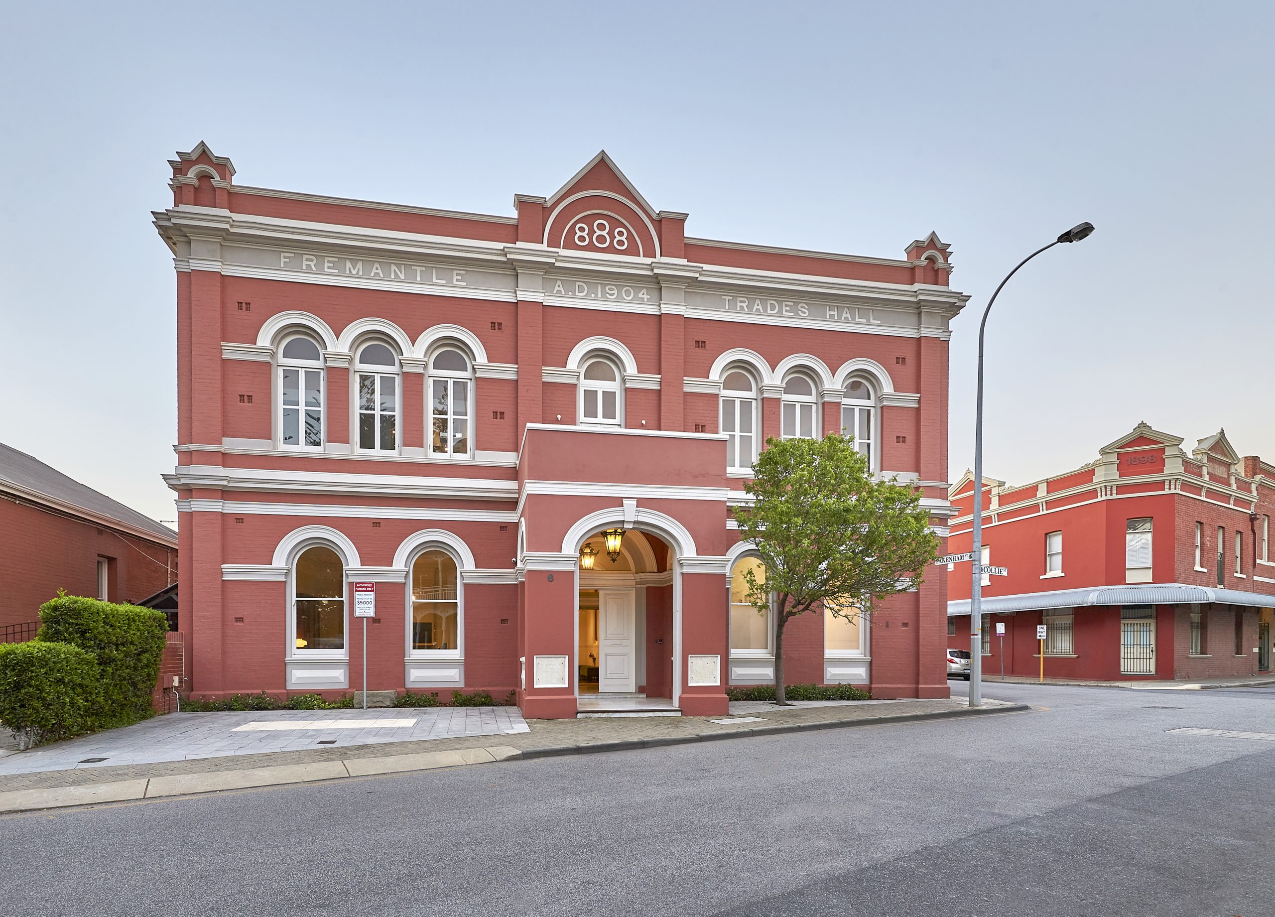
Kaiko had wanted to buy into the Casba building in Waterloo’s Danks Street precinct since it opened almost 10 years ago. A collaboration between architects BLP and SJB, and interior designers BKH, the building is defined by its access to two parallel streets, linked by a central courtyard with a reflection pool at its heart. At street level, it is host to a suite of high end retailers, including the new Winnings Appliances showroom, now also home to Spence & Lyda and Rogerseller, in the heart of the popular food and art precinct.
“It has beautiful public spaces and it was really activated on the ground floor,” Kaiko says. “The architecture and build was really high quality.”
Apartments were well thought out, with careful consideration given to light, ventilation and the natural flow between spaces. After securing an apartment in the building, he set to work. Because the execution of the design and build was so well done, Kaiko says there was not a lot that needed to change with the floorplan.
“The layout is perfect,” he says. “The bedrooms face east and the two bathrooms and the kitchen are really well planned. In terms of adjustments, which is tricky in apartments, it wasn’t necessary.”
Taking inspiration from the silver travertine floor tiles and drawing on his experience in hotel design, Kaiko opted to paint the walls in soft grey tones, separated by a thin black line at picture rail height.
“The stripe on the walls came from when I used to do hotel work,” he says. “The bedroom particularly feels like a hotel and the layout lends itself to having that hotel feel.”
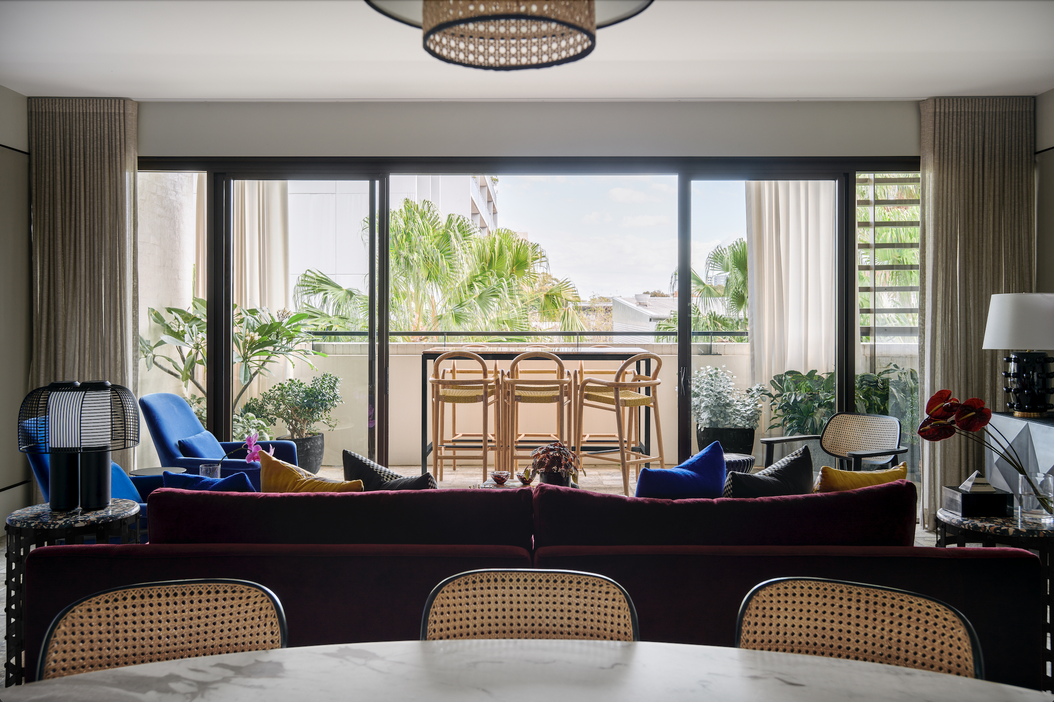
Floor-to-ceiling semi sheer curtains in the bedroom continue the sophisticated hotel vibe, borrowing an old design technique of extending the curtains beyond the window frame to make the room feel larger.
The foundation materials were already decidedly neutral when he bought the apartment, which Kaiko decided to work with, including the flooring.
“The floors are beautiful. The travertine is cross cut and they are laid in that chateau style with big and small pieces,” Kaiko says. “They were fit for purpose and they continue from the public spaces into the bedrooms and then onto the balcony.
“We always try to make the existing work.”
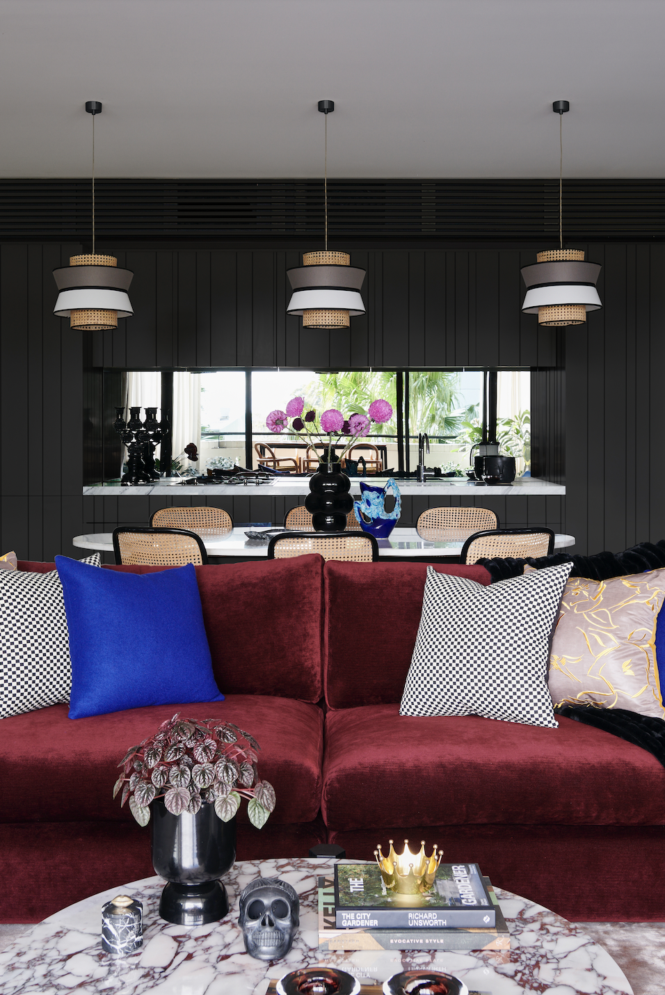
To bring some personality into living spaces, the apartment is punctuated by rich tones of cobalt, forest green and a deep crimson, including an Arpège sofa in a colour reminiscent of the 2023 Pantone Colour of the Year, Viva Magenta.
“Cobalt is my favourite colour and I wanted to make that work. In terms of the concept, it was really more about colour blocking and keeping the background palette pretty neutral,” Kaiko says.
An abstract artwork in gradient colour by Brisbane-based artist Andy Harwood plays a central role in the living space, providing depth to the room and drawing together the equally intense shades of cobalt and deep pink.

A veined marble coffee table from Zuster provides a visual link between the stronger crimson and the quieter neutrals while a touch of rattan in the kitchen pendant lights and the Thonet dining chairs lighten the mood.
Pinstriped black lines ensure the look is urbane and contemporary, without being too heavy.
For Kaiko, it’s not just a design statement. As all good interiors should, the apartment reveals the personality of its owner.
“This project gives people a good indication of my loves,” he says. “Some people think colour is not high end but some of the great designers across the world use colour.
“A lot of people are afraid of using it and have a tendency to think ‘If I do everything white, it will look more high end’ but it can look incredibly pedestrian.”
No chance of that happening here.

Many of the most-important events have slipped from our collective memories. But their impacts live on.

Paine Schwartz joins BERO as a new investor as the year-old company seeks to triple sales.


Many of the most-important events have slipped from our collective memories. But their impacts live on.
7 minAfter roughly 85 years of television in American homes, viewers have collectively shared historical triumphs and unthinkable tragedies, from Neil Armstrong’s moonwalk in 1969 to the 9/11 terrorist attacks in 2001.
But lesser-known events in the world of television have also reshaped America’s cultural landscape in lasting ways.
From redefining suppertime to digitising games to symbolising sex, drugs and rock ’n’ roll, here are six examples of TV’s impact on the American psyche.
1950: Birth of the couch potato
In the late 1930s and early 1940s, television sets marched into American living rooms.
But like the venerable radios they replaced, TVs were incredibly inconvenient. Many viewers had to actually stand up and walk across the room just to change the channel.
In 1950, Zenith Radio addressed this gross shortcoming with its release of a remote control, albeit one with a long cord and only two buttons—one to change channels and the other to power the TV on and off. Zenith aptly dubbed its remote Lazy Bones.
Taking lazy to the next level, Swanson & Sons in 1953 introduced TV dinners, convenient bake-and-eat frozen meals in aluminum trays.
Clearly, suppertime had moved to the sofa, because in 1954, the first full year of production, Swanson sold 10 million TV dinners. We were becoming a nation of “couch potatoes.”
Of course, nobody knew it at the time because the term couch potato didn’t exist yet.
In 1976, a man named Tom Iacino called his friend’s house and flippantly asked the person who answered the phone if he could speak to “the couch potato.”
Another friend, cartoonist Robert Armstrong, later heard about the mocking moniker and went on to trademark it (with Iacino’s permission).
Armstrong co-wrote “The Official Couch Potato Handbook: A Guide to Prolonged Television Viewing,” and the term couch potato entered the nation’s vocabulary.
Sept. 9, 1950: Forced laughter
The name Hank McCune may be lost to history, but his short-lived television sitcom will forever be remembered for its chuckles, chortles, giggles and guffaws. All of it canned.
Woven throughout the show’s jokes and sight gags was a laugh track—a first in American television—to “sweeten” the material and cue viewers at home when something was funny.
Countless other shows went on to use the technique, with Charlie Douglass soon becoming the undisputed “master of laughter.”
Douglass, formerly a technical director for various live shows, incorporated prerecorded laughter into shows that were filmed both with and without studio audiences.
To do this, Douglass built what he called the “Laff Box” and operated it somewhat like an organ. The upper keys were pressed to combine different types of laughter, from titters to belly laughs, and the foot pedals controlled the timing and duration of the laughter.
TV Guide published a two-part series on the Laff Box in 1966 in which industry executives explained why they went for the easy laffs: “Live audiences in from the street are tense and nervous and you don’t get their true reactions,” explained producer Don McGuire.
Arthur Julian, a writer on “F Troop,” noted that “real audiences sound phonier than the laugh track. Sometimes they freeze up and act unnatural.”
Today, television shows have mostly done away with laugh tracks. But Douglass still gets the last laugh—even though he died in 2003.
A recent study confirmed what previous research has already determined: Laugh tracks get people to laugh. In 2021, researchers concluded that a laugh track “may socially facilitate viewers’ responses and succeed in increasing the perceived humor and enjoyability of a television comedic sitcom.”
1959: Fired for being Black
At his first job in TV in 1959, Max Robinson was a voice without a face. As he delivered the latest headlines on WTOV in Portsmouth, Va., viewers at home merely saw a slide that read “News” on their TV screens.
Then one day before his broadcast, Robinson instructed the cameraman to remove the slide.
“I thought it would be good for all my folks and friends to see me rather than this dumb ‘News’ sign up there. Vanity got the better of me,” Robinson told the Washington Post in 1988.
When the slide was removed, viewers at home discovered that Robinson was Black.
The next day, the owner called him and apologetically fired him, Robinson told the Post. “He’d gotten these calls from some irate whites who’d found out that one of ‘those people’ was working there,” Robinson said.
Nonetheless, even though he lost his job, Robinson made history as the first African-American nightly news television anchor.
After his WTOV stint, Robinson went on to report the news and sit in the anchor’s chair at various stations until his big break came on July 10, 1978. ABC-TV premiered “World News Tonight” with three anchors: Frank Reynolds, Peter Jennings and Max Robinson.
Despite his success, Robinson continued to decry what he saw as racial inequities in both the media and in media coverage.
In a 1981 address at Smith College, he called the news media “a crooked mirror” through which “white America views itself,” the New York Times reported. “Only by talking about racism, by taking a professional risk, will I take myself out of the mean, racist trap all Black Americans find themselves in.”
Robinson was one of the founders of the National Association of Black Journalists and advocated for the cause until his death in 1988.
Oct. 18, 1979: A flood of BUDs
To encourage the expansion of satellite TV, the FCC voted to drop its costly and complicated licensing requirement for owning a satellite dish.
Now, cable and premium channels could more readily install giant satellite dishes to transmit and receive signals.
But the rule change also meant that Joe Schmo could install a behemoth satellite dish in his backyard and scoop up signals from cable and premium channels—all without having to pay monthly subscription fees.
Even so, Joe Schmo soon learned that saving money came at a price: All the neighbours hated him.
Some early models of the satellite dishes measured 16 feet in diameter, and hundreds of thousands of them sprouted up across the country. Technically, they were referred to as C-band satellite dishes after the range of wireless frequencies they received.
But they were better known throughout neighbourhoods as BUDs, or Big Ugly Dishes.
BUDs could capture premium programming at no cost because initially the analog-TV signals weren’t encrypted by broadcasters.
Still, even if homeowners got free programming, the upfront costs of buying and installing a satellite dish ran into hundreds, if not thousands, of dollars.
The backyard BUDs shot up just as cable and satellite programming was just getting off the ground. Home Box Office was a pioneer on both fronts.
In 1972 it was the first pay-cable network, and in 1975, it became the first TV network to transmit programming via satellite.
Ted Turner in 1976 turned WTCG, a small, independent TV station into a national cable network and later rebranded it WTBS, for Turner Broadcasting System.
Other networks that were early to the cable game include the Entertainment and Sports Programming Network (ESPN) in 1979, and Music Television—MTV—in 1981.
In 1986, broadcasters began scrambling their signals in hopes of nipping their losses in the BUDs.
Some companies, including HBO, said homeowners could continue to use their backyard dishes, but in order for them to work, they would have to also buy a $395 descrambler and pay monthly subscription fee.
Needless to say, as more channels encrypted their signals, BUD sales withered.
1972: A whole new game in town
In September 1972, the world’s first home video game console made its debut, giving the words “What’s on TV?” a literal new meaning.
Named the Magnavox Odyssey, the console setup included translucent overlays that players stuck on the TV screen to create colourful game boards, such as table tennis, roulette and haunted house.
The underlying gaming technology itself was crude by today’s standards: Three white dots and a vertical line on a black background. Two of the dots were manipulated by players using hand-held controllers, the third by the system itself.
The console had dials that adjusted the placement of the vertical line and the speed of one of the dots.
With six game cartridges and plastic overlays, the Odyssey setup offered 12 different games when it first retailed for $100—or about $770 in today’s dollars.
While rudimentary, the Odyssey broke a barrier in the world of television. It changed the medium from a passive activity with a scripted outcome into an interactive pursuit controlled by users at home.
Today, the U.S. ranks No. 1 in the world videogame market, with revenue projected to exceed $140 billion in 2025, according to Statista Market Insights.
That figure includes the creation, publishing, distribution and monetization of PC, mobile and online games, as well as spending on related hardware and accessories. China holds the No. 2 spot, with a projected $137.8 billion in revenue in 2025.
1970s: Rock stars vs. TV sets
In the late 1960s, a peculiar new synergy emerged between rock ’n’ roll music and television: Put a rock star in a hotel room with a TV, and the TV wouldn’t come out alive.
Many in the music world trace the genesis of this phenomenon to Keith Moon, who was legendary both as a drummer for the Who and for trashing hotel rooms, including TVs.
A 1972 film recording documents Keith Richards of the Rolling Stones and saxophonist Bobby Keys throwing a TV off the 10th-floor balcony of Continental Hyatt House Los Angeles.
In the recording, one of them is kindly heard saying, “Let’s make sure there ain’t nobody down there,” before dropping the TV.
Not to be outdone, members of Led Zeppelin threw televisions from the windows of Seattle’s Edgewater Hotel into the waters of Elliot Bay.
The Brits weren’t the only bad boys. While visiting Asheville, N.C., for a show in July 1975, Elvis Presley reportedly shot to death the TV set in his motel room because the vertical hold setting wasn’t working properly, according to local historian Jon Elliston.
It didn’t take long for trashing hotel property to become a hallmark of the rock ’n’ roll mythology, with television sets seemingly taking the brunt of the abuse.
Still, destroying them was an expensive thrill, since the band was expected to reimburse hotels for the ravaged TVs and other damage to the rooms when checking out.
It could also be dangerous. After a night of heavy drinking, Black Sabbath’s former frontman Ozzy Osbourne and guitarist Zakk Wylde hurled a TV out of a sixth-floor window at the Four Seasons in Prague
Wylde, who recalled the incident in a 2024 interview, said it happened after Osbourne mentioned that he had never done it before.
Describing the TV drop in a 2019 interview, which has been edited for TV, Osbourne said, “I ripped the window open, picked it up and threw it out of the BLEEP window. It landed on the floor and BLEEP exploded. It went like a bomb. Little did I know that there was a guy smoking a cigarette, and I shudder to think if that had hit him on the head. I would have killed him stone BLEEP dead.”
Osbourne, who famously bit the head off a bat that was tossed onto the stage at a concert in Iowa (he said later he thought it was fake), died in July of 2025 of a heart attack at age 76.
On the opposite end of the safety scale: Guitarist Kelley Deal of the Breeders and Nirvana’s Krist Novoselic.
On tour in the early 1990s, the two musicians decided to toss a TV out of a hotel window, Deal told the Guardian.
Novoselic “called down to the front desk, got permission, paid for the TV and asked security to make sure nobody was below. This is the kind of sweet band they were. Then we shoved it through the window. It was fun, but the funniest bit was all the planning and anticipation.”
Today, rock ’n’ roll is past its heyday, and many icons of the genre are fading as well. But legends still have a soft spot for the old days.
Asked about artificial intelligence creeping into music, rocker Joe Walsh dismissed concerns in a 2023 video clip, saying: AI “can’t destroy a hotel room.
It can’t throw a TV off the fifth floor into the pool and get it right in the middle. When AI knows how to destroy a hotel room, then I’ll pay attention to it.”

From farm-to-table Thai to fairy-lit mango trees and Coral Sea vistas, Port Douglas has award-winning dining and plenty of tropical charm on the side.
Many of the most-important events have slipped from our collective memories. But their impacts live on.