Touch Screens Are Over. Even Apple Is Bringing Back Buttons.
Product designers are embracing how users actually feel after years of pushing flat and sleek
The tyranny of touch screens may be coming to an end.
Companies have spent nearly two decades cramming ever more functions onto tappable, swipeable displays. Now buttons, knobs, sliders and other physical controls are making a comeback in vehicles, appliances and personal electronics.
In cars, the widely emulated ultra-minimalism of Tesla’s touch-screen-centric control panels is giving way to actual buttons, knobs and toggles in new models from Kia , BMW ’s Mini, and Volkswagen , among others. This trend is delighting reviewers and making the display-focused interiors of Tesla and its imitators feel passé.
Similar re-buttonisation is occurring in everything from e-readers to induction stoves.
Perhaps the most prominent exponent of this button boom is the company that set us lurching toward touch screens in the first place. Apple added a third button it calls the “action button” to its full slate of new iPhone 16s unveiled this month, after introducing the feature on its upscale Apple Watch Ultra and Pro-model iPhones over the past couple of years. It also added a button-like “camera control” input on the iPhone’s side.
As Apple shows, companies aren’t just rediscovering buttons, they’re reconceiving them. The camera control includes touch features, and the company has also developed the “force sensor” that enables its AirPods to respond when you squeeze their stems.
Engineers and industrial designers—often prodded by user complaints—are tapping into our exquisitely sensitive sense of touch and spatial awareness, known as proprioception. And it’s all in service of making gadgets easier, more fun and, in some cases, safer to use. We want to touch type or operate cruise control without averting our eyes from the road.
Why buttons became sensors
To understand why buttons are making a comeback in a world in which any kind of controls are possible, it helps to understand how we got to the current, too-often sorry state of human-machine interfaces.
Touch screens have their virtues, which explains the initial enthusiasm for them. We can do a lot more by tapping our iPhones than we ever could have with the old-school BlackBerry , however much we miss those clicky little keyboards.
As soaring production drove down the price of such displays, though, they became something of a crutch for gadget designers and corporate bean counters.
“Now that touch screens are the cheapest option, they’re being deployed everywhere, even in places where they don’t belong,” says Sam Calisch, chief executive of Copper, a startup that makes induction ranges for cooking . In electric stoves and ovens, this has led to poor design decisions—for example, induction cooktops with touch-based controls that become inoperable when a pot boils over, as my Wall Street Journal colleague Nicole Nguyen lamented last year .
Even when our devices have buttons, they are too often the kind that are flat like touch screens, and have similar shortcomings. Capacitive buttons sit flush on hard surfaces and don’t actually give way when you press, and so can only signal they’ve been activated through sound or light. These, too, have taken over because they are cheap and easy to incorporate into the printed circuit boards that are already inside gadgets, whereas incorporating physical switches means additional wiring and complexity, Calisch says.
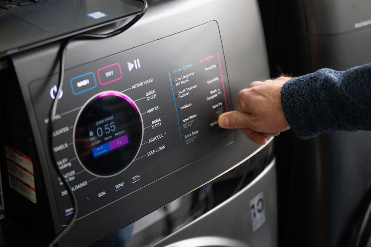
Anyone who has known the agony of having to mash a capacitive button on a newer washer, dryer or dishwasher knows how uniquely infuriating such cost-cutting measures—masquerading as futuristic interfaces—can be.
The hazards of ‘touch’ interfaces
Fundamentally, the problem with touch-based interfaces is that they aren’t touch-based at all, because they need us to look when using them. Think, for example, of the screen of your smartphone, which requires your undivided gaze when you press on its smooth surface.
As a result, “touch screen” is a misnomer, says Rachel Plotnick, associate professor of cinema and media studies at Indiana University Bloomington, and author of the 2018 book “Power Button: A History of Pleasure, Panic, and the Politics of Pushing,” the definitive history of buttons. Such interfaces would be more accurately described as “sight-based,” she says.
The hazards of burying many of a vehicle’s controls inside touch-screen menus that need drivers to look at them have become so obvious that the one European automotive safety body has declared that vehicles must have physical switches and buttons to receive its highest safety rating. Responding to criticism from drivers, Volkswagen has pledged to bring back physical controls for certain oft-used features, such as climate control.
Newer electric vehicles from BMW Mini are bristling with physical controls. To make it so drivers never have to take their eyes off the road, industrial designers at Mini put into their vehicles a user-customizable head-up display that drivers can navigate using buttons and a scroll wheel on the steering wheel, says Patrick McKenna, head of product and marketing at Mini USA. These controls can also be accessed through the vehicle’s round touch screen, and via a voice assistant. The entire point of the vehicle’s interfaces is redundancy, safety and a reduction in distractions, he adds.
Satisfying switches and clicky keyboards
The switch back to physical interfaces is also, in many ways, a vibe shift. With touch screens ubiquitous, what was once viewed as luxurious is becoming tacky. Physical controls, done well, now signal the kind of thoughtfulness and exclusivity once attached to the original iPhone.
Take the knobs on the induction range from Copper. Made of walnut, they let cooks know, without looking, the level of heat they’ve set a burner to—just like physical knobs on a gas range. This is deliberate, says Calisch, who admits that in the past he’s put capacitive-touch sensors on other electronics he’s designed.
Physical controls are effective in part because of our sixth sense, known as proprioception. Distinct from the sense of touch, proprioception describes our innate awareness of where our body parts are. It is the reason we can know the position of all our limbs in three-dimensional space down to the precise position of the tips of our fingers.
Making good physical interfaces isn’t just about the utility of engaging our sense of touch; the big button comeback is also about joy. Think of the satisfying heft of the volume knob on a hi-fi stereo, or the way a proper ergonomic keyboard can make typing seem less of a chore.
A good example of this sense of fun is the hand crank on the side of the Playdate portable video game system, which also includes a familiar, plus-shaped D-pad and two buttons. Putting a controller that works like the crank on an old coffee grinder onto a gadget resembling the original Gameboy is about whimsy, but also introduces new game mechanics that would otherwise be cumbersome or even impossible on other devices, says Greg Maletic, director of special projects at Panic, the company that makes the Playdate.
Makers of musical instruments have always understood the importance of physical controls. Teenage Engineering, the Swedish consumer-electronics company Panic partnered with to make the Playdate, makes a variety of synthesisers bristling with a dizzying array of buttons, sliders and knobs.
Once you know what to look for, it becomes apparent that this kind of design thinking is showing up all over the place, and that adding physical controls back to a device ignominiously stripped of them can unlock new kinds of interaction and utility.
E-readers have begun adding back page-turn buttons. While Amazon has abandoned such buttons in its Kindles, competitors from Kobo, Nook and Boox all now offer models that include them.
Similarly, Apple—whose 2007 launch of the iPhone ushered in a touch-screen era—is adding a surprising variety of buttons back to devices that previously seemed on a trajectory to have none at all.
It restored the physical function keys atop the keyboards on its MacBook Pro computers in 2021, after replacing them with much fanfare in 2016 with a touch-screen strip that it touted as the Touch Bar. Apple boasted that restoring physical keys brought “back the familiar, tactile feel of mechanical keys that pro users love.”
The push to re-physicalise interfaces has even led to an unexpected side gig for Dr. Plotnick, the academic authority on buttons. Companies are tapping her to consult on how to improve their physical controls. At its heart, these consultations—which include advising on the function of potentially lifesaving buttons on medical devices—are about making interactions with machines less intimidating and more intuitive.
“You know, there’s often a lot of skill behind button pushing—even though it seems like the simplest thing in the world,” she says.
 Copyright 2020, Dow Jones & Company, Inc. All Rights Reserved Worldwide. LEARN MORE
Rising rates, construction inflation and shrinking investor confidence are pushing Australia deeper into a dangerous housing spiral that monetary policy alone cannot fix.
Automobili Lamborghini and Babolat have expanded their collaboration with five new colourways for the ultra-exclusive BL.001 racket, limited to just 50 pieces worldwide.
Italian wines are emerging as a serious contender for Australian collectors, offering depth, rarity and value as French benchmarks continue to climb.
Formula 1 may be the world’s most glamorous sport, but for Oscar Piastri, it’s also one of the most lucrative. At just 24, Australia’s highest-paid athlete is earning more than US$40 million a year.
From Italian vegetable-tanned leather to real-world training insight, Australian brand PK9 Gear is redefining what luxury means for discerning dog owners.


