


Luxury in every shade: How colour creates a high-end interior
From timeless neutrals to rich jewel tones and earthy hues, the right colour palette can elevate any space, creating mood, elegance and effortless sophistication.
 3 min
3 min
When people think of luxury in interior design, their minds often jump to expensive furniture or opulent finishes, but in truth, one of the most powerful tools in creating a refined, elegant home lies in the palette you choose.
Colour has an extraordinary ability to shift a space’s mood, scale and energy. The right hue, applied with thought and care, can make a modest room feel expansive, elevate everyday pieces and instantly signal sophistication. As a designer, I believe that luxury is not about excess; it’s about intention. And colour, when chosen well, can speak volumes.
Timeless neutrals: The essence of understated elegance
There’s something inherently luxurious about a well-balanced neutral palette. Soft whites, warm beiges, and the perfect blend of greige, which is a gentle meeting point between grey and beige, offer a timeless foundation for any space. I often gravitate toward warm whites like ivory, bone, or champagne, tones that feel luminous yet grounded.
In more modern interiors, cooler greys bring a crisp sophistication, especially when layered with clean architectural lines. The beauty of neutrals is their versatility, they allow your materials, textures and lighting to take centre stage, creating a quiet kind of opulence that never goes out of style.
Rich jewel tones: For depth, drama and decadence
If you’re drawn to interiors with a sense of grandeur, jewel tones are your secret weapon. Emerald green, in particular, has an enduring allure especially when paired with brushed gold or antique brass. It evokes nature but with a regal twist. Deep sapphire blues bring a sense of calm authority to a space, while ruby red delivers unapologetic confidence.
These colours work best when expressed in rich textures: velvet armchairs, high-gloss cabinetry or dramatic accent walls. In the right application, jewel tones don’t shout they whisper luxury.
Dark and moody: The modern masterstroke
I’ve always admired the elegance of moody interiors. Charcoal greys and deep navies create a sense of intimacy, wrapping a room in warmth and quiet confidence. A matte charcoal wall in a living or dining room feels architectural and considered, while a navy velvet headboard or cabinetry in a study can anchor the room with presence and depth.
To keep these spaces from feeling too heavy, I like to introduce metallic highlights, a polished chrome lamp, a brushed gold sconce, or even a soft glint of silk in a throw or curtain. It’s these small contrasts that give dark interiors their designer edge.
The soft side of luxury: Muted pastels
Pastels can be incredibly luxurious when done right. Think blush pink offset by crisp linen, soft gold and creamy stone. It’s not saccharine; it’s sensual. I find muted lavender and powder blue especially beautiful in bedrooms and dressing spaces, where they exude serenity and quiet indulgence.
These colours pair well with tactile textures, cashmere throws, velvet cushions, and silk sheers for a softness that’s both comforting and couture.
Earthy tones: Effortless sophistication from nature
Earth-inspired shades like terracotta, olive green and warm taupe have surged in popularity for good reason. These tones bring a worldly richness to interiors, referencing Mediterranean villas, lush vineyards and sun-drenched landscapes.
Terracotta, whether in a statement wall or an artisan vase, offers warmth and groundedness. Olive green is wonderfully versatile both calming and bold and works beautifully with natural timbers and leathers. Taupe, the quiet achiever of the colour world, blends seamlessly into almost any palette while adding depth and warmth.
Elevating colour through detail
Colour is only part of the story. The way you apply it and what you pair it with makes all the difference.
How to enhance the luxury effect in your home
Beyond colour, the way you use and complement these colours and shades can enhance the luxurious look and feel of your home:
- Pair with metallics: Gold, brass, or chrome accents instantly elevate a colour scheme.
- Choose high-quality finishes: Matte, satin, or high-gloss paint finishes can impact how colours reflect light and create a sense of depth.
- Layer with textures: Velvet, silk and high-thread-count linens add richness to any colour palette.
- Use statement lighting: Elegant chandeliers or modern sconces enhance the mood and sophistication of a space.
Final thoughts
Creating a luxurious home doesn’t require extravagance. It requires consideration. The right colour palette whether classic neutrals, dramatic jewel tones or earthy naturals can transform your home into a sanctuary of style and substance.
As I often tell my clients: luxury is not a price point it’s a feeling. And colour is one of the most powerful ways to create that feeling, every day, in every room.
A record-breaking $11 million sale at The Centennial Collection has set a new benchmark for luxury apartment living in Bondi Junction.
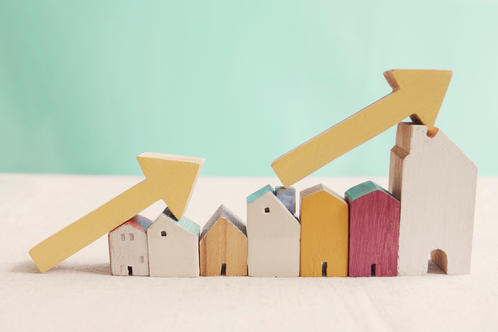
As interest rates, inflation and market sentiment fluctuate, investors are being urged to focus on data, not panic.

Police, paramedics, firefighters and the public will walk from Newcastle to Penrith this September for World Suicide Prevention Day.
2 min
NSW schools, gyms, 000 services and the public are being called on to lace up for Steps for the Love of Living, a four-day, 200km walk from Newcastle to Penrith held in honour of World Suicide Prevention Day.
The walk will draw star power as well as solidarity: legendary MMA fighter and former WIBA and WBF world champion boxer Arlene Blencowe, known as “The Aussie Girl ‘Angerfist'” and a respected youth mentor, will join the walk’s final leg from Parramatta to Penrith.
She’ll be joined by five-time Olympian and diving icon Melissa Wu, Ambassador for the Step Into Action Foundation.
The walk runs from September 10 to 13, beginning on World Suicide Prevention Day itself, and starts at Newcastle’s McDonald Jones Stadium before finishing at Penrith Showground.
It’s a joint initiative between The Australian Man Cave Support Group Inc and the Step Into Action Foundation, two organisations working on the frontline of suicide prevention in NSW.
The Australian Man Cave provides a safe, non-judgmental space for men to speak openly, with a focus on reducing the rate of male suicide, while Step Into Action concentrates on youth suicide prevention through resilience-building and early-intervention programs.
This year’s event also features a friendly inter-service challenge between NSW Police, NSW Ambulance, Fire & Rescue NSW, SES, Surf Life Saving NSW and the Rural Fire Service, who’ll compete to walk the furthest and raise the most for suicide-prevention initiatives.
“This walk is about hope, connection, and standing together,” said Lou Greco, President and Co-Founder of The Australian Man Cave Support Group Inc. “Every step taken is a step toward saving a life.”
Leading the charge is Chris Barton, Founder of the Step Into Action Foundation and a long-distance walking adventurer, who is taking on the full 200km route.
He’ll be joined for part of the way by the “Bakery Brothers”, Tyson Pedro and Rama Pattison, who are trading in punches and pastries for kilometres, walking the full distance alongside Chris.
How to get involved
The event is open to everyone, not just those able to walk the full distance. Participants can:
- Walk the full 200km from Newcastle to Penrith
- Join for a single day or section of the route
- Take part virtually from anywhere in Australia — at school, the gym, work or in the local community, logging kilometres through walking, running, rowing, cycling or treadmill sessions
000 services can enter as teams for the inter-service challenge, and schools and gyms are encouraged to form their own teams to complete the distance collectively.
Funds raised will go towards mental health first aid training, crisis response support, community outreach programs, support services for at-risk men and families, and youth suicide awareness and prevention programs.
Suicide remains one of the leading causes of death among Australian men and young people. Both organisations say the walk is about ensuring no one feels alone in their struggle.
To register or find out more, visit stepsforloveofliving.com.au.
This is a sensitive topic. If this raises any issues for you, Lifeline is available on 13 11 14.

A&K Sanctuary unveils Kitirua Plains Lodge, a sustainability-focused luxury property shaped by landscape, local craft and contemporary safari architecture.

Barnet, in North London, lays claim to two of the country’s most expensive roads to own a home.